Gurmukhi/ Punjabi Unicode/ASCII Fonts for free download (over 17.5 million font downloads to date)
All of the 304 fonts in 49 families that you can download from this site are created by me (Paul Alan Grosse) and this is the only place that I put them. You can find older versions of them to download from other people's websites but occasionally, I update some of them or make modifications that the font files on these other sites will not have. This site is the only place that you can guarantee has the most up-to-date files. Further to this, if there are special instructions on how to get the most out of a font, such as special character sequences, the pages where you will find that information are on this site - each font family has its own page.
Also, when I make a new font, it can be months if not years before they appear on other sites. For example, GHP Full is one of the most popular of my fonts in film publicity, including the films themselves and yet there are plenty of Punjabi font download sites that do not have it at all, let alone the most recent version of it. Here, you can see which fonts are new from the list just above the main families table below.
What Is In A Font. . .
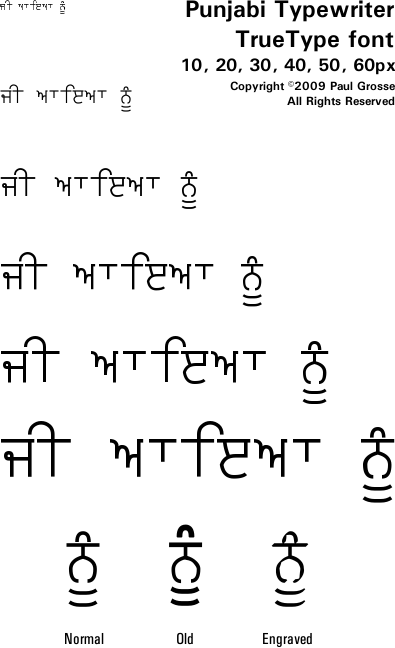
All of these fonts have characters in both Gurmukhi Unicode and ASCII as shown in the diagram on the right. The 'Extra' portion holds characters that are not directly accesible using a single keystroke such as the paer characters and special, shortened variants of aunkard and dulaunkard that occur with the paer characters.
The font is basically a file with the letter shapes in it. When you press a key on your keyboard, the computer looks at the code that is sent to it from the keyboard and looks up the shape in the font file, then it displays it on the screen or prints it out, depending upon what you have told it to do.
Keyboards are normally configured to produce the codes for ASCII characters and leaving it like this will make your computer look up the character shapes from the ASCII part of the font. For Gurmukhi characters in the ASCII range, see the Computer/ASCII Keyboard page for the layout used in the fonts. However, with Punjabi, you also have the option of configuring it to produce the Unicode codes for characters and when this happens, the Unicode part of the font is used. The standard layout is for the 'InScript' layout which is very much like the Dvorak layout and is very easy to use although there are others. For the Gurmukhi Characters in the Inscript layout, see the Computer/Unicode Keyboard page for the layout used in the fonts. I use both layouts as well as typing ASCII English on my computer and whilst I am fluent in the latter (I started working as a writer in the 1990's so being fluent was really part of my job description), I also find that both the Inscript and the Phonetic layouts are as easy as each other and I can switch between them without any particular difficulty.
The font families on this site are all Gurmukhi Unicode fonts and each one falls into one of three categories:
ASCII
NumbersASCII
LettersUnicode
charactersMeaning... Unicode Gurmukhi with ASCII Gurmukhi letters and ASCII Gurmukhi numbers. Unicode Gurmukhi with ASCII Gurmukhi letters and ASCII Latin numbers you can easily convert to Gurmukhi. Unicode Gurmukhi with ASCII Latin letters and ASCII Latin numbers. In other words, if it has Gurmukhi letters and Latin numbers in the ASCII code range, you can turn the numbers into Gurmukhi numbers just by typing '##' after any digit you want to convert.
In the table below, you can see which numbers and letters are in which ranges.
What These Fonts Have Been Used For. . .
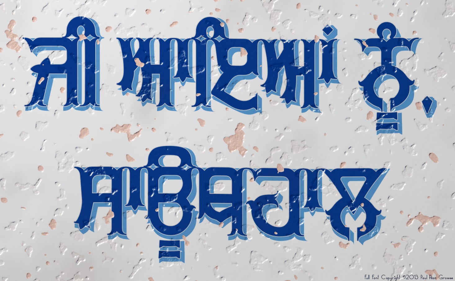
Representing literally thousands of hours of font design work with the resulting fonts used in over two hundred Punjabi films and on the covers of over two hundred books as well as in magazines, newspapers, jewellery and even as tattoos, my fonts are available for you to download from these pages and use for free for non-profit / personal use. Even if you are making a profit, you only need to pay for a use if you are producing: a book (whether it is in the book itself or only on the cover - a single payment of £100 for the book regardless of how it is used); or an internationally distributed film that lasts half an hour or more (it doesn't really matter how it is distributed or whether it appears in the film itself or in the publicity material such as posters or similar material) for which the fee is £1,000.
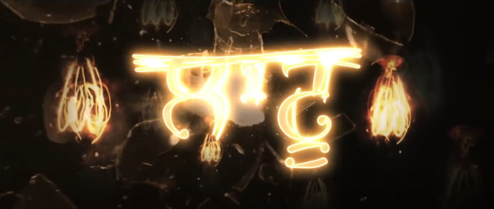
My fonts have been used in many films and/or their publicity material - see the 'Fonts In Use'/'Fonts In Films' page - these films including seven of the 20 highest grossing Punjabi films:
Manje Bistre 2017; Qismat 2018
; Muklawa 2019
; Ambarsariya 2016
; Bambukat 2016
; Punjab 1984 2014
; and, Vadhayiyaan Ji Vadhayiyaan 2018
, and ten in the next 20: Jatt James Bond 2014
; Manje Bistre 2 2019
; Nikka Zaildar 2 2017
; Lahoriye 2017
; Kala Shah Kala 2019
; Golak Bugne Bank Te Batua 2019
; Ashke 2018
; Nikka Zaildar 3 2019
; Guddiyan Patole 2019
; Nikka Zaildar 2016
.
making a total of 17 in the top 40 - film positions from Wikipaedia: List of highest-grossing Punjabi films page retrieved on 31/01/2021.You can see the extent to which the Covid-19 pandemic has affected the film industry from the lack of films released during 2020 and those that have been delayed until 2021 and 2022.
The Gurmukhi fonts - 304 fonts in 49 main families (literally over 17.5 million font downloads to date) can be used in commercial as well as non-commercial contexts.
Have you got the latest version of one of these fonts? If you have just downloaded it from this site, you have. Otherwise, you can check any font file by comparing the hash function results of the file on your computer with the values in the list by clicking here for text file and here for a web page - opens in a new tab. Select the font file on your system and look at the properties. Compare the hash result against the values in the table. These pages are kept up-to-date so whenever I update a font or create a new one, it will be on there.
Download All Fonts
You can download all of the fonts from all of the font families on this site in one compressed archive by clicking here for a ZIP file
or here for a TAR.GZ file

If you want to make a contribution directly using PayPal, my email address is paul.alan.grosse@gmail.com and please include your name and if relevant, your company and the project so that they can be included on the contributors page with a link if appropriate.
To see a list of contributors, click here.
Thank you.
All of the fonts here have characters both in the Gurmukhi Unicode range and also in the ASCII range. This means that you can use them with programs that haven't got UniCode capabilities as well as with those that have although you might find that you can do more with the font using Unicode, or that there are extra features built in so that things are done automatically by the font, such as contextual substitutions - look for the 'CSub' logo.
If you have installed a complete family of fonts, such as 'Raaj', and you think you can't see them all, look at the end of this page.
Recently produced fonts.
Click on the image to go to that font family's page2022 Dhobi Ghat 2021 Mansa Bhojanshala Ek Jot Thikriwala Patiala Circuit Small Dilli Khanna Rocket Khicho Parda Pixel Serif Blob Circuit Muskan 2020 Plotter Pachami
Recently modified fonts.
Click on the image to go to that font family's pageISO Date Font Notes 20210804 Modhera Added Latin-numbers-to-Gurmukhi-numbers ASCII code to get Gurmukhi numbers in ASCII as easy user option. 20210804 Dwarka Added Latin-numbers-to-Gurmukhi-numbers ASCII code to get Gurmukhi numbers in ASCII as easy user option. 20210804 Gubara Improved ASCII support for Adhaks;
Added Latin-numbers-to-Gurmukhi-numbers ASCII code to get Gurmukhi numbers in ASCII as easy user option.20210803 Julaf Added Latin-numbers-to-Gurmukhi-numbers ASCII code to get Gurmukhi numbers in ASCII as easy user option. 20210803 Jashan Added Latin-numbers-to-Gurmukhi-numbers ASCII code to get Gurmukhi numbers in ASCII as easy user option. 20210802 MFF DIN 1451 A Added Latin-numbers-to-Gurmukhi-numbers ASCII code to get Gurmukhi numbers in ASCII as easy user option. 20210801 MFF Adami Improved ASCII support for Adhaks;
Added Latin numbers to Gurmukhi numbers ASCII code to get Gurmukhi numbers in ASCII as easy user option.20210731 GHP Full Improved ASCII support for Adhaks and 'left-blocked' bindis;
Added Latin numbers to Gurmukhi numbers ASCII code to get Gurmukhi numbers in ASCII as easy user option.
Font Summary Name Year Use Fam
sizeASC Unicode Used
inNotes Cont
subsFont
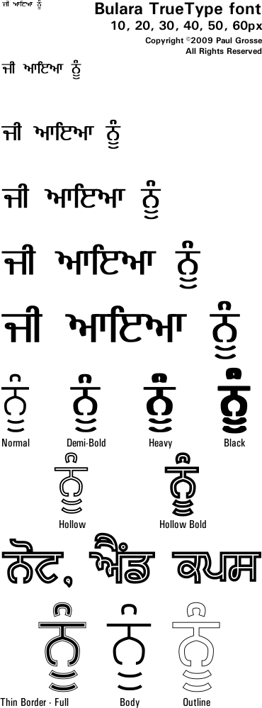
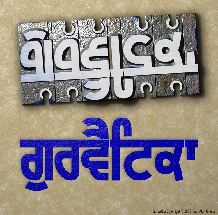
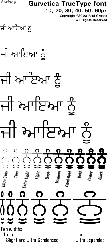
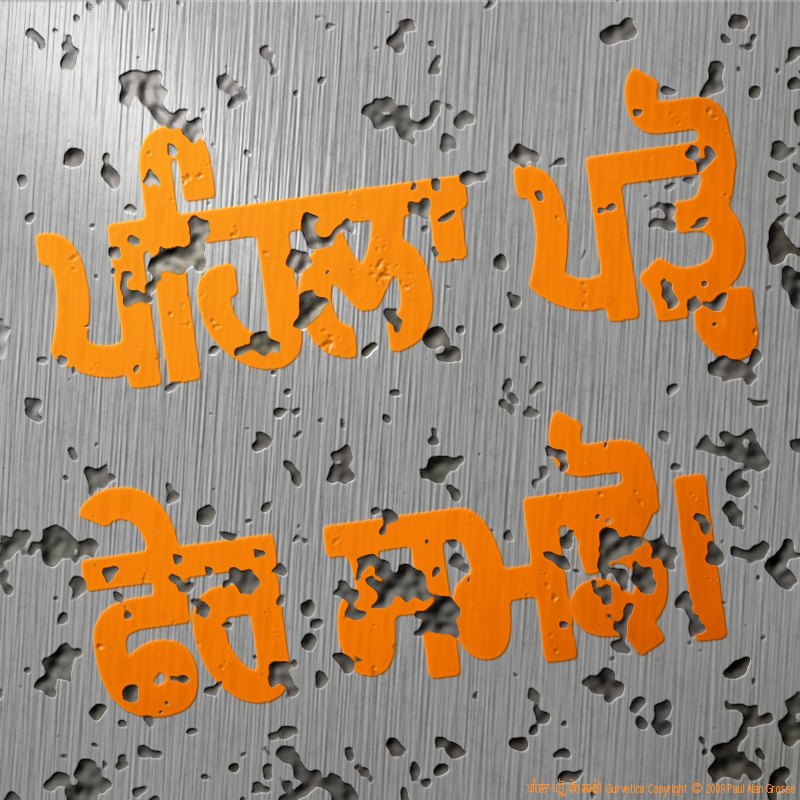
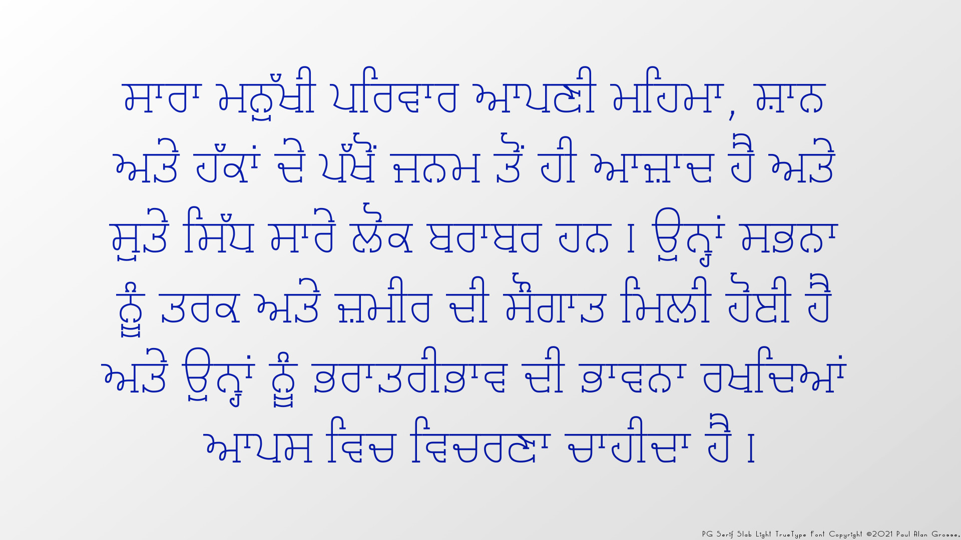
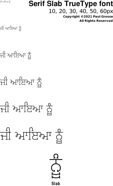
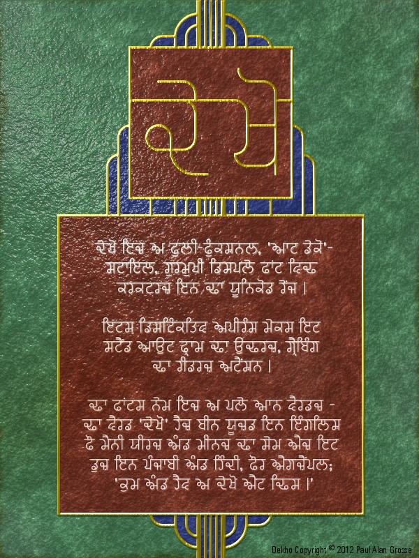
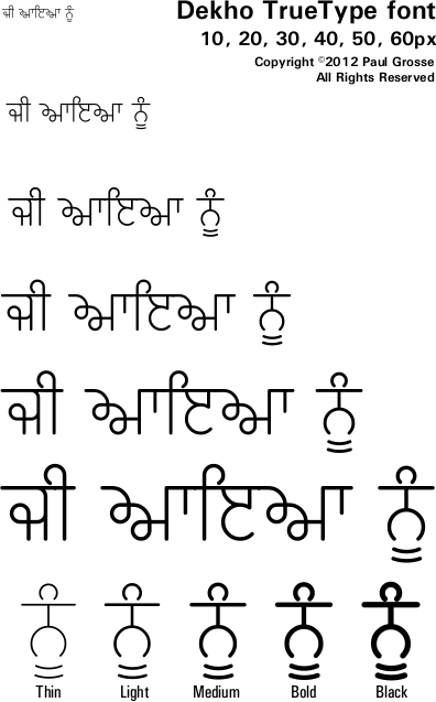
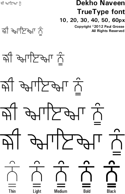
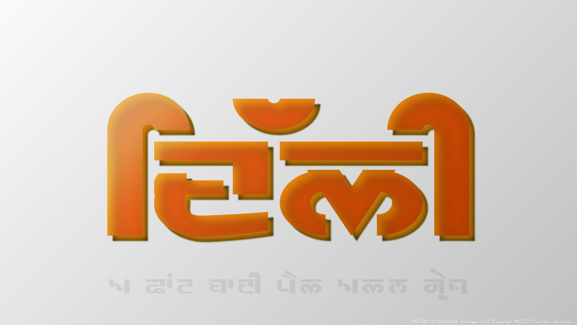
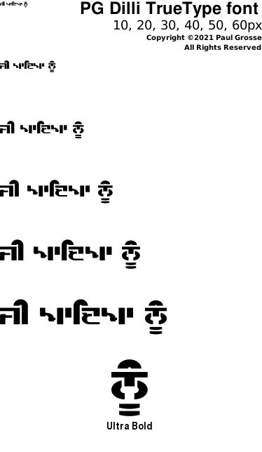
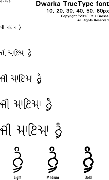
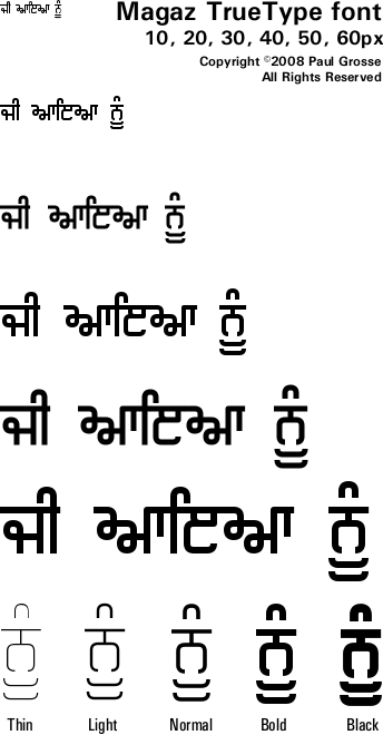
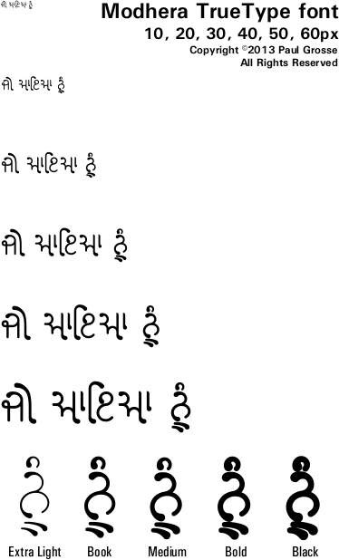
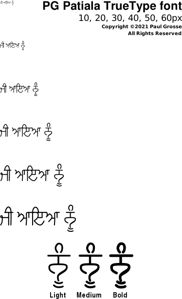
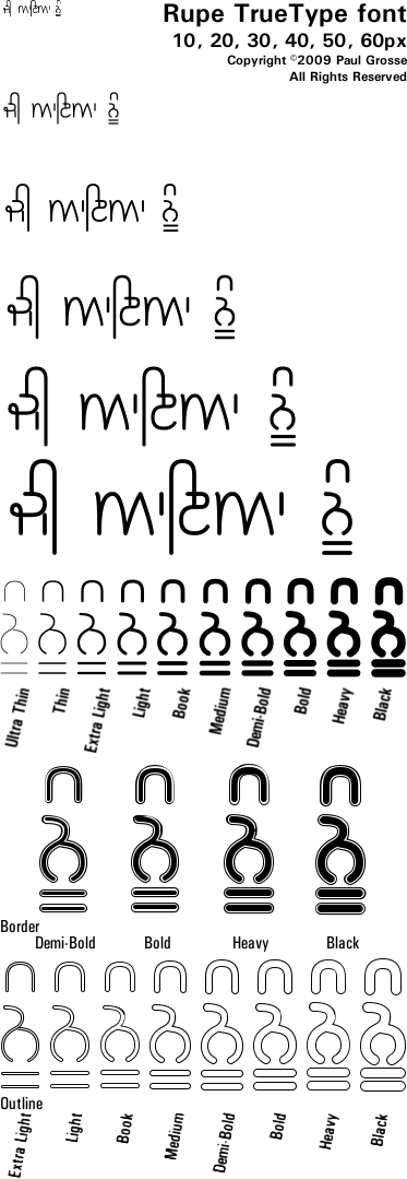
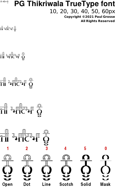
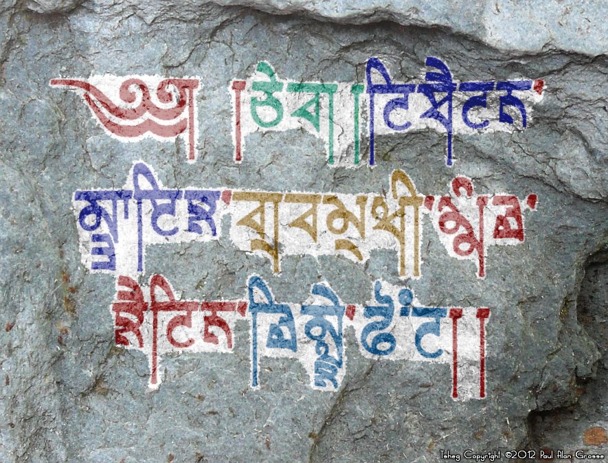
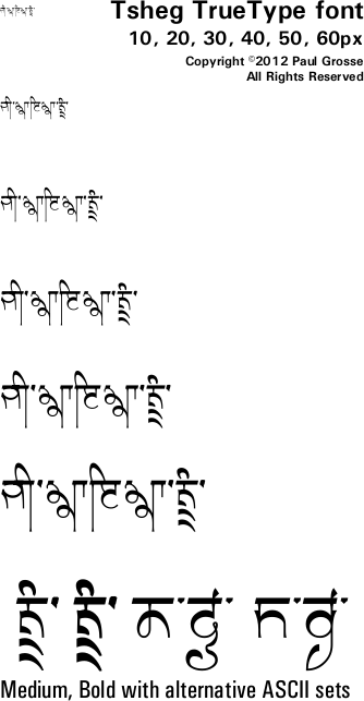
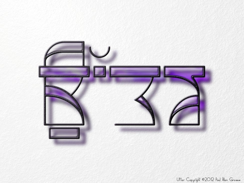
PageLinks Num Lat Gur Dev Example N F.I.U. Soc High-legibility - Machine Bulara 2009 9 High readability font with body and display variants - also has hollow and bordered variants for display uses. Gurvetica 2009 48 Designed specifically for readability. Includes Roman characters that match style and size for each font. Gurvetica A 2009 10 As Gurvetica but ASCII range has Gurmukhi for those without Gurmukhi keyboard layouts. PG Serif 2021 2 Roman-style and slab serif fonts based upon Gurvetica. Suitable for both body and display uses. Slab serif font light and highly legible. Roman serif font standing out. PG Serif SL 2021 1 Slab serif font based upon Gurvetica with Latin characters in the ASCII range. Suitable for both body and display uses. Slab serif font light and highly legible. Art abstract Dekho 2012 5 Very stylised display font, based on Art Deco, making it good for medium-sized font work as well as display work. Dekho Naveen 2012 5 Even more stylised display font, based on Art Deco, making it good for medium-sized font work as well as display work. Latin range is kerned. Dilli 2021 1 Very stylised, Ultra-Bold, Extended display font designed for work in logos and similar designs. Dwarka 2013 3 Monolinear Gurmukhi font in the style of Gujarati. Legible enough for body-font work and for display. Intelligent glyph coding in font. Magaz 2008 5 Very stylised display font, based around low number of horizontal lines, making it good for small font work as well as display work. Modhera 2013 5 Very stylised, 'rounded-serifed' Gurmukhi font in the style of Gujarati. Highly legible with many contextual alternative forms of sihari and bihari. Intelligent glyph coding in font. Patiala 2021 3 Based upon PG Ek Jot, this font is the stylised essence of hand-drawn Gurmukhi with a number of embellishments and additions. Legible enough for body-font work and for display. Rupe 2009 22 Based upon GHW Dukandar, this font is the stylised essence (ਰੂਪ) of practical, stripped-down Gurmukhi. Legible enough for body-font work and for display, includes bordered and hollow variants. Thikriwala 2021 6 Crisp, legible, display font with openface options . Tsheg 2012 6 Stylised display font, Tibetan (Uchan)-styled Gurmukhi Tee-shirt/tattoo font. Over 600 glyphs. Uttar 2012 9 Stylised display font, providing part-way step to Tibetan-styled Gurmukhi. imitation Gurmukhi
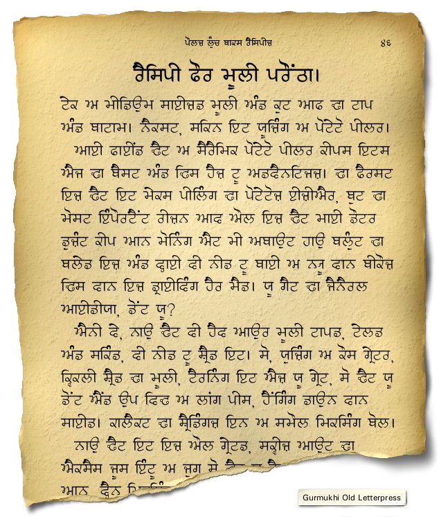
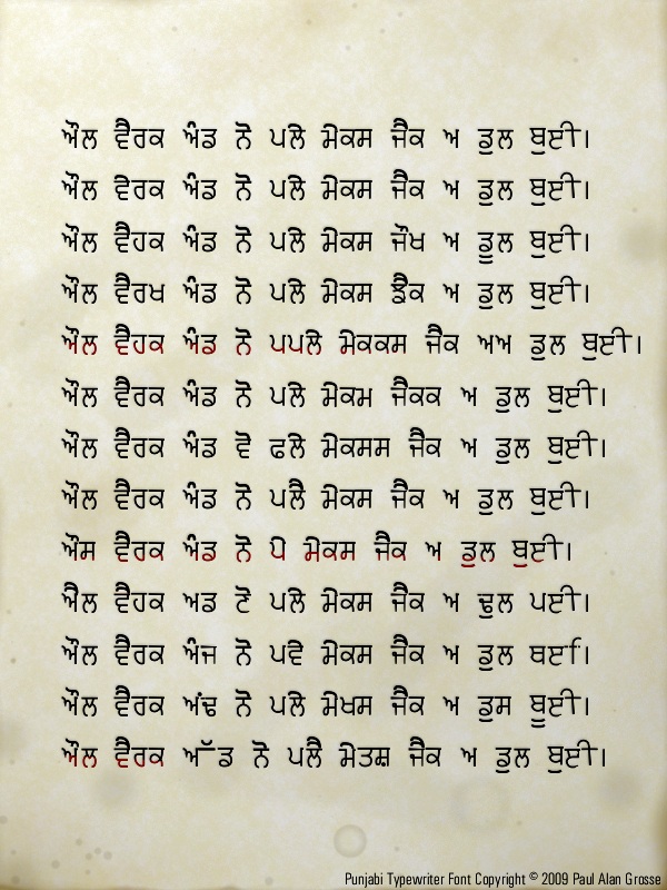
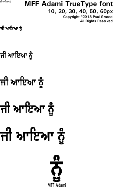
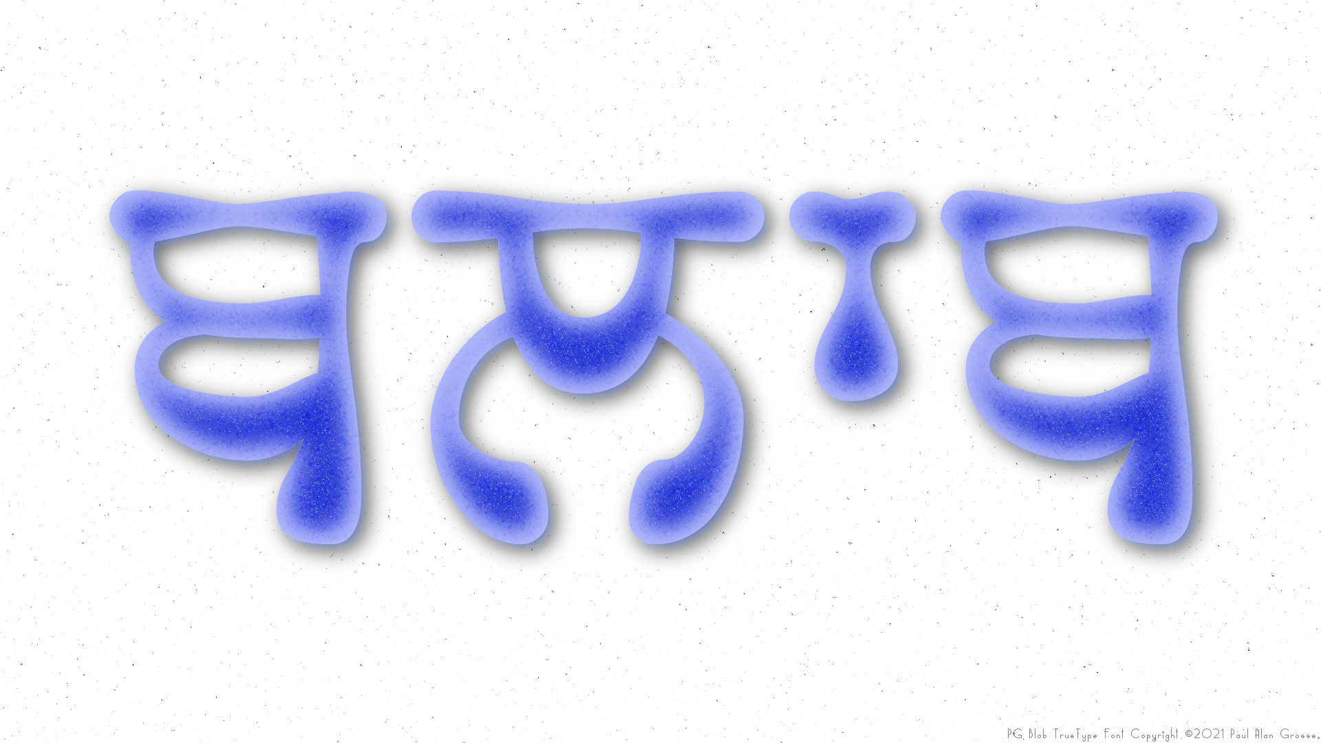
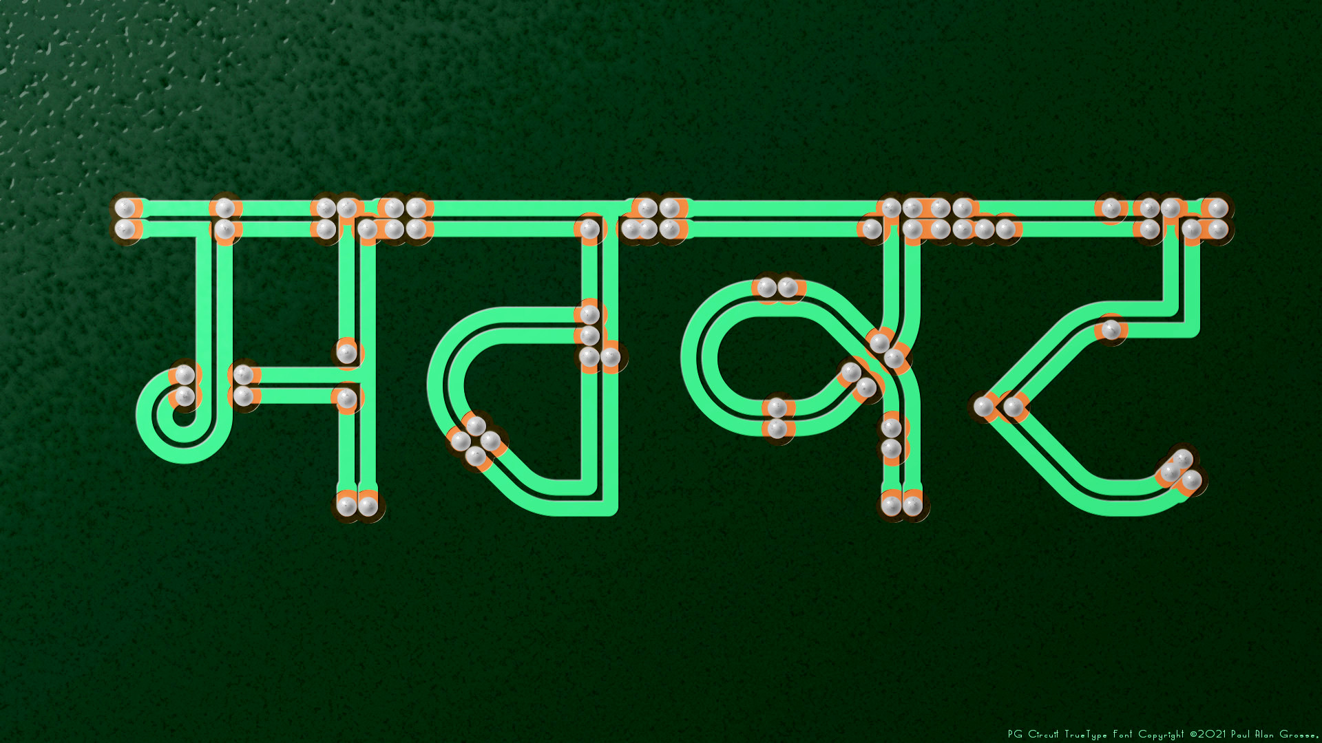
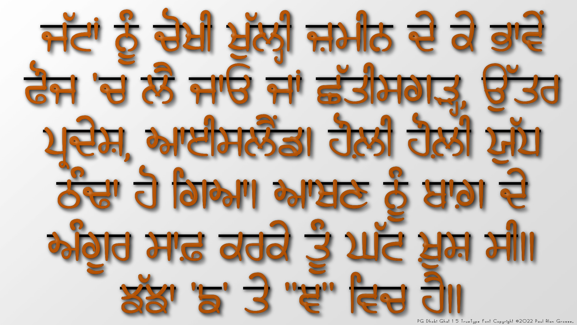
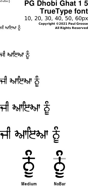
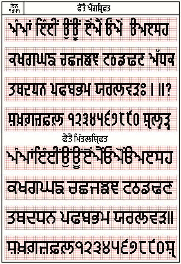
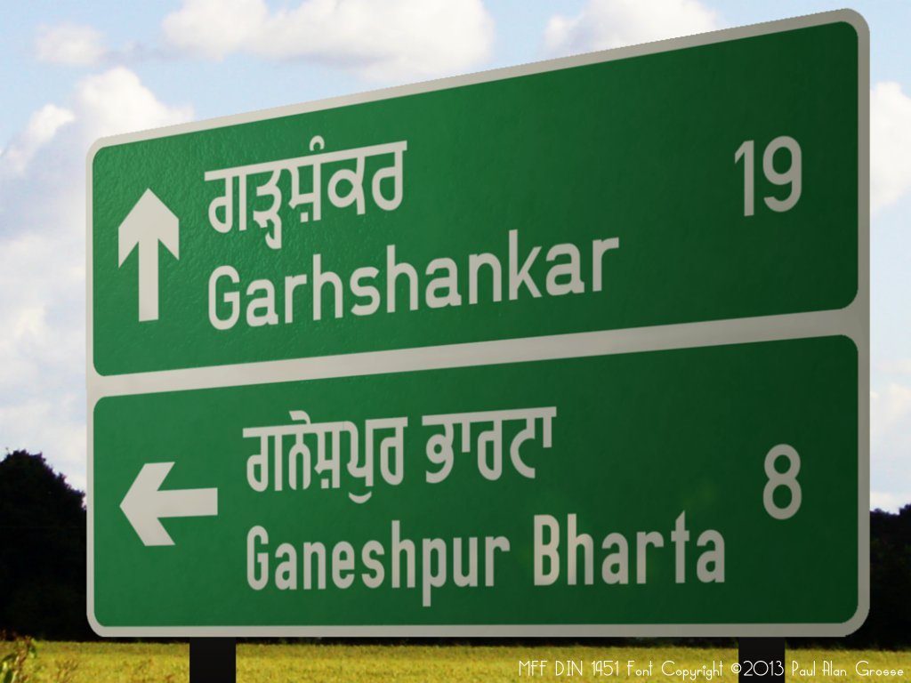
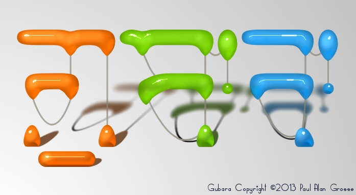
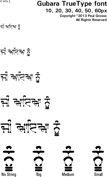
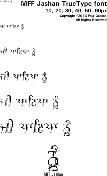
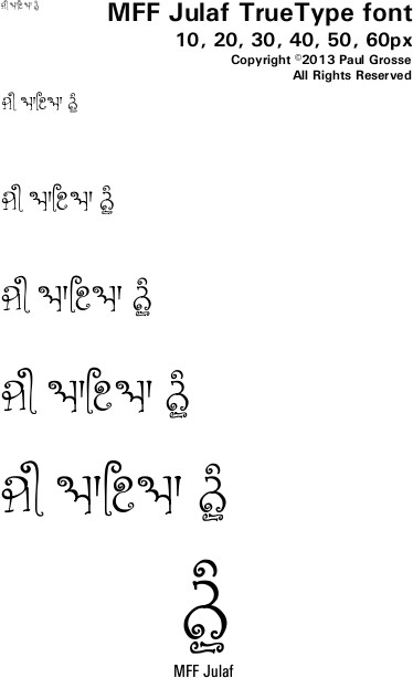
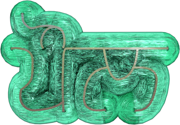
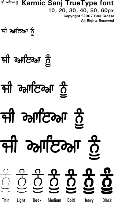
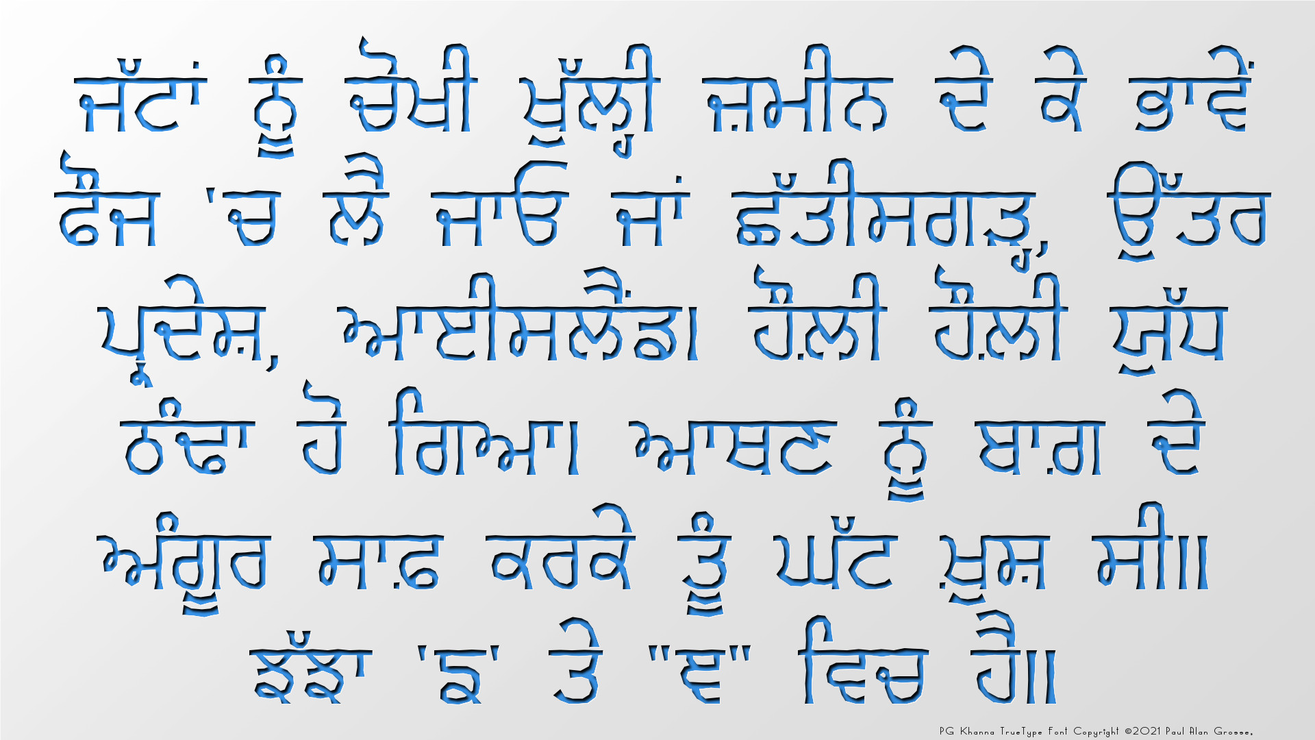
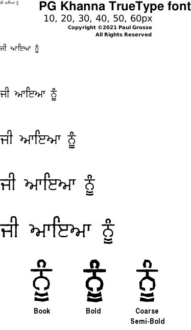
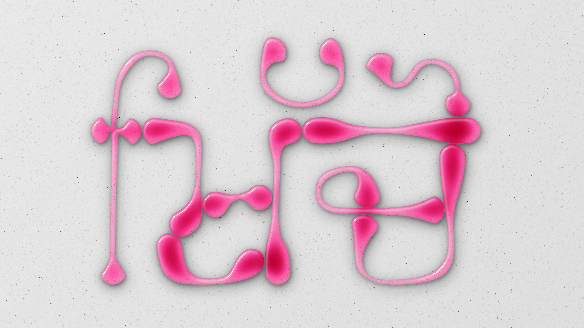
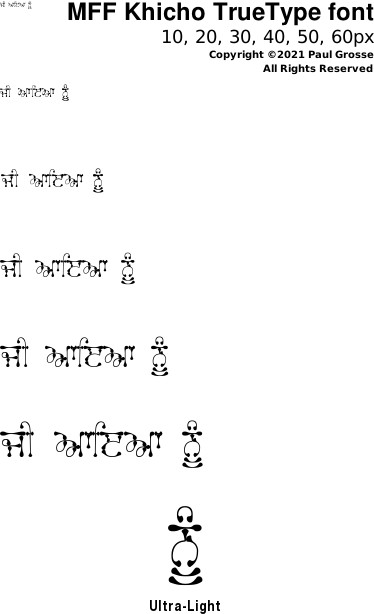
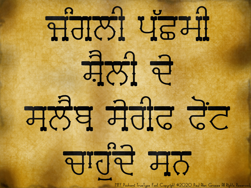
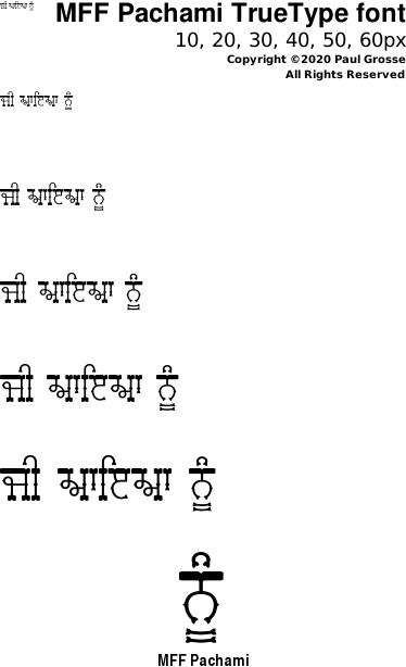
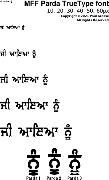
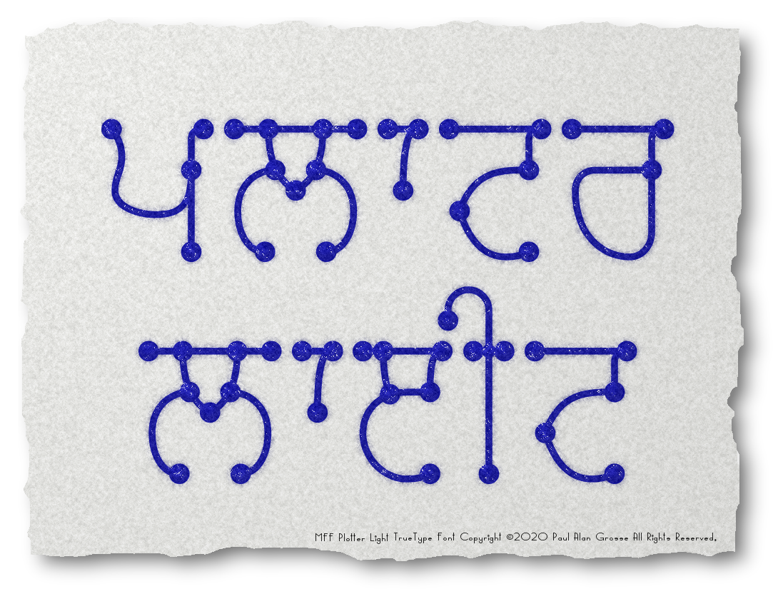
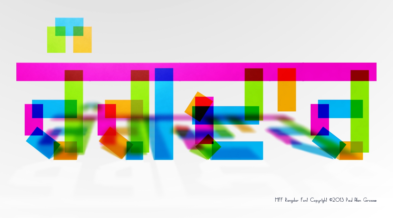
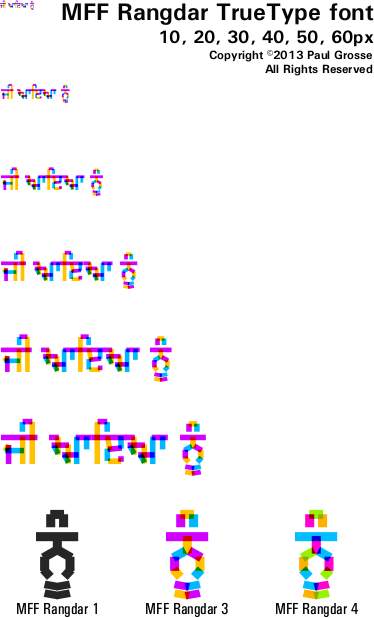
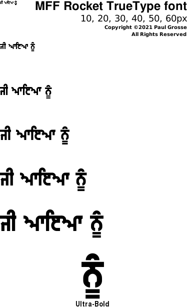
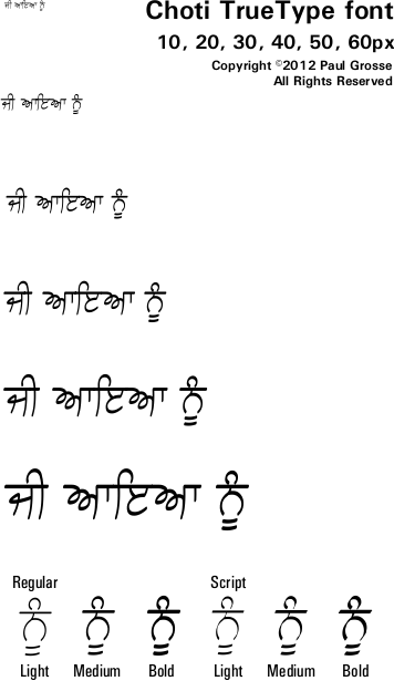
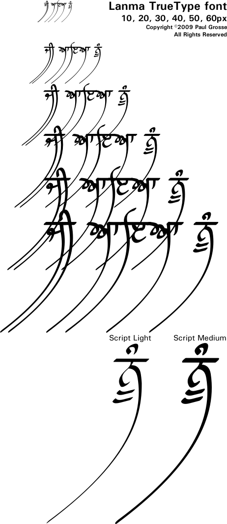
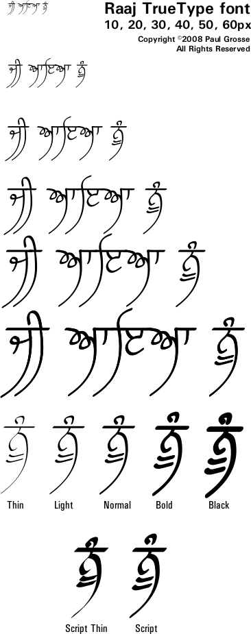
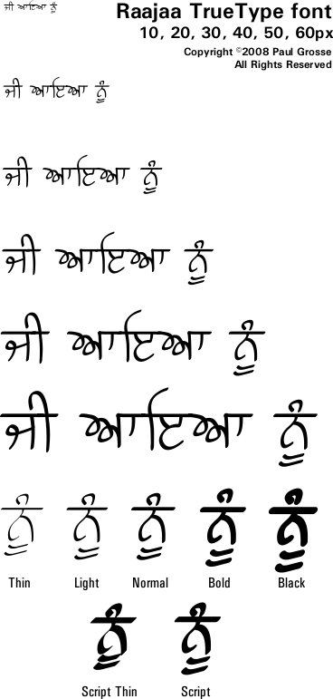
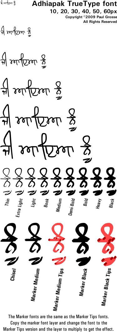
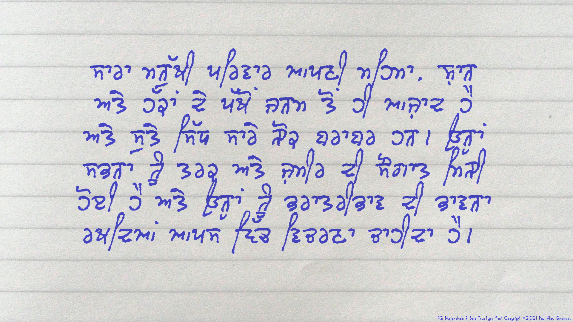
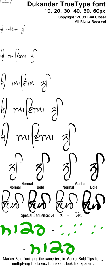
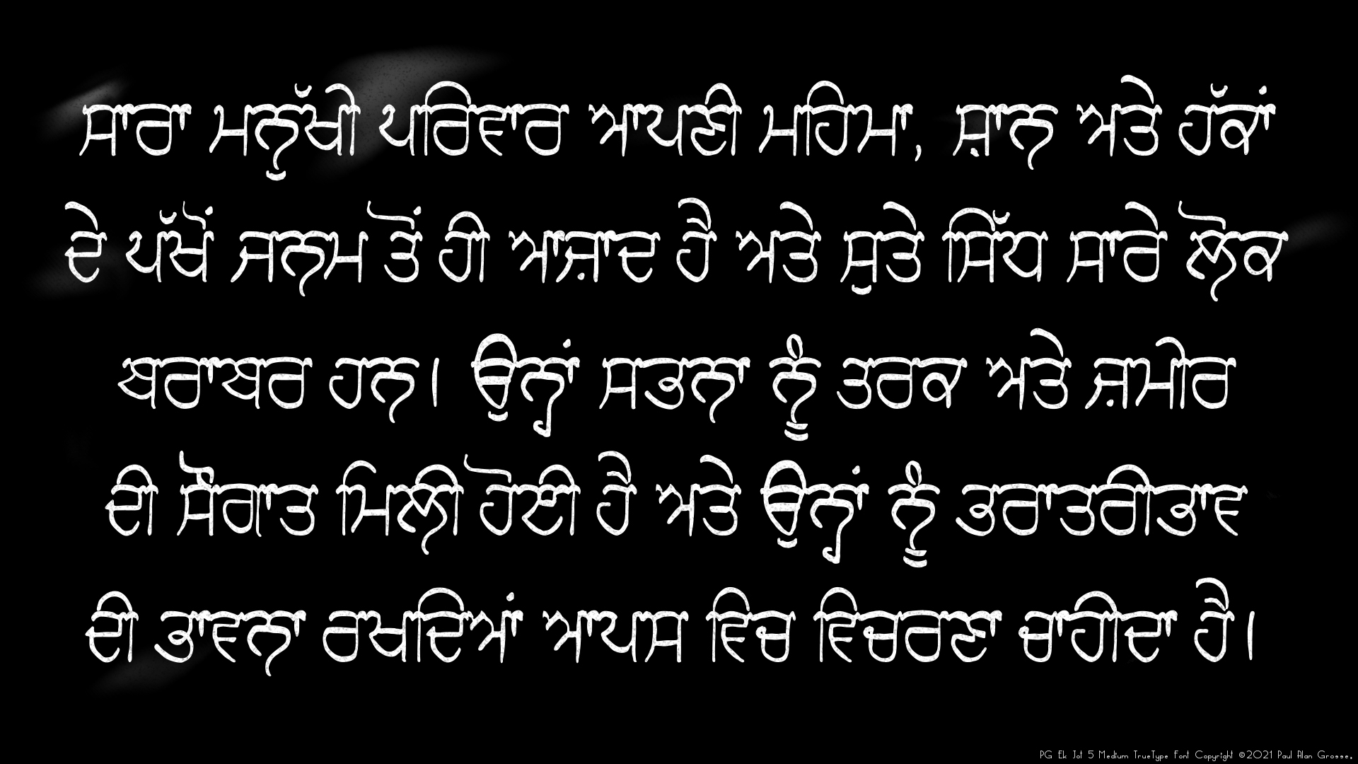
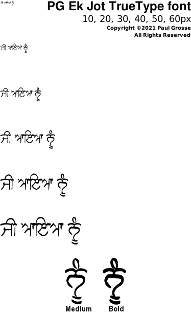
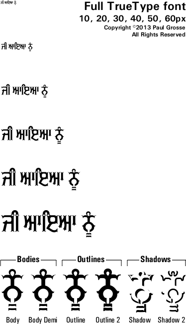
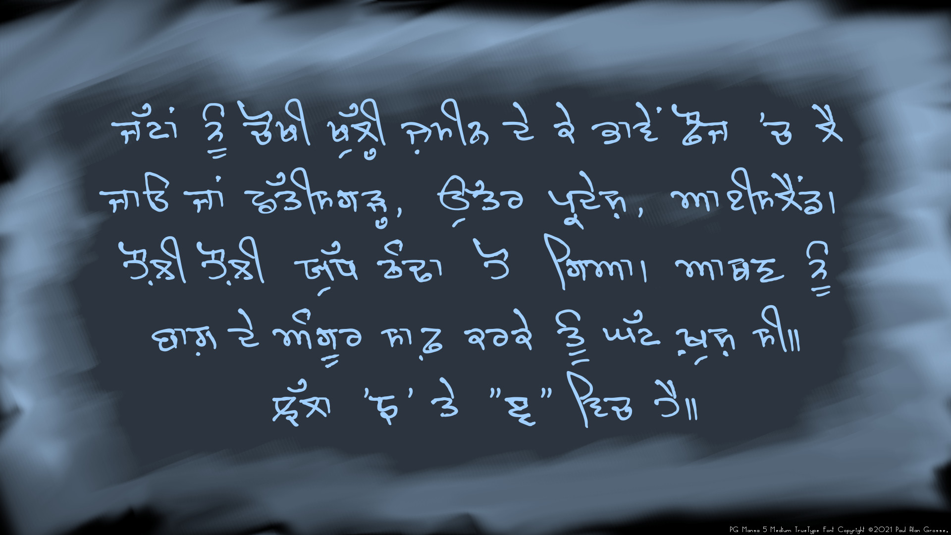
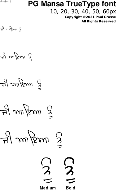
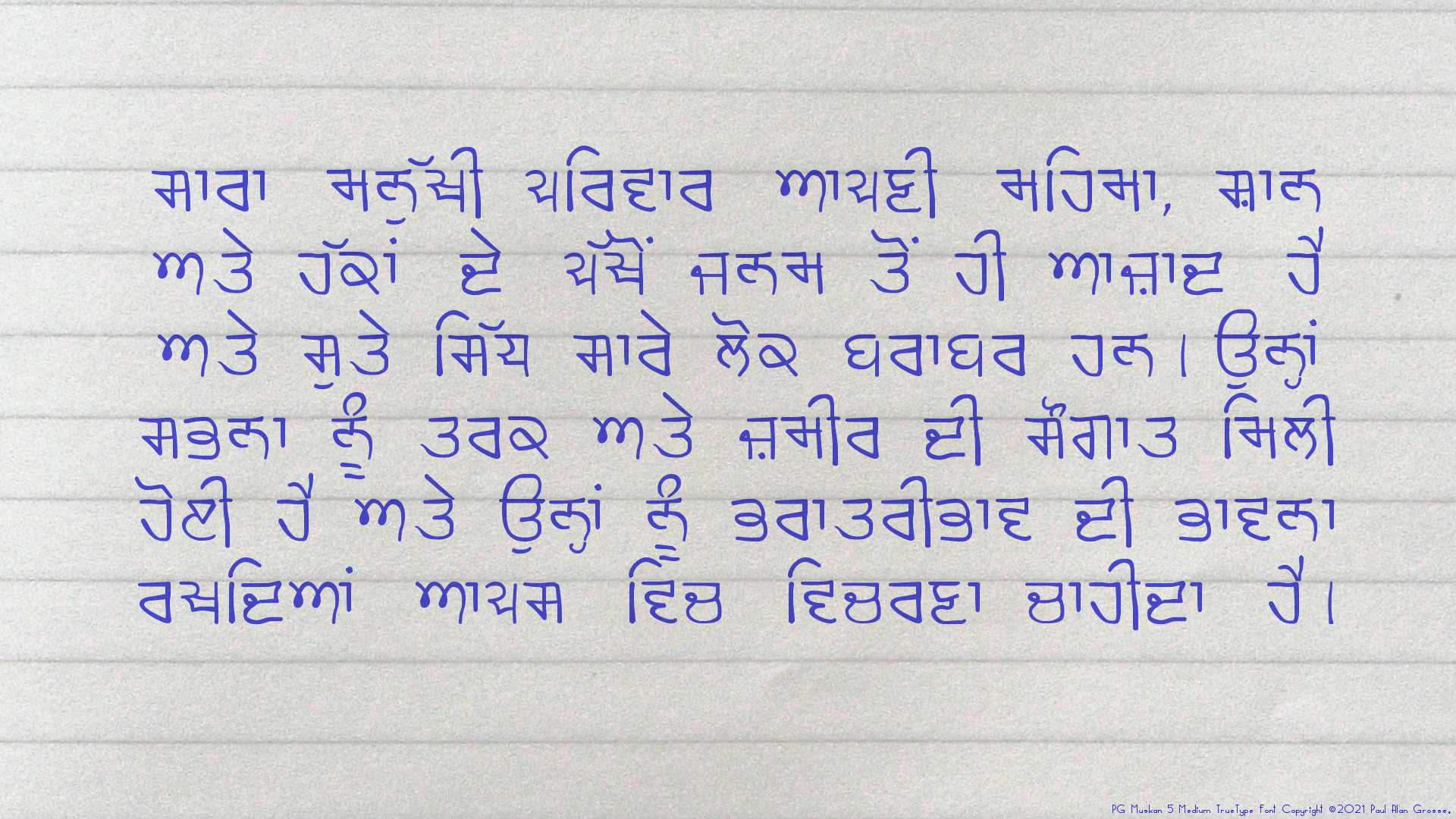
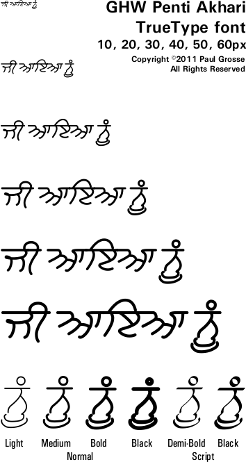
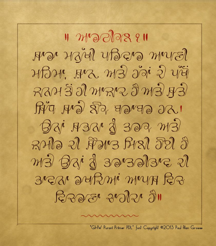
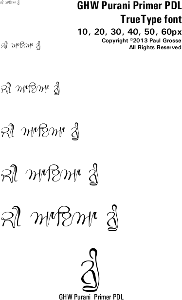
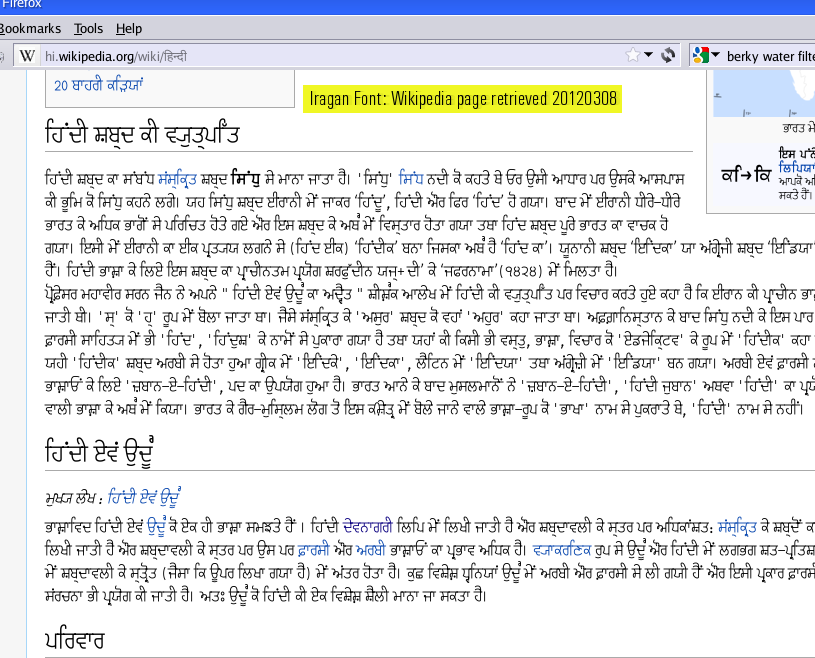
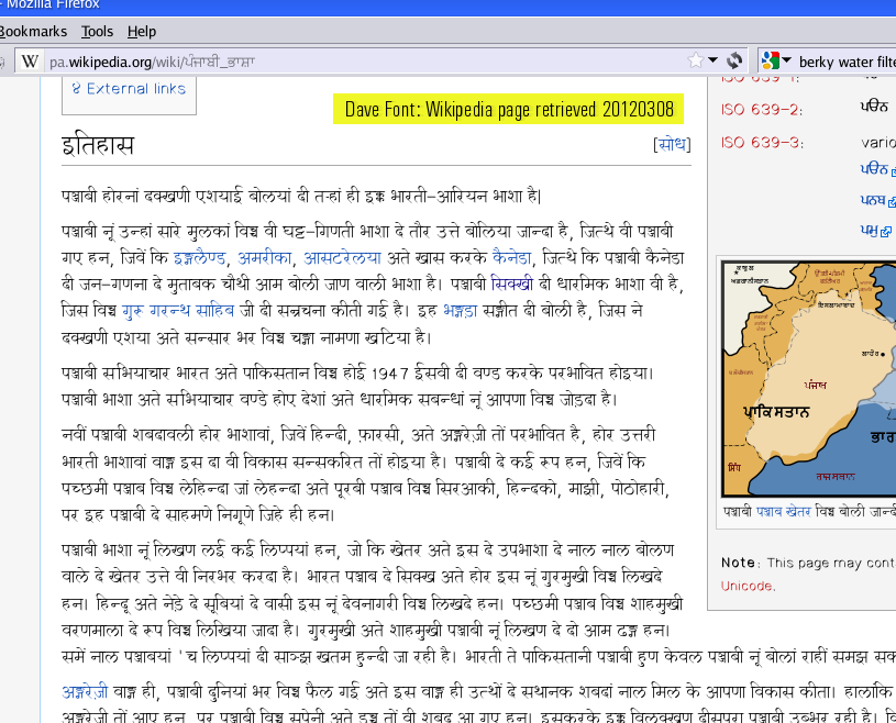
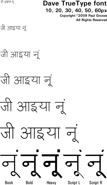
Old Letterpress2012 4 This is before Gurmukhi settled down to the single Bani style in the late 20th century and has some interesting characters. Punjabi Typewriter 2009 3 Monospaced, mechanical typewriter with its limitations imitated in this font. fun Adami 2013 1 Stylised, 'fun', 'party' block font with angular cut-outs. Punjabi take on Adamski. Intelligent glyph coding in font. Blob 2021 2 Letters fashioned from a gelatinous material that has started to flow under its own weight producing smaller counters and thicker bottoms. Circuit 2021 4 Gurmukhi characters in the form of double copper tracks on printed circuit boards. Circuit Small 2021 4 Gurmukhi characters in the form of single copper tracks on printed circuit boards. Dhobi Ghat 2022 2 Gurmukhi characters in the form of washing hanging from a line. DIN 1451 2013 2 German international standard for road signs and so on - Very early design in the standard. Intelligent glyph coding in font. Latin letters and numbers in ASCII range. DIN 1451 A 2013 2 German international standard for road signs and so on - Very early design in the standard. Gurmukhi glyphs in ASCII range, Latin->Gurmukhi numbers - . Intelligent glyph coding in font. Gubara 2013 4 Very stylised, 'fun', 'party' font. Balloons form letters, helped by string and weights. String in different thicknesses and additonal balloons only variant supplied to help colouring. Intelligent glyph coding in font. Jashan 2013 1 Very stylised, 'fun', 'party' lively font - Punjabi version modelled on the Party font. Intelligent glyph coding in font. Julaf 2013 1 Very stylised, 'fun', 'party' curly font - Punjabi version modelled on the Curlz font. Intelligent glyph coding in font. - Karmic Sanj 2008 7 Handwritten body/display font simulating someone with a felt-tipped pen trying to do a neat job. Khanna 2021 3 Irregular outline making it look as though it has been cut from thick card with a sharp knife - short, straight cuts. Khicho 2021 1 Pulled-Gum-style font. If you had chewing gum that you pulled out into lengths and then formed Gurmukhi letters with them, this is what you would end up with. Pachami 2020 1 Wild-West-style Slab Serif font. Parda 2021 2 Wedge-shaped font in three varieties. Pixel 2021 6 Based upon Dot-Matrix printers and displays. Legible enough for body-font work and for display. Includes two densities of square dots as well as round dots representing screen pixels, heat-sensitive paper pixels and pin-matrix printers. Plotter 2020 3 Plotter printer style font with paper-absorption blobs at the nodes of each line thus creating a unique effect. Rangdar 2013 8 Multi-coloured font - size and position font with font 1 and then select 3 or four colour versions. Intelligent glyph coding in font. Rocket 2021 1 In the style of the official NASA logo (which, it appears from the original style book, only consisted of the word NASA) but here, extended it into the Gurmukhi Unicode range. Script/ Stylised Hand Writing Choti 2012 12 Short-tail-length handwritten script special body text Similar to Raajaa but with short tails. Lanma 2008 2 Long-tailed handwritten display script with full-length tailed paer characters for tailed characters. Suitable for certificates and other special documents. Raaj 2008 7 Medium-tail-length handwritten script special body text. Unicode Gurmukhi range uses paer characters that modify the tails where appropriate. Raajaa 2008 7 Tailless variant of Raaj, suitable for body text where space is limited Real Handwriting/painting GHW Adhiapak 2008 14 Handwritten text from a Punjabi Teacher, born and brought up in the Punjab, now resident in the UK. Combines standard character forms with speed, fluidity and humanity. PG Bhojanshala 2021 1 Practical, small, fast handwriting, when you need to write a lot in a small space. GHW Dukandar 2008 5 Practical, no-nonsense, fast handwriting, just like your grandmother back in the Punjab writes. PG Ek Jot 2021 2 Hand-drawn sign-writing in chalk on blackboard, suitable for shop notices, large headings et cetera. GHP Full 2013 6 Hand-painted sign-writing, complete with shadows, suitable for shop signs, banners, Tee-shirts, large headings et cetera. PG Mansa 2021 2 Fluid handwritten text with a distinct left-handed slant. PG Muskan 2021 4 Handwritten text available in two styles - handwritten and pen - both in two weights. GHW Penti Akhari 2012 10 Late 16th, early 17th century handwritten Gurmukhi, just like you would find in important texts of the day. Includes 4 Larivar styles. GHW Purani Primer PDL 2013 1 Fancy, handwriting based upon a primer supplied by Punjab Digital Library. Contains many versions of letters according to context - all selected automatically in Unicode but all accessible through ASCII using code sequences described on its own page. Transliteration Iragan 2009 8 Converts Devanagari to Gurmukhi so Gurmukhi readers can access Devanagari texts online. Dave 2009 20 Converts Gurmukhi to Devanagari so Devanagari readers can access Gurmukhi texts online.
Regarding Unicode text: Note that whilst all of the fonts on this site work fine on UNIX/Linux there is a bug in some older versions of the rendering engine on Windows that means that in the Unicode range, some fonts will not display correctly in some programs on those systems. All of the fonts on this site work correctly in The Gimp - free image editing program - on Windows and UNIX/Linux but on some older versions of Windows, some programs don't process Indic fonts correctly.
Fonts work to differing degrees on those systems, depending upon how buggy the system is, you might find that some programs:
For example, Adobe Photoshop CS3 on Windows Vista Ultimate with Microsoft's own Raavi font falls into ths latter category, even though it all works perfectly on The GIMP on the same system with the same font.
- work completely well;
- don't allow ligatures in Latin (like 'ffi' and so on) used by some fonts to give extra functionality;
- have problems with conjunct formation
- might steal elements from adjacent conjucts in complex words (usually English words in Gurmukhi written with explicit conjncts)
- have problems with conjunct glyph element positioning
- ...
- don't even put a sihari before the consonant/conjunct.
Mappings
The key mappings for each of them is the same - you use the UTF-8 mapping for your system but the ASCII part of the mapping is the same as the Windows98SE mapping above on this page.
There are some additonal mappings in that:
- Exclamation mark is mapped to noon - ਨੂੰ - so that you have it all in one character;
- Shift-Backtick (usually the top-left key on the keyboard) is a paer wawwaa;
- Underscore is mapped to a short line so that you can extend the space between letters if you want to (say you need some extra space between an adhak and a sihari for instance);
- Minus gives an aunkard that is shifted to the left in the Raaj family of fonts - this is still mapped in the Raajaa family but not shifted thus giving you the ability to change between families without having to retype anything;
- Equals gives a dulaenkarday that has the same properties as the aunkard as described above;
- Plus give a tippee that is shifted to the left so that if you need it over a single letter (such as above a ਨ or a ਤ), you can make it centralised rather than over to the right;
- Less than and greater than give you two different versions of ੴ;
- On the handwritten fonts, 'Noon' - ਨੂੰ - is picked up in the usual manner to produce the
character;
- On the handwritten fonts, the word 'Singh' - ਸਿੰਘ - is special when written by hand, it is written a lot and, like noon, has its own form
; and,
- On the hollow Bulara fonts, the round brackets [(] and [)] give the end caps for the words (note that these aren't needed on the hollow Rupe fonts because the Rupe characters don't write over each other).
On some programs on some operating systems, you might think that you cannot access all of the fonts that you have installed.
This can be a problem with fonts that have a lot of weights such as 'Raaj'.
Normally, you will get a list of fonts that you have installed like the one on the right which is from WordPad (Windows Vista).
You can see all of the fonts that you have installed and you know what is what - even thought it has put them in alphabetical order rather than weight order.
However, some programs will try to be a bit cleverer than that and you might end up with a font list like the one on the right (this is Photoshop CS3).
In fact, all that has happened here is that the program as tried to separate the fonts into families and to a certain extent, it has succeeded - although not completely.
This list is actually a font families listing (so, we can see that it was wrong not to place 'Raaj Thin' in with 'Raaj').
On Photoshop - and a number of other programs - there is another set of options and here, to the right of the font families dropdown list, is the font style list.
Now, you can see the different styles that it offers you and largely, it has got this right - although not completely.
When I first came across this problem in an email, I wondered if it might be a problems with the operating system and font installation (this doesn't happen on the OS I use - SuSE) but it appears that it is nothing more than the program itself.
As for the 'Raaj Script' font, it has just renamed it for you as 'Raaj Medium'.
Ho hum.
Copyright ©2007-2023 Paul Alan Grosse.