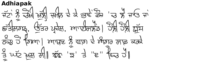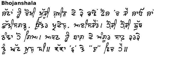
Handwritten Font Comparison - at the bottom of this page, compare two font families using a pangramatic paragraph devised by Hardeep Singh Mann, putting the characters in the context of actual words. The font examples have all been sized so that the centre of the font has the same height (a 'ਸ' or a 'ਖ਼' for example) with the ascenders and descenders going as far as they needs so that you can get a feel for each font.
The fonts below are all hand-produced for various purposes:
Handwriting


The handwritten fonts are the sort of thing that you would write when putting pen to paper. They are the sort of writing you do when you are producing writing that only needs to be read by yourself or one or two others such as writing a letter or producing notes for others to read. The writing is fast, fluid and personal; and takes liberties with forms, in the knowledge that the intended readership is limited but they use standard forms that all people can read. This type of writing has been used to great effect in films, posters, DVD covers and so on where these qualities need to be conveyed.
Hand-drawn
Ek Jot is derived from hand-drawn notices in chalk on blackboard. Hand-drawn lettering is has a few idiosyncrasies but is still highly legible with easy-to-follow rules that can be picked up quickly.
Hand-painted
Full is derived from hand-painted signage and has a bold, consistent, carefully-produced nature as sign painting is meant to stand out, last for years and be read by a great number of people. Hand-painted sign lettering is highly legible with easy-to-follow rules that can be picked up in the first few letters. This makes it suitable for many applications and has been used in films, song cover art, books, signs and so on.
Historical
These two fonts are provided for historical use and show a developmental stage in Gurmukhi as well as a student trying out something that we have all had a go at doing.
Penti Akhari dates from hundreds of years ago when Gurmukhi was being developed and you can see how 'ਛ', Dulaavaan and Kanaurdaa were developing at the time that this writing was produced (late 16th- early 17th-Century).
Purani primer is what you get when a student tries to write all of the Gurmukhi characters without taking their pen off the paper. If you use the ASCII range to write produce your graphics, there are a lot of options that let the font give you exactly what you want regarding beginnings and endings for letters as well as the way that they join up to each other and the vowels - most letters having five variants with some having six. Additionally, different set of dandes and double dandes are accessible as well as numbers so that the graphics produced by the font look more like hand-produced lettering rather than the same character being repeated from a font. The font's home page has all of this on and is a good reference when working with the font until you get to know what it is capable of.
From the list on the left: Move the mouse over to select a font family in a window; click on the name to go to that page. 


Copyright ©2007-2023 Paul Alan Grosse.


