PG Circuit and PG Circuit Small . . .
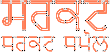
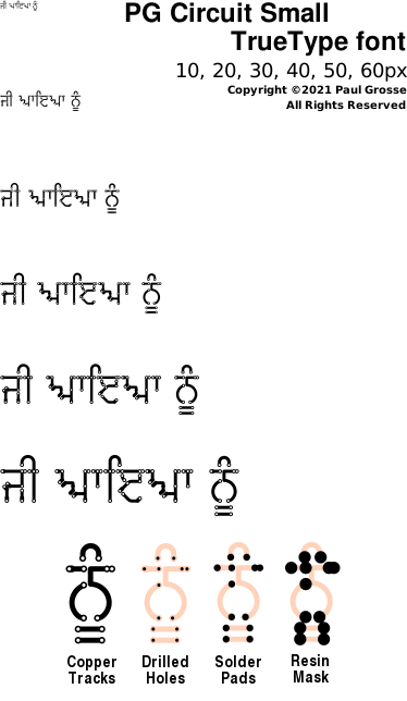
The 'PG Circuit' fonts imitate the copper tracks on the back of printed circuit boards. There are two types and they are designed so that the 'small' font (the font with the single set of tracks), if sized to exactly half the size of the double track font, will have tracks, holes, pads and mask details the same size. This means that you can have a main title using the double font and a subtitle in half the size using the single font and appear as though they are on the same printed circuit board.
There are four parts to each family although you only really need to use the first of the fonts - PG Circuit 1 and PG Circuit Small 1.
The other fonts in the families represent different parts of the circuit board production process and of course, you don't have to use them if you don't need them.
As has already been stated, PG Circuit 1 produces the outlines for the copper tracks that go on the circuit board.
The next three fonts represent the holes and their associated roles as the pattern gets larger.
PG Circuit 2 represents the holes themselves. These are already in the PG Circuit 1 tracks font so you don't need it to make holes in the tracks. However, if you want to produce a mask for making holes in the circuit board, this is the font to use.
PG Circuit 3 represents the parts of the copper tracks that are tinned with solder so that they make a good connection with the component legs when they go through the holes.
You can leave it there if you want to but it is customary to put a protective layer of resin over the tracks which will both protect them physically and also protect them electrically. PG Circuit 4 provides you with a mask that you can use to create this. Simply create a layer and then use the opacity of the PG Circuit 4 layer to remove parts of the mask where the solder has to go. Note that these masks usually have holes in them that are larger than the areas to be soldered because they are applied to the printed circuit board with a lower standard of accuracy of alignment - often via silk screen.
Note that not all printed circuit board protective resins are green. I have seen red and blue as well and as the colour lets the manufacturer know where it is easily, there is no reason why it cannot be literally any colour you like.
Here, you can see how the application of each layer changes the appearance as it is built up.
The numbers 2 to 4 are related to the size of the features and not the order that they should be applied.
To make the image up as it is on the right, use the tracks font (if you want to make a resin layer, start off with a space as explained below) and type your text. Next, copy that layer as many times as you need layers and change the font accordingly. The characters will all align as the spacings in the font, along with any special characters will all work the same as the tracks layer.
Note that the resin mask for a lot of characters extends beyond the start of most of the characters and as such, your image processing program will make it start at the beginning. To avoid this, start your character string with a space - this does not have anything in it other than the ability to move the cursor along so if you start off with a space, any characters that have parts of a glyph that extend to the left will not shift everything else along and you will not need to correct for this as the layers should all align properly now.
Here, the solder is made to look more three dimensional by by using the PG Circuit 2 holes font. The font is blurred and then a copy is made of it. To one of the copies, the font is made white and that layer is added to the image. The other layer is made black and that is multiplied by the image. The white is shifted slightly towards the top-left and the black is shifted slightly towards the bottom-right so that they make the solder look as though it is standing out slightly.
The holes font gives you access to the hole part of the tracks font and therefore you can use it to expand masks or modify them in other ways - whatever is appropriate. The pads and masks fonts are outlines produced by the font compiler so if you are expanding a holes outline by a large actor, you may find it better to use one of the fonts with larger holes instead of the holes font so that you get fewer pixelation artefacts from your image processor.
One additional point is that if you need to add a bit of extra space on the bar - suppose you have an adhak before a sihari - you can use the underscore character to add the space. This is only short but it adds that bit if extra space should you need it.
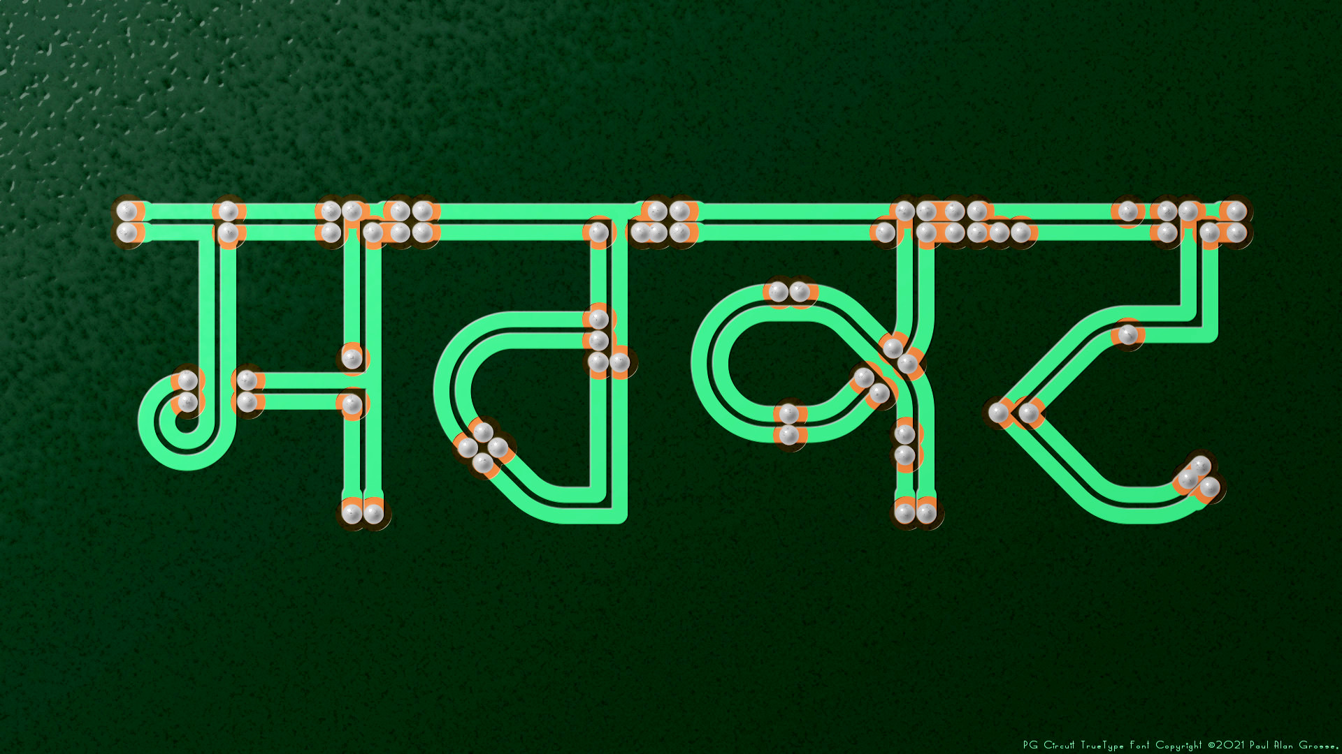
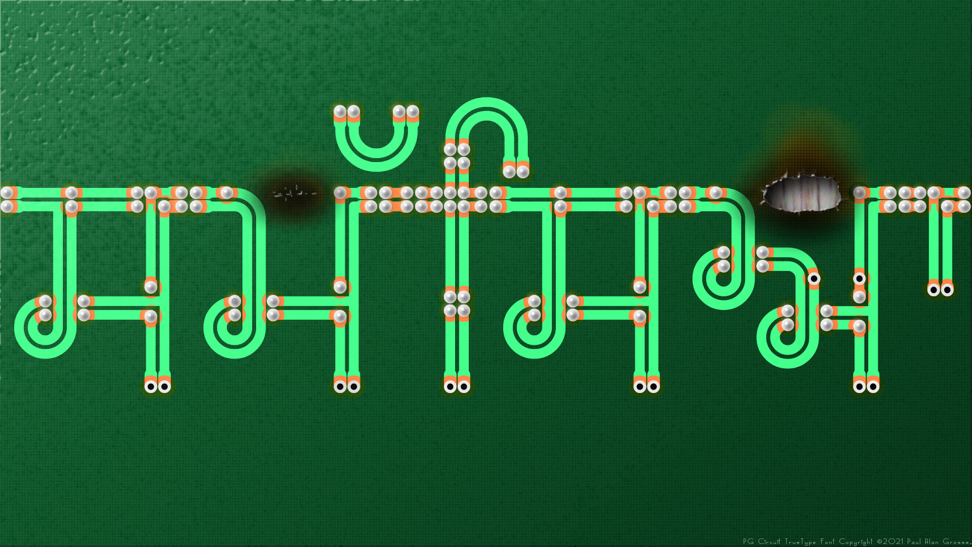
Examples of artwork with PG Circuit . . .
click on the images to open them up, full-sized, in another tab...
These images are 1920x1080p so you can set them as your desktop wallpaper and have a closer look at it if you want.

Hover the mouse over the images below to show examples of font characters and weights
Download PG Circuit and PG Circuit Small . . .
Have you got the latest version of one of these fonts? If you have just downloaded it from this site, you have. Otherwise, you can check any font file by comparing the hash function results of the file on your computer with the values in the list by clicking here for text file and here for a web page - opens in a new tab. Select the font file on your system and look at the properties. Compare the hash result against the values in the table. These pages are kept up-to-date so whenever I update a font or create a new one, it will be on there.
Download All Fonts
You can download all of the fonts from all of the font families on this site in one compressed archive by clicking here for a ZIP file
or here for a TAR.GZ file

If you want to make a contribution directly using PayPal, my email address is paul.alan.grosse@gmail.com and please include your name and if relevant, your company and the project so that they can be included on the contributors page with a link if appropriate.
To see a list of contributors, click here.
Thank you.
Copyright ©2007-2023 Paul Alan Grosse.


