


When we are taught how to read and write Gurmukhi, we are told that the letters hang from the line like washing hangs from the washing line. Mumbai has the Mahalakshmi Dhobi Ghat (महालक्ष्मी धोबी घाट in Devanagari and ਮਹਾਲਕਸ਼ਮੀ ਧੋਬੀ ਘਾਟ in Gurmukhi) which is a particularly large open air laundry facility. The letters of the PG Dhobi Ghat fonts hang from the bar in this way (I would have loved to have called it 'PG Mahalakshmi Dhobi Ghat' but most of the line in the font selection dialogue box would have been taken up with the bit that is repeated in all of the variants so I kept it short).
End Caps and Bar Extensions
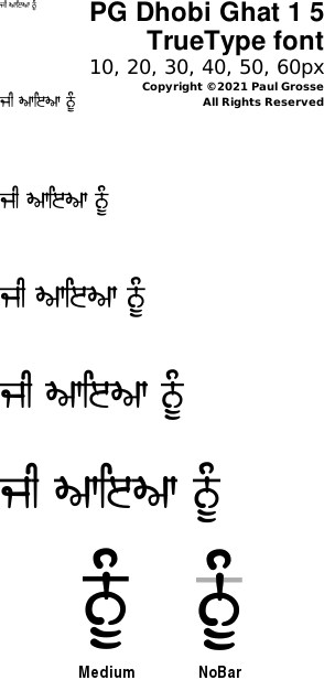
A number of times that fonts have been used in books and films is that the bar has been extended well beyond its normal limits so here, I have provided end cap glyphs so that the bar ends can look the same.
Like other fonts, the underscore also has a small part of the bar on it so that you add some wherever you need to. The underscore bar has parallel sides so that you can use the tracking on your image processor to change the length down to the order of pixel precision.
- On the right, you can see the text on its own;
- This one has the end caps on it. The end caps are the keys '{' and '}' which are sufficiently redundant for them to be sequestered for this purpose. You don't need to use the end caps whether you are going to extend the bar or not but they for a nice, in-character ending for the line;
- Here, the bar has been extended at either end by adding underscores which each add a short bit of the bar;
- Finally, this shows that you can add underscores to extend the bar as much as you like, for whatever purpose you wish, wherever you like although if you are doing this in Unicode rather than ASCII, you must complete each syllable before you add an underscore because the glyph processing engine will most likely not like it.
Adhaks
One problem with all Gurmukhi fonts is collision of features that are above the bar such as vowels colliding with other marks including adhaks.
Tippees are only used when there is space and bindis are taken care of automatically by the font so that leaves adhaks.
On the right you can see a number of variants of adhak inclusion in Gurmukhi. Below each of them, there is the key sequence if you are typing it in using ASCII (ie, Latin characters).
Figures 1 and 2 show no issues because in 2 the sihari and bihari are not near to the adhak.
In figure 3, the preceding bihari is displayed using a special character in the font that combines it with an adhak using the correct spacing.
In figure 4, the normal adhak collides with the following character's sihari and in figure 5, the modified bihari-adhak character collides with the following sihari.
In the cases of figures 4 and 5, the short line of the underscore character needs to be added so that the characters to the right are shifted along the correct amount.
You can see how this addition works with figures 6 and 7.
There are other ways of selecting adhaks that are positioned with or without extra extensions of the bar by adding up to three '/'s, '\'s or '#'s.
Layers
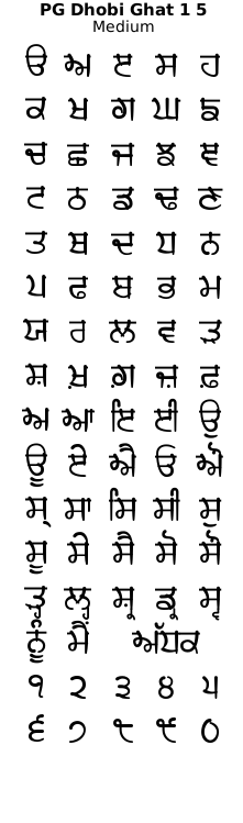
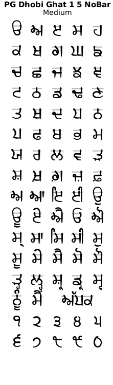
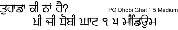
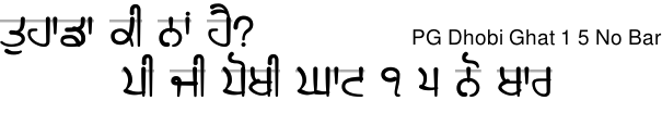
The idea behind the PG Dhobi Ghat fonts is that it abstractly represents the Gurmukhi characters hanging from the bar in the same way that washing hangs from a clothes line (although nobody has ever suggested how this works with characters that have a break in the line such as 'ਮ', 'ਖ', 'ਘ' and so on). With this in mind, I have produced an additional version of the font where the bar is missing as you can see on the right.
One particularly effective way of producing text like that on the right is to use the version of the font with the bar to get your text's layout just the way that you want it (especially any tracking, leading or kerning) and then make a copy of that layer.
Next, change the font of the upper layer - the one that is going to be placed in front - to the version of the font without the bar and then change the colour or whatever you want to do in relation to making it look different.
Note that now, you have a layer that is the bar and the reat of the characters and a layer that is free of the bar. In this way, you can make drop shadows that are different for each layer.
In the image below that starts with the text 'ਜੱਟਾਂ ਨੂੰ ਚੋਖੀ ਖੁੱਲ੍ਹੀ', that is what has been done there. The bar has a less displaced, less blurred drop shadow to give it the impression that it is closer to the background than the rest of the letter.
An example of artwork with PG Dhobi Ghat 1 5 . . .
click on the image to open it up, full-sized, in another tab...
It is 1920x1080p so you can set them as your desktop wallpaper and have a closer look if you want.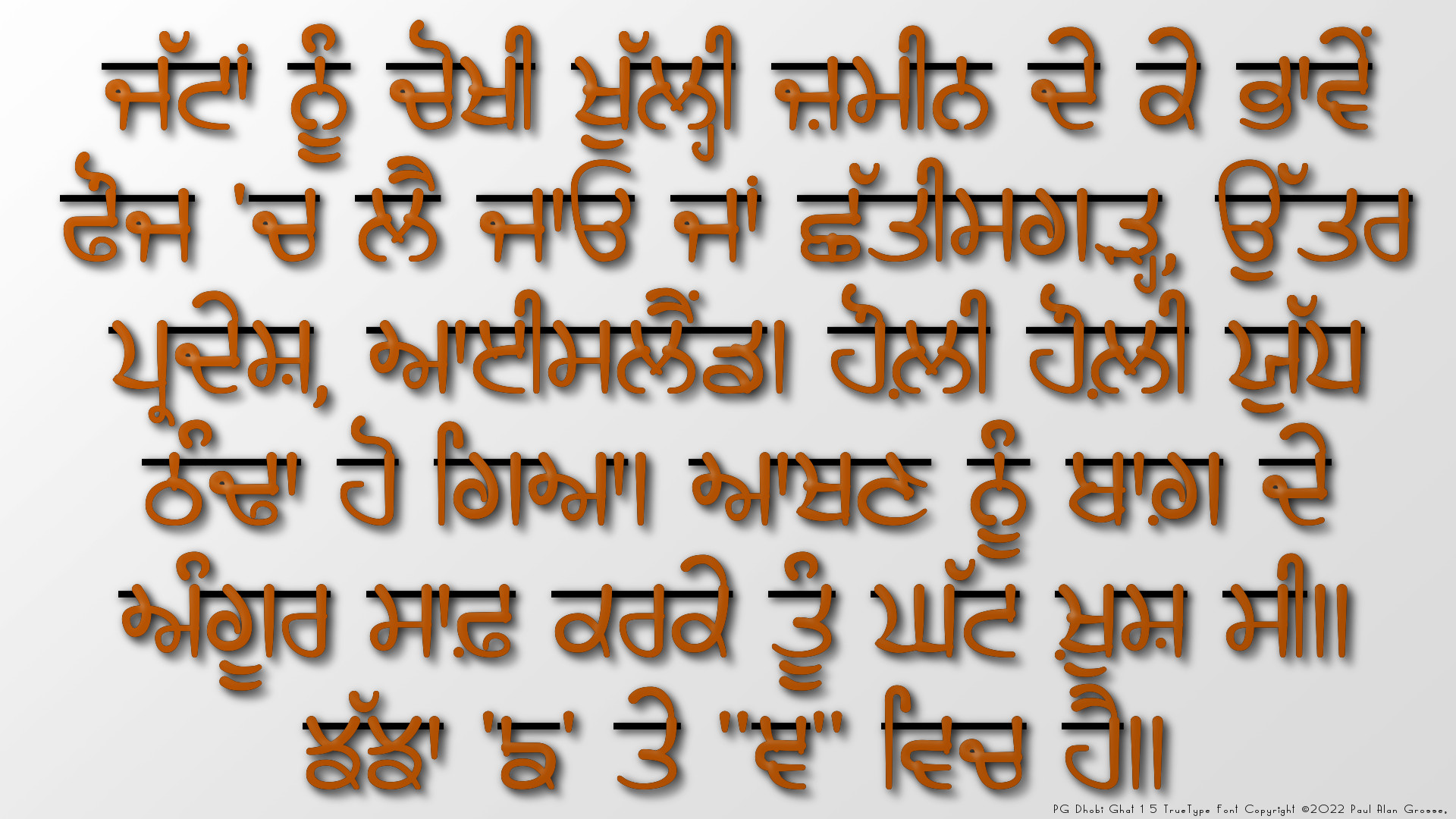
Hover the mouse over the images below to show examples of font characters and weights
Download PG Dhobi Ghat 1 5 . . .
Have you got the latest version of one of these fonts? If you have just downloaded it from this site, you have. Otherwise, you can check any font file by comparing the hash function results of the file on your computer with the values in the list by clicking here for text file and here for a web page - opens in a new tab. Select the font file on your system and look at the properties. Compare the hash result against the values in the table. These pages are kept up-to-date so whenever I update a font or create a new one, it will be on there.
Download All Fonts
You can download all of the fonts from all of the font families on this site in one compressed archive by clicking here for a ZIP file
or here for a TAR.GZ file

If you want to make a contribution directly using PayPal, my email address is paul.alan.grosse@gmail.com and please include your name and if relevant, your company and the project so that they can be included on the contributors page with a link if appropriate.
To see a list of contributors, click here.
Thank you.

Copyright ©2007-2023 Paul Alan Grosse.