


Abstract Font Comparison - at the bottom of this page, compare two font families using a pangramatic paragraph devised by Hardeep Singh Mann, putting the characters in the context of actual words. The font examples have all been sized so that the centre of the font has the same height (a 'ਸ' or a 'ਖ਼' for example) with the ascenders and descenders going as far as they needs so that you can get a feel for each font.
Simplicity
Dekho, Dekho Naveen and Magaz all take the essence of each character - the things that differentiate between them - and put them into each character of the font using a few, simple style rules.
Dekho uses essentially three different sizes of circles with each completing its arc to lead into the next part of the stroke.
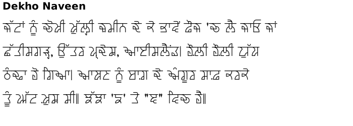
Dekho Naveen uses larger arc radii and usually leads into the next part of the character at an acute angle, giving each character a pronounced, angular look.
Dilli is an Ultra-Bold, extended font with a pronounced bar. The bar is segmented to each syllable and the lines are kept simple.
Magaz takes similar rules to Dekho but uses only one diameter of arc, producing its unique appearance with larger counters being produced by using straight lines.
Patiala is a monolinear version of Ek Jot with a few additional stylisations and on initial characters and vowels.
Thikriwala has a clean, high-legibility outline and has options on hollow faces. This is suitable for both display and body font purposes.
Essence - heading into Gujarat
Rupe reduces the differences between characters to a minimum, producing characters with only the minimum of clues for the reader and even though its appearance is quite a long way from the writing that we are all learn when we learn how to write Gurmukhi - it is missing the familiar bar across the top for a start - it is still very legible, having characteristics that are in the handwritten fonts - this font has been used in body text in at least one film that I have seen.
Dwarka takes that essence and applies it to the standard Gurmukhi, producing an intermediate where letters look largely more conventional although still missing the bar across the top.
Modhera takes Dwarka and stylises it so that instead of Dwarka's slant towards the bottom left with the aunkard and dulaunkard, all of Modhera's features slant off the to the bottom-right in the same way that Gugarati does. I have a tee-shirt with article 1 of the Universal Declaration of Human Rights on it in this font and people start off by thinking that because it is not obviously Gurmukhi, they will not be able to read it but very quickly, they realise that they can and within seconds, their mind has accepted the style rules and they are able to read it fluently.
A step further north into Tibet
Uttar essentially takes the style of Dekho Naveen and expands vertically, the horizontal lines and in addition, makes spaces in the bar between letters, giving it a little bit of a Tibetan look whilst still being explicitly Gurmukhi.
On the other hand, Tsheg (pronounced 'cheg') takes Gurmukhi script and pushes it a lot closer towards Tibetan Uchan which is what is seen on official documents, vehicle number plates and so on.
Tsheg is more like Devanagari with conjuncts inhabiting one letter space - in the same way as paer hahha, paer rarra and paer wawwa characters do in Gurmukhi. In the case of Tsheg, there are more conjuncts, with up to five characters stacked in one syllable.
Again, like Modhera, I have a tee-shirt with the same text on it and the same happens with Tsheg as happens with Modhera.
From the list on the left: Move the mouse over to select a font family in a window; click on the name to go to that page. 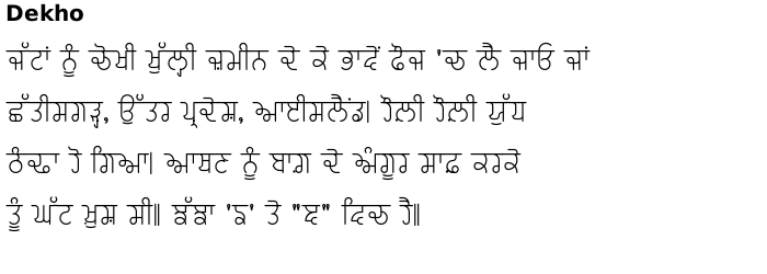
Copyright ©2007-2023 Paul Alan Grosse.