


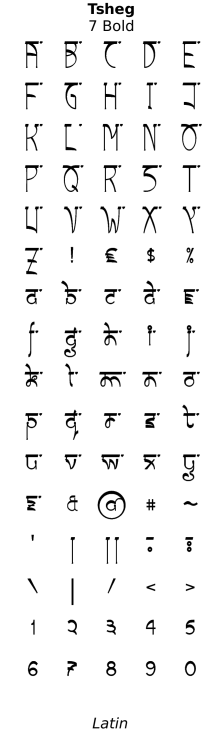
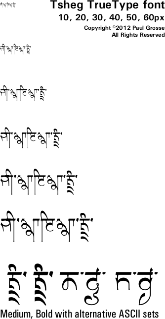
Tsheg TrueType Font for free download. . .
About Tsheg . . .
Why and How? . . .
In addition to providing a medium for quantities of information in the form of body text - such as what you are reading now - text also has an artistic role where being able to read the text quickly is not quite so important, so a few words or names or pieces of text that signify enough for the inquisitive mind to make the effort to take a while to read it - essentially 'display text'.
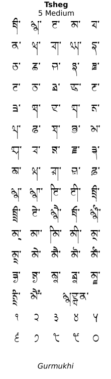
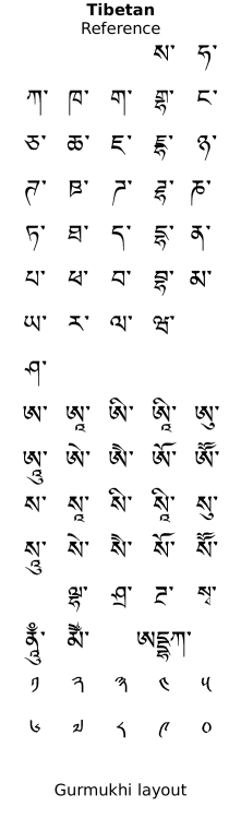
Devanagari has been popular in this role for a while, as has the Tibetan Uchan script - an example of which you can see on the right. Uchan, like Devanagari and Gurmukhi, is an abugida, with each syllable taking up one consonant block position, with vowel symbols added where the vowel sound is not the default 'a' (like the last 'a' in 'panorama'). In this way, it works very well as a candidate for transliterating text that could otherwise appear in Devanagari, Gurmukhi, Gujarati and so on.
You can see in the image that Uchan has symbols - with a top line that is often continuous - that represent consonants and occasionally, there is a second consonant underneath - this is a conjunct and is the same as how paer characters appear in Gurmukhi. In fact, like the paer characters, 'y', 'r' and 'w' change their shape to a simplified version - the second character you can see being a consonant that starts with an 's' sound, then has a 'g' with an 'r', like 'sgr' in 'misgraft'.
Additionally, the vowels are added to the top and to the bottom of the consonant blocks whereas in Gurmukhi (and Devanagari and Gujarati) exceptions are made for ਇ and ਈ and their dependent forms - this is preserved in the Tsheg font so that it is easier to read
You will also notice that the dande lines are roughly double the height of the characters, so two-consonant conjuncts are fairly commonplace. In Gurmukhi, this is also the case when it is used for Punjabi. Further, like Punjabi, double dande is used for end of sentences and a single dande is sufficiently similar to a comma in use that we can use it as such. In Uchan, the dande is called a 'Shad' and the double dande is called the 'Nyis Shad'.
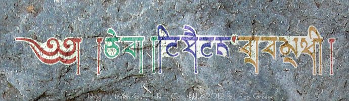
Propenultimately, instead of spaces, there are little dots - this dot is called a 'Tsheg' (pronounced 'cheg'). The dots appear where a space would be between words but you only get them one at a time. If you click on the image, a larger image with the Tibetan text in Tibetan language
Penultimately, you will notice is that the overall style is one that slopes down to the right.
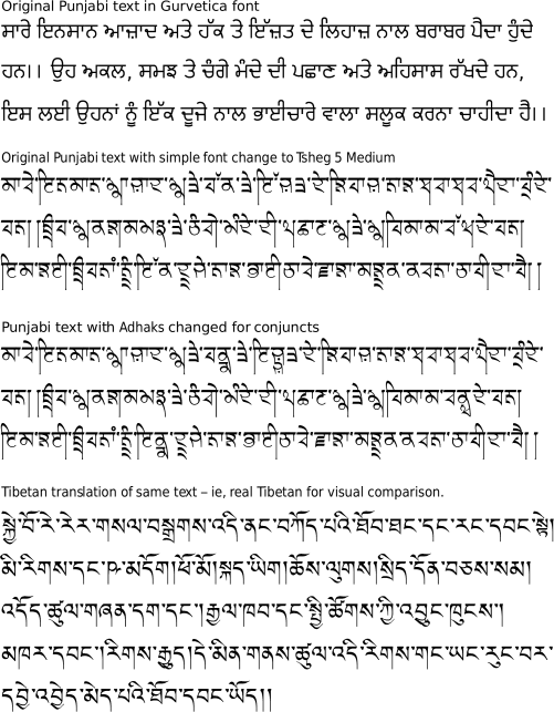
Finally, it would be good if you could take a piece of text that has already been typed out in Punjabi and just change the font with the font doing the hard work of making sure there there are no double Tshegs, that lines don't start in the middle of words and so on and only with a minimum of effort, make it conform to the finer details of the font - people seem to be in the habit of never using double dandes at the end of sentences (you will need to add them) and worse, using full stops instead (whilst these can work all right, they can produce the wrong result under certain circumstances - see below). Click on the image above right (white background) to see an image in a new window showing a piece of text (Article one of the Universal Declaration of Human Rights) in:
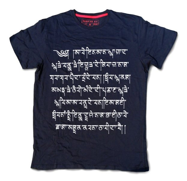
If you click on the image on the right (blue background), you will see that article printed on a tee-shirt so that you can see what it looks like in a potential use.
- the original Punjabi;
- the same text unaltered but in the Tsheg font you can download from this site;
- The same piece of text with Adhak turned into explicit conjuncts (you don't have to do this but artistically, your eye can decide that it is more pleasing); and,
- the Tibetan version of the same article in Uchan, so that you can see what real Tibetan looks like in comparison to the Punjabi in the Tsheg font.
Glyph design . . .
Click on the image on the right to see the full-sized version open in a new window.
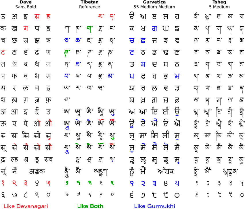
The image shows, laid out in a consistent way, the parts of the alphabets used by Punjabi in: Devanagari; Tibetan Uchan; Gurmukhi; and then, the Gurmukhi Tsheg font.
Highlighted in Devanagari and Gurmukhi are the glyphs from each that are similar to the Tibetan Uchan (we'll stay with the Gurmukhi names so that we know what we are talking about).
Note that in Tibetan, there are no long vowels. In order to make long vowels, a small symbol is added (you can see this under the equivalent of an aunkard ( as in 'ཨུ' to 'ཨཱུ'), or, the vowel sign is doubled up ('ཨེ' to 'ཨཻ' for example).
Further, there were no retroflex consonants so, in order to accommodate Sanskrit - which uses them - an additional line was added which is the line that corresponds to 'Taenka' ('टठडढण' ie 'ཊཋཌཌྷཎ'). The designs for these are simply the dental line that follows (ie 'ཏཐདདྷན'), written left-right inverted. Remember that the dentals came first and were adapted to accommodate the palletals.
Also note that in the Uchan conjunct 's' - 'w' ('སྭ') the 'w' changes in a way that is similar to Gurmukhi ('ਸ੍ਵ'), ie, the paer-form changes shape as in 'y-r-w-h' in Gurmukhi. In Uchan, similar things happen with the 'r' and 'y' as well, ie 'སྲ' ('sr') and 'སྱ' ('sy').
Also the Uchan 'dh' geminate in 'Adhak' ('དྡྷ') similar to Devanagari ('द्ध'), ie, it is explicit.
So, we want a font that is:
Also:
- able to take unaltered Gurmukhi unicode text and 'transform it' without any editing, only needing the slightest editing of human-introduced nonconformities such as double-dande and so on;
- readable as Gurmukhi;
- has the line running across the top as in Gurmukhi;
- has a single Tsheg after each word instead of a space;
- will word-wrap on a word processor at word joins (ie tshegs), looking at them in the same way as spaces in the original Punjabi;
- has a general sloping-down-to-the-right feel about it as in Uchan;
- has half-height glyphs so that conjuncts can be built (the paer 'y-r-w-h' versions being used by Punjabi simply accommodated or built in the same way);
- has explicit geminates (adhaks) so that they can be used if you want to;
- handles double-dandes intelligently; and,
- provides start-of-paragraph/ start-of-line decorative character (variants of yig mgo tsheg shad ma) in varying widths (༅། ། ༄། ། ༄༅། ། and so on - there are many designs).
- has at least one version of Latin text so that it is readable by Latin-only readers;
- provide useful alternatives so that it can be used by image editing/ text editing programs that do not have the ability to use the 'liga' (ligature) facility in TTF/OTF fonts; and
- provide ways of working around some of the more curious ways that some word processors work.
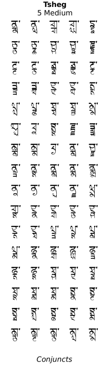
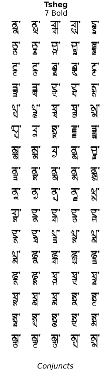
Conjuncts . . .
One of the more obvious features of Uchen and therefore the Tsheg font, is that the letters are written in the top half of the space on the line. Below that is a space that in just Punjabi, would be used for aunkard, dulaunkard and ਸੁ, ਸੂ the paer characters such as ਪ੍ਰ, ਲ੍ਹ, ਸ੍ਵ and ਧ੍ਯ. In the top example in the image on the right, you can see how, in the word 'book', the space under the 'b' is used for the aunkard.
However, Tsheg is a display font and if you want to print an English word such as 'display' or a name that has a number of letters joined together without vowels between them, this space is where those letters go and the structure they form is called a 'conjunct'.
You can make your own conjuncts by typing the consonants and between them, type a virama (a lowercase 'd' on the standard layout). This was originally used in Sanskrit to have a consonant with the trailing implicit 'a' sound suppressed and has the effect of joining the two consonants either side of it to make a conjunct. Think of the 'kt' sound in 'act'. The 'k' and 't' sounds stop the air flow completely and in effect, you use the first half of the 'k' sound and the last half of the 't' sound to make the word 'act'.
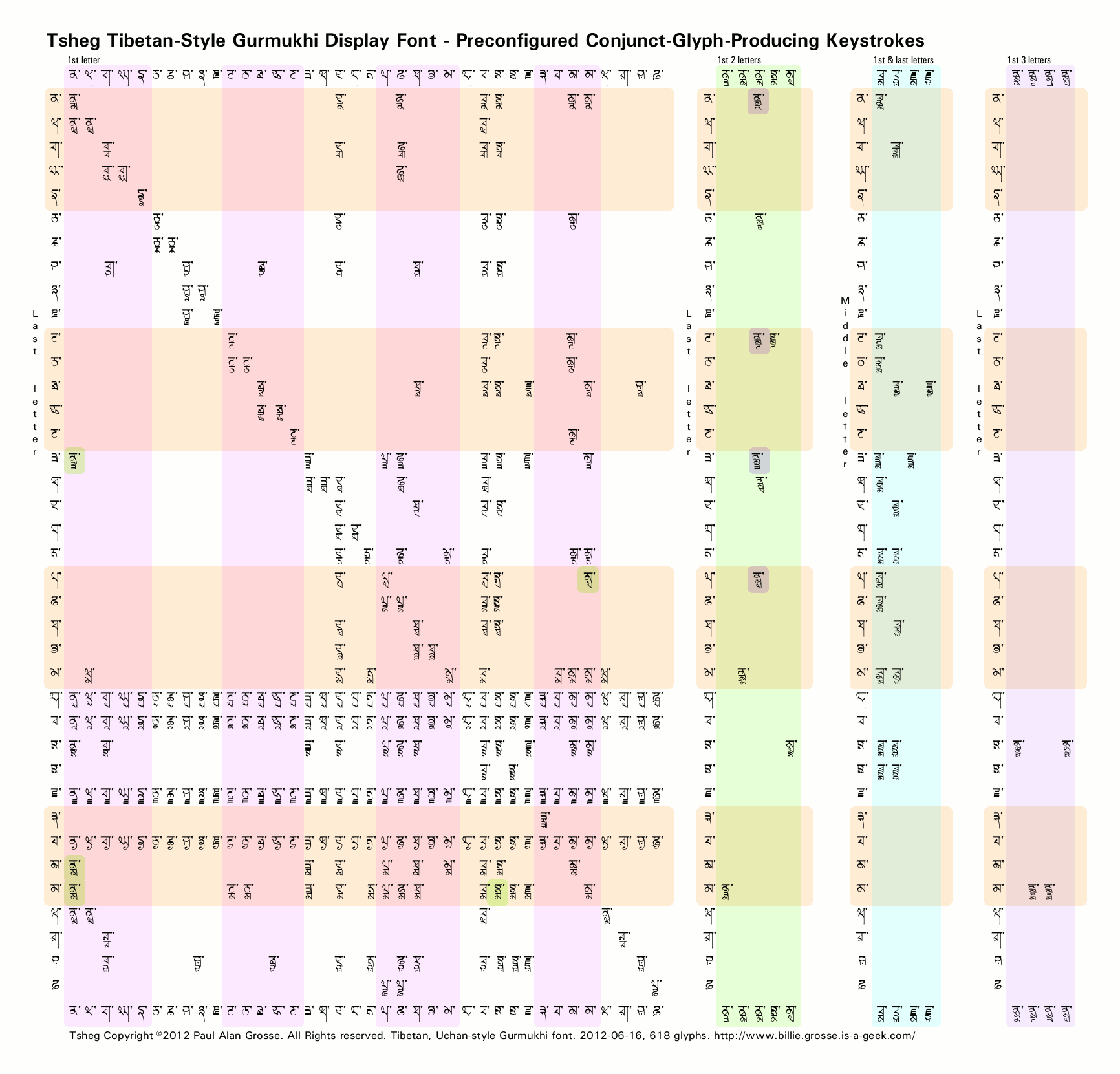
If you click on the image on the left, a diagram of the list of keystrokes that make ready-made conjuncts will open up in a separate window. You will be able to see that not only are there the normal two-letter conjuncts, there are also three- and some four-letter conjuncts as well.
You can add to these by appending a virama/[r,w,h,y] paer character as well and each takes aunkard and dulaunkard, like any other character. In the image, the diagonal line is formed from the geminates (adhaks) and the four horsontal lines are formed by the paer characters.
Some letters are inherently conjuncts - one example being the letter 'x' when it is not at the beginning of a word (when it is at the beginning of a word, it sounds like a 'z' as in 'xylophone'). 'X' is a conjunct of 'k' and 's' and on the second line in the example on the right, you can see how 'k' and 's' are stuck together with a virama to form a conjunct that now occupies the full height below the bar. If you add an aunkard or a paer character (or both) they will go below the bottom. Put 'ਬਾ' in front of it and you have the word 'box' or 'ਬਾਕ੍ਸ'.
Note that unless you have Tsheg installed as your default font for your browser, you will see the viramas which will display whenever there is an unresolved conjunct, including no following letter. This latter point is interesting in relation to Punjabi and Gurmukhi - in Punjabi, viramas tend not to be used unless they do form a conjunct (always a paer character) and so, you get a situation where the word for word in Hindi is 'shabd' (शब्द or ਸ਼ਬ੍ਦ) and if you right it down in Gurmukhi and leave out the virama, you get the Punjabi for 'shabd' which is 'shabad' (ਸ਼ਬਦ).
As you can see, you can just add letters to make increasingly complex conjuncts - so long as the font has them in it (click on the matrix above left to see which keystrokes lead to which explicit conjuncts (the implicit ones as far as the font are concerned are those it has to make up - ie the paer character versions of these conjuncts such as k.s.t.r in the extrude example, above-right).
There are limits of legibility if cramming the letters between the top line and the bottom of the text - normally, two will fit on nicely and three is pushing it but there are some four-letter conjuncts included in the font. However, it is a display font so artistic value has a higher weighting than legibility because reading speed is not an issue here.
Remember though, that the normal paer characters will appear below, along with any aunkards and dulaunkards that are required so whilst 'exclaim' and 'explain' fit into the height of the font, the 'r' of 'excrete' and the 'roo' of 'extrude' go below that line so, if you have anything below that in your design, you need to make sure that it has enough room so that, for example, an aunkard is not interpretable as a laanv for the line below.
In the image on the right, you can see a perfectly legible three letter conjunct 'spl' as in 'display'. If you click on the image, you can see the full image open in a new window. On it you will see how a paragraph can be opened with a stylish variant of 'yig mgo tsheg shad ma' (༄༅། །). You will also see the Tshegs that separate each word and how a line does not start with them; how a double dande is used to indicate the end of a sentence; and, how where the last character of a sentence is one that goes to the bottom in a straight line (or uses a bihari), one of the dandes is missed out. More of that later.
Geminates . . .
As in Devanagari, the geminates in Uchan are explicit.
So, whilst you have the option of simply leaving in any adhak that happens to be there, you also have as an option, the ability to turn them into explicit geminate conjuncts, making use of the vertical space that is there and increasing its artistic value.
You can see on the right, a number of examples of geminates found in Punjabi words, how they look in normal Gurmukhi, how they look, unaltered, in Tsheg, how they are transformed when made into explicit conjuncts and how they would look if they were simply transliterated into Devanagari - which does use explicit geminates.
Above, I stated that where you have a consonant that stops the air flow - such as a 'k' - you use the first half of that consonant for the first half of the conjunct and the second half of the following consonant to say what happens when the stop is released.
In that way, a geminated 'k' would have the first half of the conjunct as a 'k' - saying what happens as the air flow stops - and the second half of the conjunct as a 'k' - saying how the air flow starts. The result of that is that the 'k' (or 'k.k') takes about 1.5 to 2 times longer to say.
In the case of a geminated 'kh' the aspiration that makes it different from a 'k' happens after the air starts flowing again so the first part (stopping) is going to be the same as a 'k'. Thus a geminated 'kh' is going to be a conjunct in the form of 'k.kh'.
For a geminated 'kh', the Tsheg font will take either 'kh.kh' or 'k.kh' and print out a 'k.kh' so it doesn't matter which you type - something less to remember because the font does it for you.
On the right, you can see a relatively mistake-resistent way of replacing an adhak.
The part of each line with the red cursor on it shows you what you type and how the word processor/image processor sees logically; and, on the right is what is displayed.
Below that is a list of all of the geminate consonant pairs - the relative sizes of the characters on the top and the characters on the bottom is roughly 5:4 and largely, the characters are drawn together so that they work artistically.
In fact, all of the single paer characters have their own glyphs as well so each is special in its own right.
Conjunct Character Theft Prevention . . .
Whilst by far outshining the standards of ASCII as a method of displaying Abudiga writing systems such as Gurmukhi, Devanagari, Gujarati and Uchan, one problem with all unicode is that of stealing characters from neighbouring conjuncts.
This happens because the implicit way that the paer characters are added to characters in other fonts and to the conjuncts in Tsheg - the normal characters/paer character conjuncts are all explicit in Tsheg.
To keep the font size small and therefore easy for your computer to use, the paer characters are attached to the main character by using the 'halant glue' (lowercase 'd' on the normal layout). In the font, this is part of the coding for the paer character but it can be used on the next character instead, due to a curious programming priority in Unicode - it puzzled my when I first encountered it and there is no reasonable explanation for it that I have found.
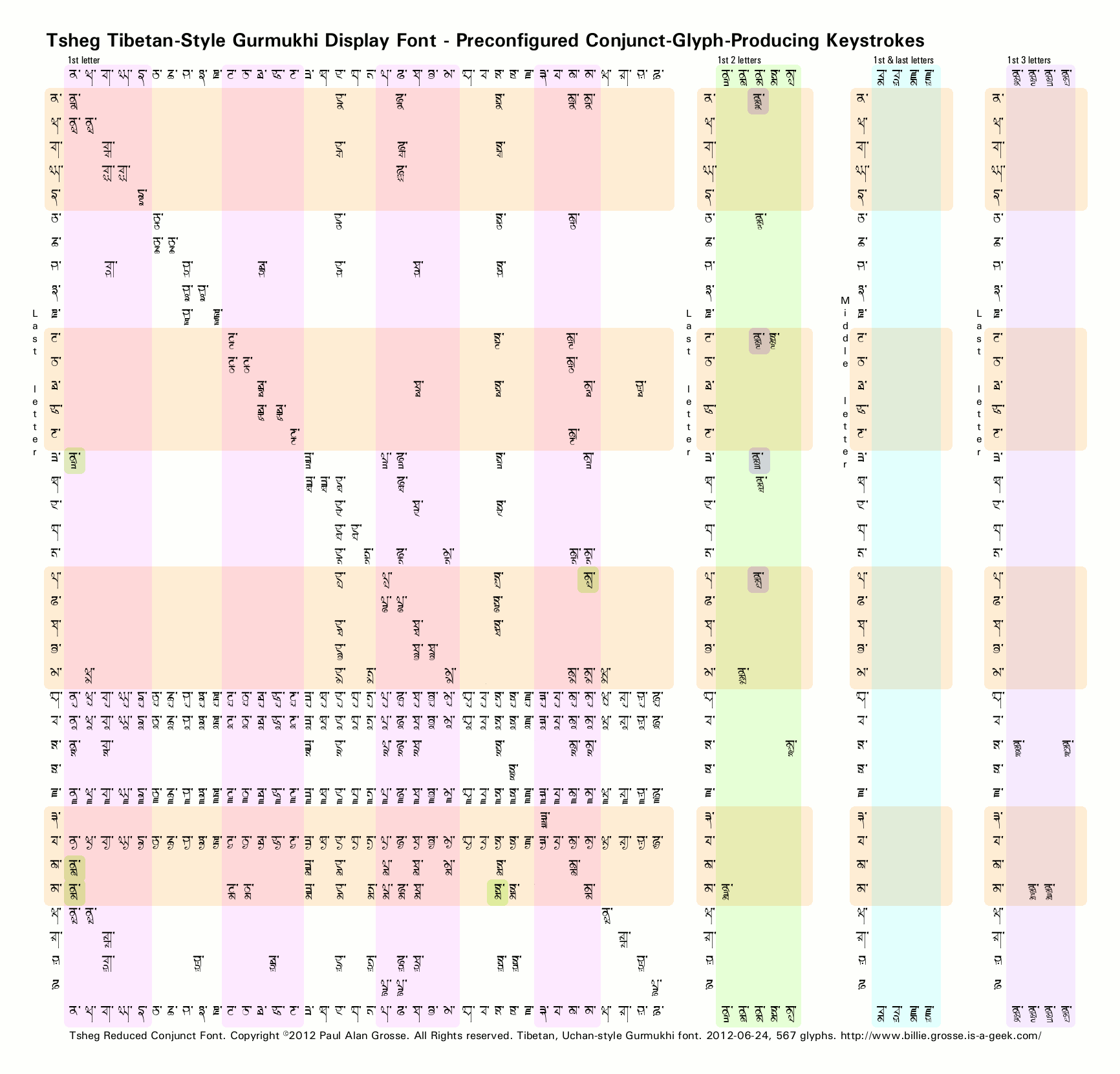
There are two ways of solving this - if you are producing images that do not use the four paer characters ('ਰ', 'ਵ', 'ਹ' or 'ਯ') when leading a conjunct, you can use the 'Reduced Conjunct' versions of the font - the one that has 'RC' in the font name.
Using the full font, in the image on the right, we have the word 'spendthrift' - simply because: there aren't many words that fall into this category; it has a number of conjuncts of the right type; and, in the right place.
You can see the code you would type as it would appear in another font and then how it can appear in a font that looks at conjuncts in more depth than regular Gurmukhi does - in this case Tsheg. it should be just three syllables (that is three columns of glyphs in Uchan and Tsheg) and read 'spen.dthri.ft'
You can see in 'a' that the 'r' has bee stolen by the last conjunct which has then split thus making 'spen.dthi.rf.t'
If we split that syllable where it should be 'b', by using a space, we get 'spen.dthri ft' which is now two words.
On many computers, you can add extra Unicode symbols. We need to add a character that will stop the drawing program allocating the paer character to the wrong conjunct.
We don't want to add a space because that would move the cursor along. Even a zero-length space still has a property of spaces that is undesirable in this instance and that is word processors use them to decide where to break a line when it gets long enough and breaking lines in the middle of words is not a good thing.
Instead, doing it the proper way, we split the syllable where it should be, using a no-width, no-break character 'c' from the menu. As an alternative (if you can't get that menu, for instance), you can use the tilde character '~' which, is not that useful and has been replaced by a zero-width space that the drawing program looks on as a non-space so it will not normally break across a line. As a result, it forces the drawing program to allocate the paer character to the correct conjunct and as a result, we get 'spen.dthri.ft'. Note that if you do need a tilde character, such as in an email address, it is still in the ASCII font versions.
Alternatively, if you are just rendering some Punjabi text and therefore do not need the paer characters ('ਰ', 'ਵ', 'ਹ' or 'ਯ') leading in conjuncts, you can use the RC (Reduced Conjunct) versions of the font - which has 51 glyphs removed - as a quick and easy solution.
These show in your font list as 'RC'
and still carry all of the other conjuncts but including the geminates (Adhak versions) of 'ਰ', 'ਵ', 'ਹ' and 'ਯ', therefore there is still a slight possibility of character theft taking place whereupon you should use one of the methods described above.
On the left, you can see the differences between the two fonts and if you click on the image, a fully sized version will open up in a new window for you to see.
Commas and fullstops . . .
In Uchan, the rough equivalent of a comma is represented by the equivalent of a single dande. Commas are used in Punjabi to represent short pauses in the same way that they are in English - the mark being the same as well.
In Uchan, the single dande/comma replaces the Tsheg/dot that is used as a word-space. In the Tsheg font, the amount that the cursor moves on with the single dande is a space short of its width - the single space being the next character thus taking the cursor to the end of the single dande.
The advantages of doing this are:
- the word processor sees the space after the comma and uses that as a break so that if a new line is needed, it makes it after the dande - you never start a line with a dande;
- the cursor takes existing text with correct single spaces after commas and reproduces them correctly on the screen - it looks correct; and,
- the font uses contextual substitutions so that it does not draw a Tsheg/dot if the preceding character is a dande so you don't end up with a lot of dots around for no apparent reason.
Full stops are a different matter however.
Some people will use a full stop instead of a dande and double dandes are hardly ever used - the normal keyboard layout doesn't have one - in Punjabi text. This is wrong and causes some editing - remember though, that this is a display font so the length of text you are going to have to do this with is only going to be small any way.
Whilst you can leave full stops and double-dandes as they are - they will appear the same - they will not be processed by the font in the same way if there is an exception to there use. For correct processing, you need to have two single-dandes at the end of a sentence - doing this gives you an artistic choice.
This is the rule and where it comes from. In Uchan, you used a double dande at the end of a sentence (ie, what looks like dande, space, dande) unless you have a 'k' ('ཀ')or a 'g' ('ག'), in such cases, you use a single dande (ie, what looks like space, dande). You can add vowels to this and it is all right but if you make a conjunct out of it, you go back to using a double dande. For example: 'ཀ །' 'ཀུ །' 'ཀྦ། །'.
From this, we can take it that if the last thing at the end of a sentence is a full-height straight line like a dande, we miss the first one out.
On the right, you can see what happens to the letters 'k' ('ਕ' - no such line so double-dande default) and 'g' ('ਗ' line exists so single-dande default) when we add various vowels and so on to them.
Note that in Uchan, the vowels and nasals appear above and below whereas in Gurmukhi, some things appear to the sides as well thus a bihari can modify the 'k' like so 'ਕੀ'.
Again, this is done automatically for you by the font.
An advantage of this is that the font just lets the computer program see letters and punctuation followed by a space so it knows where to make a line break.
On the screen, we see a double dande as a dande followed by a space followed by a dande.
As a result, the space that seems to be between the two dandes will never be broken up across a line boundary and, you will not end up with a dande at the beginning of a new line where it is joined to the end of a word on the previous line.
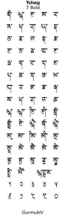
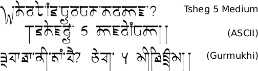
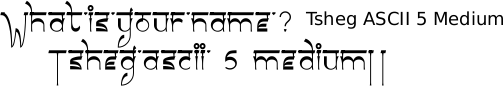
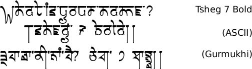
ASCII Range . . .
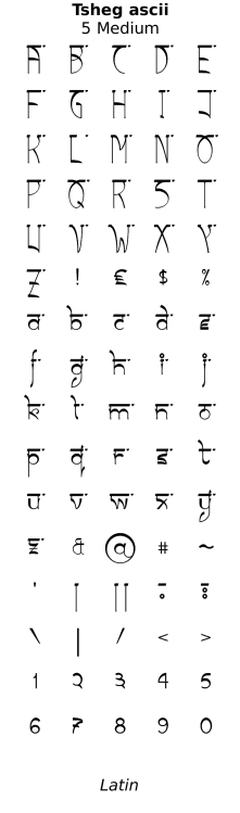
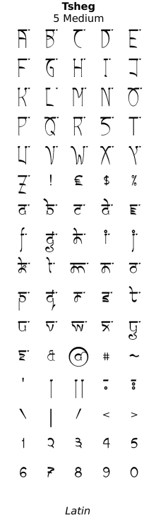
The font also has Latin characters in the style of the Tibetan font in the Latin/Roman part of the font.
In fact, when I was designing this, I came up with two versions - I thought that the first version was too much like the Latin text so I devised another version that was more like Uchan.
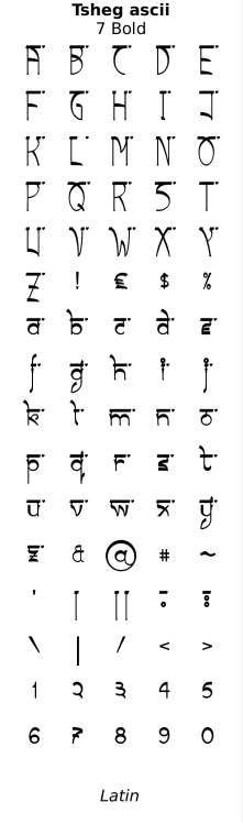
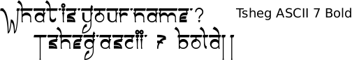
The version with the Gurmukhi characters is the final version and I have put the earlier version in a purely ASCII-only font - 'Tsheg ascii'.
One of the problems with the 'fancy stuff' that goes with the fonts on this site - the contextual substitutions, ligatures and so on - is that it is very poorly supported in the Latin range. As a result, I have supplied alternative ways of achieving the desired results in the ASCII range using methods that don't involve the advanced features.
You can see on the right in close-up, the differences in style of two of the characters whose basic template go to make up a substantial proportion of the fonts.
The characters in the groups 'a b c d g o p q u y' and 'h k m n r' account for 15 out of the 26 letters and if you look at the lower example on the right, Tsheg 5, you can see that these two groups are based loosely upon the Uchan 'm' ('མ') and the Devanagari 'd' ('द').
Here, you can see all of the lowercase letters of the two fonts and where they differ.
LIGA and associated problems . . .
One of the problems with computer programs is the extent to which they support the features that have been designed into the fonts.
One of the features that is very well supported in the Indian fonts is ligatures - just a simple combination of characters will generate a new one that is how the font designer wanted it so, if you have a dulaunkard added to a sassa paer wawwa ('ਸ੍ਵੂ'), you can just type the normal characters, you don't have to choose a special version of the dunlaukard that fits - it is all done when the font is designed. This is why the unicode versions of the fonts are so much more powerful.
However, whilst things are improving slightly, the world of ASCII ligatures is not as well advanced. Certainly until recently, the feature that allows ligatures 'liga' has not been supported uniformly. For instance, you might find that your image editor supports some features but your word processor does not. Anyway, here are some extra features of the fonts and how to use them in a supported/non-supported program environment.
If your program supports 'liga' ASCII ligatures then letter-pairs where there might be a clash (such as 'f.b', 'f.l', 'f.t') have ligature versions that do not clash. Also, the capital 'L' has versions with 'L.i' and 'L.l' that take advantage of the extra space at the top-right of the 'L'.
Extra marks . . .
Yig Mgo: One thing that you might have noticed as you have looked at the examples is that where there is some important text or a long passage, there is sometimes a large symbol at the beginning. This is a yig mgo ('༄༅། །') and has been provided in a number of widths so that you can choose one, fairly easily, that fits your piece of work ('༅། ། ༄། ། ༄༅། །' and so on). Note that on pieces that are long enough to go over to a second side, this only appears on the first side.
If liga works on the program you are using, you can type 'asd# ' where '# ' is a unary number followed by a space. In this way, you can type, say 'asd1 ' and get the first one down. If you decide that you wanted a slightly longer one, just type another '1' and another if required so you might end up with 'asd1111 ' which would get the fourth one.
If you know which one you want -
say the third one - you can type 'asd3 ' and get it. If you decide that you wanted the fourth one instead, just add another three like so: 'asd33 '. In this way, you can get the fifth one by typing 'asd11111 ', 'asd2222 ', 'asd333 ', 'asd44 ' or 'asd5 ' and whilst that might seem a little complicated, it makes things simple in that when you are sizing it, you can concentrate on looking at the display instead of looking at the keyboard.
If 'liga' doesn't work, you can still get the fourth one by pressing the grave accent character on the keyboard which should be on the key to the left of the '1' on a UK keyboard and probably a lot of others - check your manual if you can't find it.
Tshegs: Another problem is with word processors not printing a space at the end of a line that it has wrapped. This is not a problem with the ASCII range text because it has a Tsheg as part of each glyph but with the Gurmukhi glyphs, the font uses contextual substitution to replace the first space after a valid character with a Tsheg.
To get around this, you can set your text so that it looks the way you want it and then, at the end of each line, where it wraps, place the cursor and type a logical not - again, on this key in the top left of the keyboard. You might find that the word processor wants to be 'helpful' and changes the font of the logical not for you but you can change the font back again easily enough if that happens.
Email dots: This time, requiring 'calt' (contextual alternative in ASCII), if you find that your email dots are still represented by double-dandes, you can simply replace them with semi-colons that will produce the dots that the font would have produced if your program supported 'calt'.
Commas and points in numbers: In the font, commas and full stops have already been replaced by dandes and double-dandes ('c') because that is by far the most common use of them. However, it might just be that you want to use them in numbers.
This time, a contextual alternative ('calt') is used that looks for a dot ('fullstop') or a comma and then a number. In the Indian range, the contextual substitution that works is used.
So, if you have Gurmukhi numbers with commas and a fullstop ('a'), they will be replaced by the Latin/Roman alternatives automatically. The same goes if you use Latin/Roman numbers with commas and a fullstop with a Gurmukhi character next to it ('b') not counting spaces.
If you have a zero in the number, you can swap that with a Gurmukhi zero and it will swap the commas and fullstop all right ('d').
Failing that, you can put some arbitrary Gurmukhi character on the line somewhere next to it and then remove it once you have the image ('e') - if you are using it for image editing, or cover it up with something if you are making a PDF or similar.
Speech :This is fairly unlikely to be used but, it is there as a strive towards completeness.
Again, relying upon either proven Indian contextual substitution or on the less well supported ASCII equivalent 'calt', this looks for the sequence: [comma/semicolon][space][singlequote/dblquote] and will replace the comma or semicolon with the appropriate Latin/Roman character.
You might well decide that you like the look of the character that is there instead of the semicolon.
Tee-shirts and Tattoos . . .
As this is a display font, there are a number of obvious uses for it (although its legibility is high enough for it to be a body font as well). One area of application is Tee-Shirts or other similar items such as sweatshirts, hoodies, mugs, mouse mats, CD/DVD covers and so on and the other is tattoos.
If you click on the image on the right, you will be treated to what such a tattoo could look like if it was done using modern tattooing techniques and the Sanskrit phrase 'Anugachatu Pravahan' - 'અનુગચ્છતુ પ્રવાહં' (Gujarati), 'अनुगच्छतु प्रवाहं' (Devanagari), 'ਅਨੁਗੱਛਤੁ ਪ੍ਰਵਾਹੰ' (Gurmukhi), '༄༅། །ཨནུགཅྖཏུ་པྲཝཱཧྃ། །' (Uchan) - which means; 'Go with the flow', in the Tsheg font from this site.
So, to make your own tee-shirt design, just:
Select a printer that does 'dye-sublimation' or inkjet dye printing directly onto the fabric and try to avoid those that print onto a 'membrane' that is then ironed on. With the iron-on membrane type, you end up with a plastic layer that will not breathe or stretch and it ends up cracking and peeling off in places. With the dye-sublimation or inkjet printing directly onto the fabric, you are left with coloured fabric that breathes in teh same way as the rest of the garment.
- download the fonts (below),
- open up a suitable image processor (I use the Gimp which is free and does everything),
- create an image that is around 2100 pixels square and just the way you want it to be,
- save it as a high-quality '.jpeg' or a '.png' file (if you are going to have it printed on something other than a white tee-shirt, produce your image with a transparent background and save it as a '.png' file) and then
- send it off to your favourite tee-shirt printer.
I have just test purchased a tee-shirt from Vistaprint - www.vistaprint.co.uk - and apart from it being low-cost (only GBP3.50 + P&P @ GBP2.58 + VAT at GBP1.22 making a total of GBP7.30), it was delivered quickly (and this was using the 'Slow', 21-day delivery option - delivered from Belgium and getting here (UK Midlands) in 2 days so finishing the order online to getting the tee-shirt took 5 days including a Sunday), the quality of the shirt is good and the printing looks as though it is by either: a reactive dye version if inkjet; or dye-sublimation.
An example of artwork with Tsheg . . .
click on the image to open it up full-sized in another tab...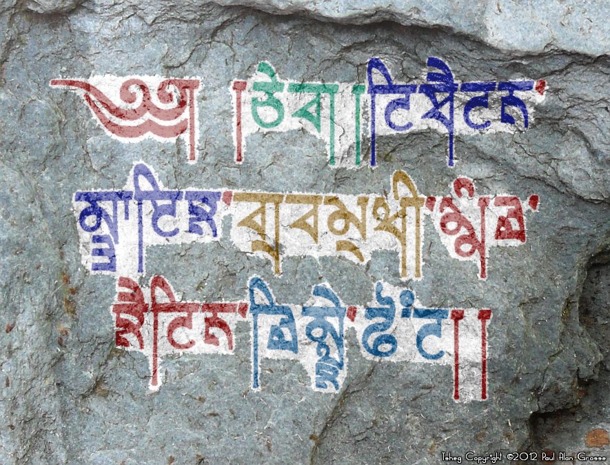
Hover the mouse over the images below to show examples of font characters and weights
Download Tsheg . . .
Download Tsheg 5 Medium TrueType font tsheg_5.ttf 143,728 bytes tsheg_rc_5.ttf 128,796 bytes Download Tsheg ascii 5 Medium TrueType font tsheg_as_5.ttf 16,536 bytes Download Tsheg 7 Bold TrueType font tsheg_7.ttf 181,416 bytes tsheg_rc_7.ttf 163,224 bytes Download Tsheg ascii 7 Bold TrueType font tsheg_as_7.ttf 23,496 bytes Have you got the latest version of one of these fonts? If you have just downloaded it from this site, you have. Otherwise, you can check any font file by comparing the hash function results of the file on your computer with the values in the list by clicking here for text file and here for a web page - opens in a new tab. Select the font file on your system and look at the properties. Compare the hash result against the values in the table. These pages are kept up-to-date so whenever I update a font or create a new one, it will be on there.
Download All Fonts
You can download all of the fonts from all of the font families on this site in one compressed archive by clicking here for a ZIP file
or here for a TAR.GZ file

If you want to make a contribution directly using PayPal, my email address is paul.alan.grosse@gmail.com and please include your name and if relevant, your company and the project so that they can be included on the contributors page with a link if appropriate.
To see a list of contributors, click here.
Thank you.


Copyright ©2007-2023 Paul Alan Grosse.