


The PG Ek Jot font family is based upon the chalk-on-blackboard daily messages found in the Gurudwara Dukhniwaran Sahib, Patiala, Punjab. The board is re-written daily and the current board can be found on the Gurdwara's website and on Facebook.
Like the GHP Full font, this represents carefully written script that is meant to last for a day and be read by a wide audience so it's legibility is close to that of GHP Full but its permanence is a lot lower so this represents an interesting middle ground as far as fonts are concerned.
For the reason that it has passages written out in it, it is classified as a body font although it has a lot of qualities of a display font.
The top portion of the letters is quite a bit smaller than other fonts and the lower portion is expanded to give an overall 'bulb' feel about it.
The siharis and biharis are different widths according to the letter they are attached to, going almost to the base line - this is a hand-drawn font so in the real world, some times they do and sometimes they don't quite.
The siharis and biharis also have a form that is open when they are used with letters that are open: ਅ; ਖ; ਘ; ਪ; ਮ; and, ਖ਼.
Many of the letters have a form where the base line is shortened when it is at the beginning of a word. Also, the letter is moved to the left a little therefore making the word-space before that letter a little smaller and making the text more compact.
Finally, the horda is quite long in the font so there are a number of variants that allow you to select the length that most suits your requirements.
As always, the font's glyphs occupy both the standard Unicode range for Gurmukhi as well as the ASCII Latin range. I have found that the unicode standards are implemented so irregularly from system to system and even program to program that I have made all of the glyph enhancements available to the ASCII range so all you have to do it type normal Latin letters and Gurmukhi appears. Just remember to type the sihari in first.
The first letter of each word, except for when there is a sihari there, has the opportunity to have a shortened bar. The extent to which it can be shortened depends upon the letter and some letters lend themselves to this so ineffectually, that they are not included in the modified glyphs.
You can see from the ਜ on the right that the extent to which the line is shortened can be quite a lot.
To display the shortened version of the letter, input the letter as you normally would and then type a '#' immediately after it so in the case of the ਜ, you would type 'j#'.
Here is a list of all of the letters that you can shorten in this way, along with the keystrokes and the resultant glyph that is displayed.
The letters that are not included are: ੳ; ਅ; ਖ; ਙ; ਝ; ਞ; ਯ; and, ਖ਼. As you can see, they all have a very short left side of the bar.
The sihari and bihari come in four widths and two styles, making five options for each.
The default is a good all-rounder but once you have your text input, you can go around it and for each sihari or bihari, you can select the type that suits your needs the best.
On the right, you can see some example letters showing off the different options for each and below each example, you can see the letter sequence you need to type it.
Simply, if you have an open-topped letter, press an 'o' immediately after the sihari or bihari that needs it.
Otherwise, you can repeat the letter until you have the width that you need. In other words, press 'i' once and you get the default sihari. Pressi 'i' again and it will shorten; again and shorter still and when you press it a fourth time, you get the long version.
The text is just a string of Latin letters so you can simply go back a step by pressing the destructive backspace key as you would with any other text.
The horda is very long in the original chalk drawings so I have done a similar thing here as I did with the sihari and bihari.
Again, the long horda is too long to have as the default so I have made an intermediate-length horda the default so that it will produce the best overall results.
If you press 'o' for a second time, you get the shorter version of the horda and if you type three letter 'o's in all, you get the long horda.
Horda with a bindi is also catered for and it doesn't matter if you type; 'oNoo'; 'ooNo'; or 'oooN', you will always end up with a long horda with a bindi. The same applies to the shorter horda versions as well.
Here is an example of one way of working with this and in my mind, it is the simplest way. Just type in your text as you normally would and then, starting from the beginning, work your way through each word, selecting the versions of siharis, biharis and hordas that you need.
On the right, you can see how the word ਵਿੱਚੋਂ is formed.
When you type 'iv~coN', you get what you see at the top. The sihari is around the right length but it collides with the adhak. The default horda is also too long for the same reason so both of them need shortening.
This is done by taking the cursor back to the 'i' and pressing 'i' again. This makes the sihari miss the adhak. Likewise, take the cursor to the end of the word and press another 'o' to make the horda shorter.
You can play around with this. If you have a word with a horda at the beginning such as 'ਹੋ', or a word where there is a lot of empty space above the line before the horda such as 'ਕਰੋੜ', you can make that into a long horda if you want.
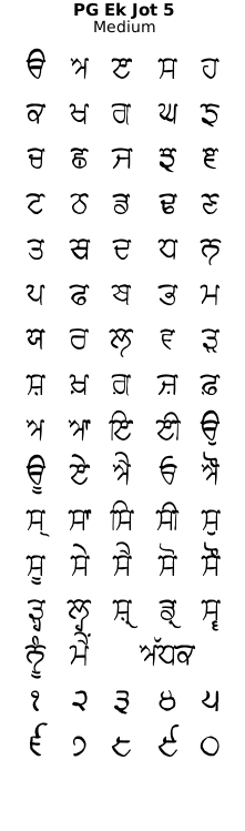
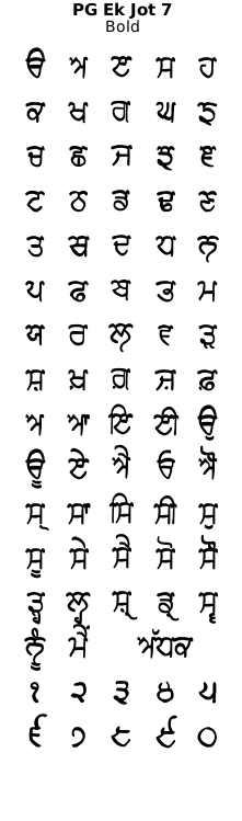
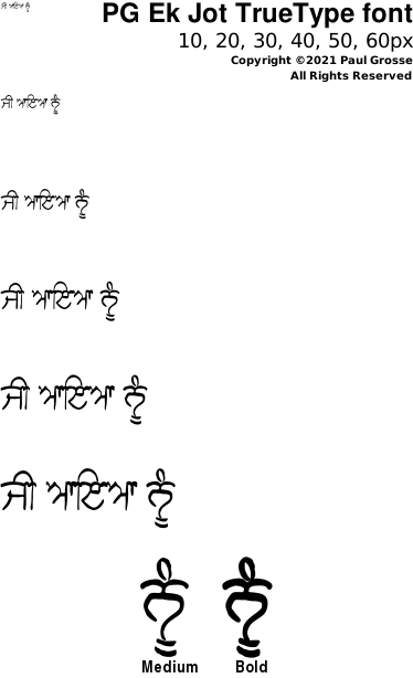
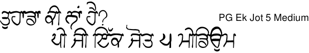
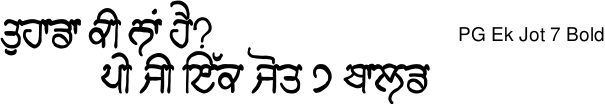
The 'PG Ek Jot' font family is provided in Medium and Bold.
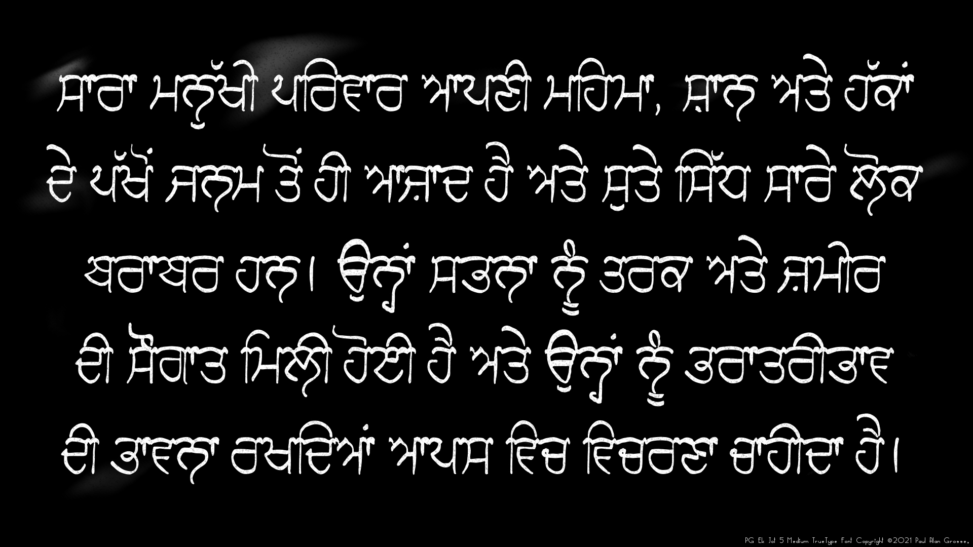
Example of artwork with PG Ek Jot . . .
click on the image to open it up, full-sized, in another tab...
The images are 1920x1080p so you can set them as your desktop wallpaper and have a closer look if you want.
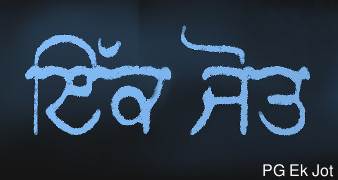
Hover the mouse over the images below to show examples of font characters and weights
Download PG Ek Jot . . .
Have you got the latest version of one of these fonts? If you have just downloaded it from this site, you have. Otherwise, you can check any font file by comparing the hash function results of the file on your computer with the values in the list by clicking here for text file and here for a web page - opens in a new tab. Select the font file on your system and look at the properties. Compare the hash result against the values in the table. These pages are kept up-to-date so whenever I update a font or create a new one, it will be on there.
Download All Fonts
You can download all of the fonts from all of the font families on this site in one compressed archive by clicking here for a ZIP file
or here for a TAR.GZ file

If you want to make a contribution directly using PayPal, my email address is paul.alan.grosse@gmail.com and please include your name and if relevant, your company and the project so that they can be included on the contributors page with a link if appropriate.
To see a list of contributors, click here.
Thank you.
Copyright ©2007-2023 Paul Alan Grosse.