GHP Full TrueType Font for free download. . .
About GHP Full . . .
(GHP = Gurmukhi Hand Painted)
There are many styles of writing/painting letters but many of them are not that dissimilar to the standard way of writing letters and if you wanted to produce some images with such writing on, all you need to do is use one of those.
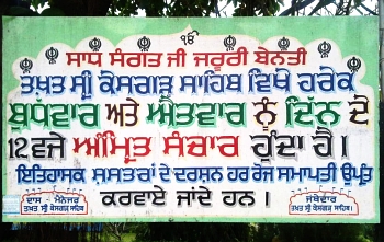
Early in 2012, Tajinder Singh from Vienna, Austria, posted onto Facebook a photograph that he had taken of a sign from the Takht Sri Keshgarh Sahib, Anandpur Sahib in the Rupnagar district of Punjab, India (the first of the two photographs on the right).
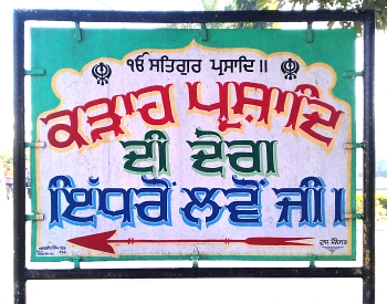
Later that year, a friend of his, Hardeep Singh Mann, also from Vienna, Austria, went there and took more photogaphs of similar signs in and around the area, including the lower of the two, which is from the Gurduara Patal Puri in Kiratpur Sahib, five or six miles south-east of Anandpur Sahib.
He then contacted me, early in 2013, suggesting that I should consider making a font of the lettering - he had managed to photograph almost all of the letters and so the process of turning it into a font began and here is the result.
The process of making a font is not as simple as copying a set of letters, it is far more involved than that. First of all, you need to define a set of rules such as the positions of horizontal lines, the widths of lines, radius of curvature, how certain features repeat themselves or versions of themselves between letters and you have to make up any shortfall of letters supplied and modify any of the letters so that they fit the rules. Then you have to do some programming to make it work in various contexts (such as which version of an adhak to use under certain circumstances, for instance), then you have to test it as exhaustively as you can and finally, produce any images and other information that will make choosing it and using it a better experience for the person whose computer it is going to end up on.
As far as real, permenant signs go, you are better off getting the real thing made for you by someone who knows what they are doing. These signs are painted by Amarjit Singh of Amritsar - the sign is signed at the bottom left with 'ਅਮਰਜੀਤ ਸਿੰਘ ਪੇਂਟਰ ASR.' - 'Painter' being the occupation rather than the family name.
GHP Full is a Gurmukhi display font that covers both the UniCode Gurmukhi range and also places Gurmukhi characters in the ASCII range so it is compatible with systems or programs that are not quite as advanced as those that are able to use UniCode.
For those who don't know, the Punjabi word for 'flower' is 'Full' - hence this font's overall style - that of decorative, hand-painted semi-permanent signs such as those you might find for shops or outside buildings advertising regular or important events.
In addition to the style of the font - which stands up as well without any extras - there are two other components to it: a drop shadow (two variants) that has more to it than just the basic type you can make with your image editor; and, a small border (again, two variants) which you can use to help to define the edge of characters when you are using certain colour combinations of shadow and character.
You can see from the image on the left with the two aerdas in it, the difference between the drop-shadow that you would produce merely by copying the text down and to the right because the left side of the character extends downwards to form the shadow, the right side goes to the right and the bottom-right travels down and to the right.
However, it is not a straight 'zoom' either. each part of the character has this or variants of it done to it, similar to the way that a painter would add a shadow by painting around the character. In the image on the right, you can see two variants of the drop-shadow: the shaped variant and the uniform thickness variant.
Here, you can see how characters are built up: first of all, you input your text, then you select the body text font; next, you copy that and change it to one of the outline fonts so as to form a border; finally, you add the shadow of your choice by copying the text and changing the font to the shadow font.
You might, depending upon your image editor or DTP program, find that you have to move the border and/or the shadow horizontally, in order to get them aligned properly. To do this, position the shadow text so that it aligns with the body - the shadow has the body removed from it so it should be a perfect match - you might need to change the line-spacing for the shadow layer on some programs - and then, make the border/outline layer visible and position that so that it is evenly spaced around the body layer.
So, which outline layer to choose? If you are going to make your text fairly small, you will need to increase the outline's visibility by choosing the 'outline 2' font, otherwise you can use the 'outline' font or the 'outline 2' font according to your taste.
Here, you can see how the various thicknesses for the ends of a letter.
GHP Full, goes to a point and is best suited to use in large signs where it can be seen.
GHP Full Demi-Bold forms an end that is more visible at smaller sizes.
The Outline and Outline 2 variants form the border around the letters and you can see here the relative thickness with respect to the body variants.
Here, you can see how each of the variants mentioned above meets up with the next character.
Again, the GHP Full variant goes to a point that all but disappears at smaller point sizes so if you are using this font to make a smaller image, you might want to use the Demi-Bold variant for the body text part of the characters - it might be that you decide that the smaller one looks best - that is your choice.
The Demi-Bold variant forms a stroke that is non-zero-width between characters and makes nice, continuous words, without any apparent breaks.
The outlines overlap each other and form a continuous word - this is why you should form all of your shadows in one layer; your outlines in another, on top of the shadows; and, your body text in the top layer, preventing the lower layers of one character overwriting the higher layers of the previous character.
Another feature that I have programmed into this font is that it can extend the tippee part of the oorda of the Ek Onkar so that it is able to reach over some of the following text.
Instead of using the normal Ek Onkar character, use a Gurmukhi one - either in the ASCII range or the Unicode range - and then follow it by either the horda form of oorda, or the aunkard or dulaunkard forms of oorda as in the image on the right.
The ASCII part of the font has two variants of the adhak so you can choose whichever you like depending upon the space available. However, the Unicode part of the font will do this automatically for you so there is no need to worry about that.
Also, bindis next to biharis and so on will change as well - this is done automatically by the font if your editor conforms to the specifications - the free image editor 'The Gimp' does this automatically.
Here, you can see how you can modify the default ascii adhak by adding two hash marks after the tilde character so that where there is already plenty of space, you can remove the small piece of bar so that the characters close up together better.
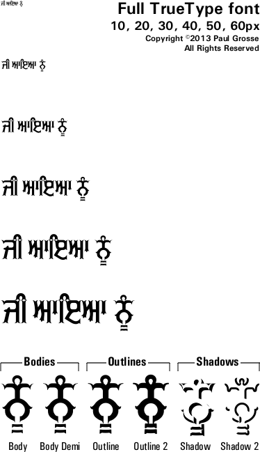
Click on the image on the right to see the full-sized breakdown of glyphs in the font.
This font - like almost all of the others - is a Unicode font with the Gurmukhi characters mapped onto the ASCII character positions as well.
Note that you can see that there are normal Latin numbers in the ASCII range as well as the Gurmukhi numbers in their normal place within the Gurmukhi range.
If you are using the ASCII keyboard and need to have the Gurmukhi number characters instead of the Latin number characters, you can access them by adding two hash marks after each Latin number character as you can see in the image on the right.
Also note that there are symbols for Rupee and Euro as well as the regular ones for Pound and Dollar/Cent.
If you are using ASCII, your keyboard layout should include the Gurmukhi numbers as certain key configurations. However, if you haven't got that or are unsure how to get them, the Gurmukhi numbers are at 0x00f1 through to 0x00fa. You can simply copy the string of characters below their corresponding numbers here (starting with ñ)
੧੨੩੪੫੬੭੮੯੦
ñòóôõö÷øùú
and paste them into your image/word processor (or copy the Gurmukhi numbers instead, if your system handles them appropriately).
So, with three layers to go at, what colours should you use?
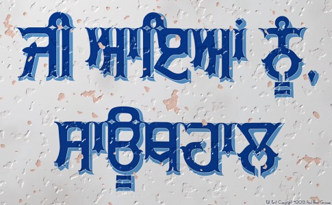
Normally, you would have a colour - here, blue - that is fairly saturated, with a drop-shadow of a mid-grey. The colour of the shadow indicates how much light comes in through all-round lighting.
You can give the impression of over exposure and harder lighting by making the blue lighter and the grey shadow darker.
However, you can make a different impression - one that is more traditional - by using a shade of the body colour as the shadow.
If you make that saturated, you give the impression that the letters are transparent. Here, as well, we have a black border and it gives the impression that it is all solid and translucent.
One problem, however, is that the idea of the sign is to make the text easy to read and yet, so far, the darkest thing of any substance has been the shadow.
So, instead, we can make the writing darker and the shadow lighter. Now, we still have a shadow but the text stands out more and if you insist on having a reality-based explanation of what could be a plausible mechanism for such an image, it is as though the characters are made from the darker material and the sides reflect the background white. Whether you buy into that or not is your choice but whether you do or not, it still looks good and it is very legible
Note also that the white border around the body parts of the characters makes them stand out more from the shadows.
If you darken it still further, so that the colour is no longer saturated, whilst the letters have more contrast with the white background, it looks duller insofar as the colours are not as saturated - the brightness/over exposure has started to go.
Some hues will produce colours that are recognised as different only by the fact that they have different names. For instance, virtually anybody who uses image editing will know that brown is a dark orange but most people look on them as two, largely unrelated colours.
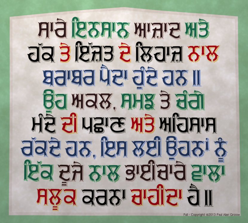
You can, of course, use the colours of flags or anything that contrasts in brightness. If you look at the example of the Universal Declaration of Human Rights, Article One, you will see that there are a number of different colour combinations, reflecting the colours used by the people who make signs like this in the Punjab.
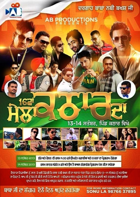
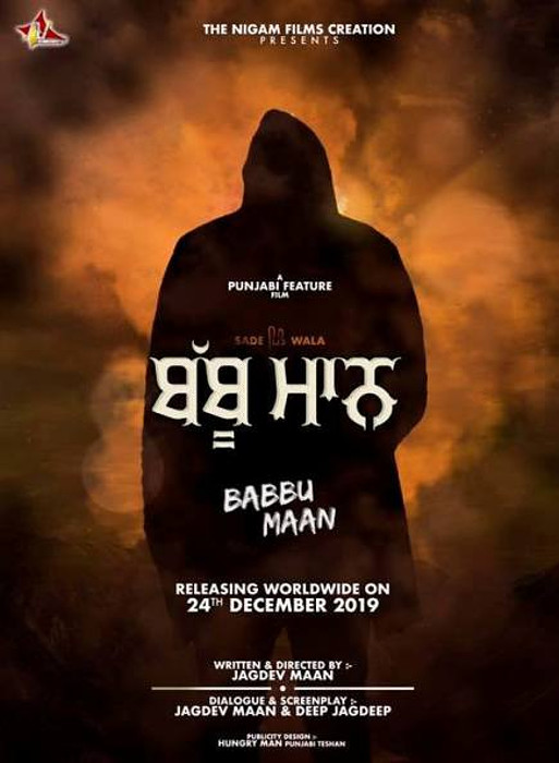
Examples of artwork with GHP Full . . .
click on the images to open them up full-sized in another tab...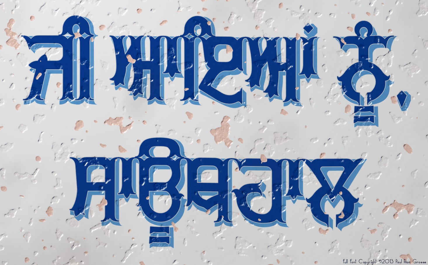
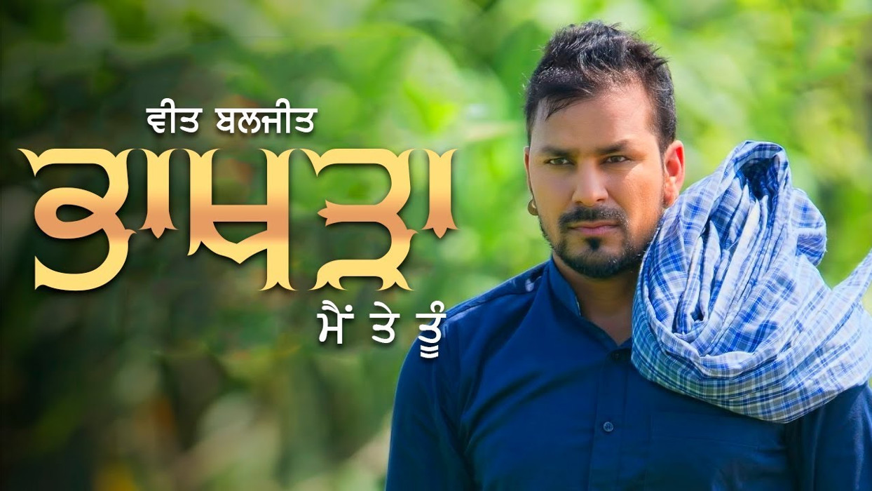
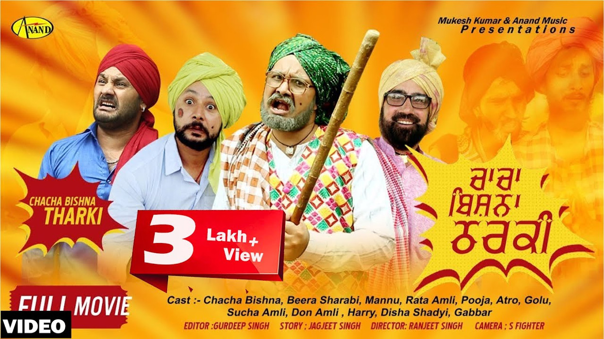
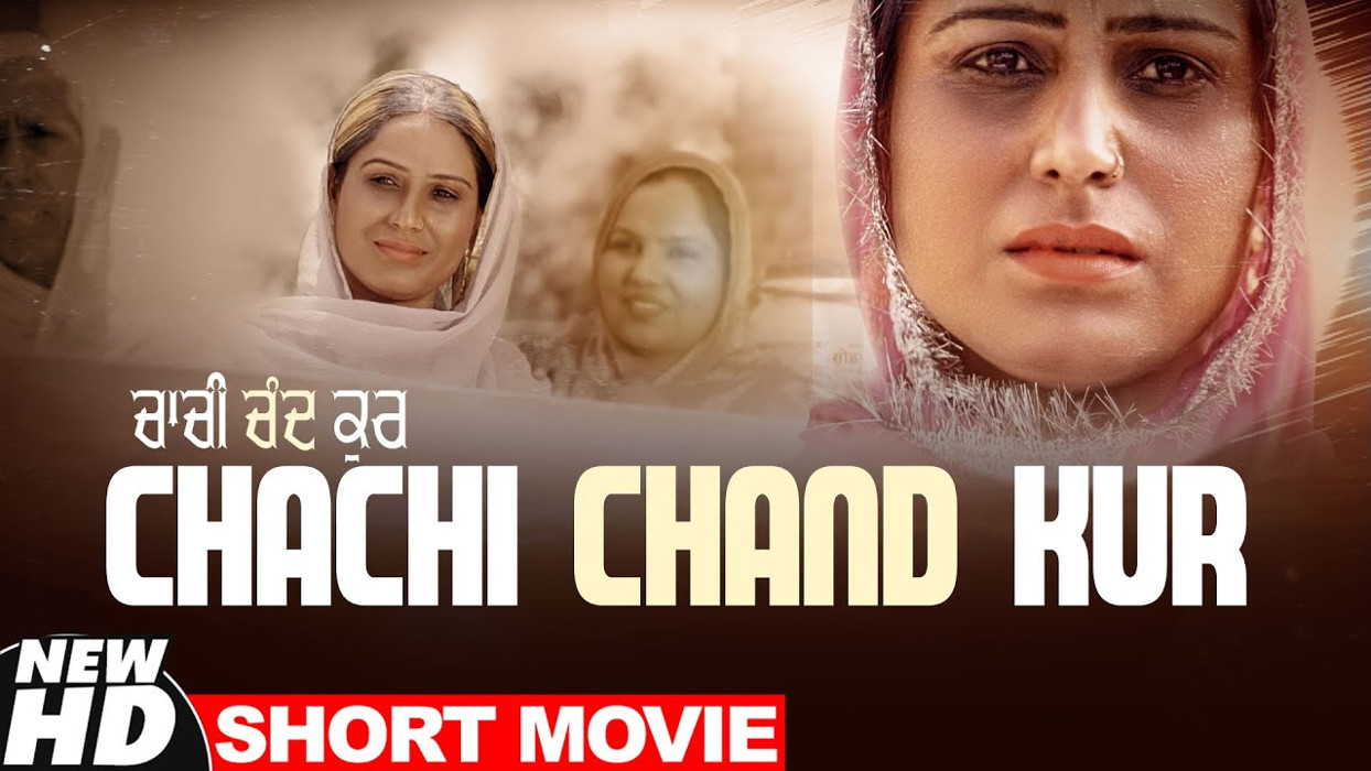
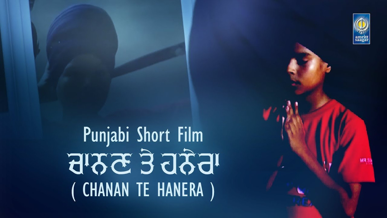
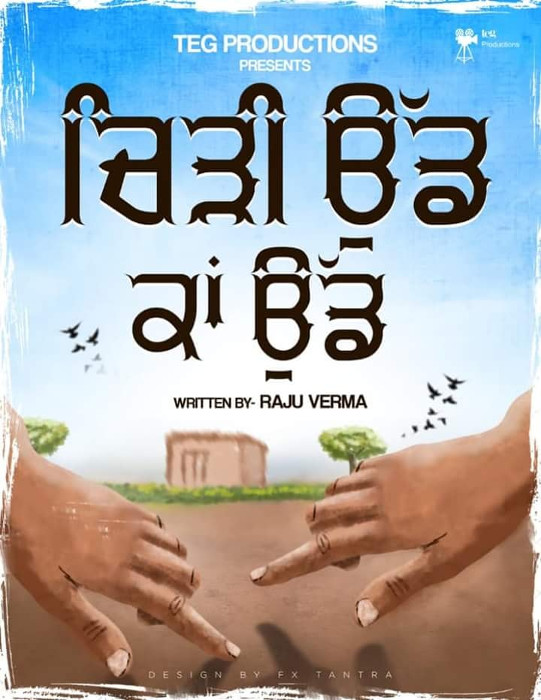
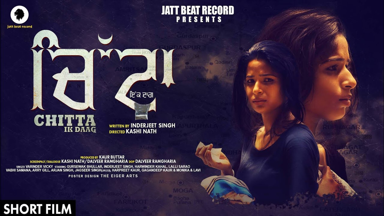
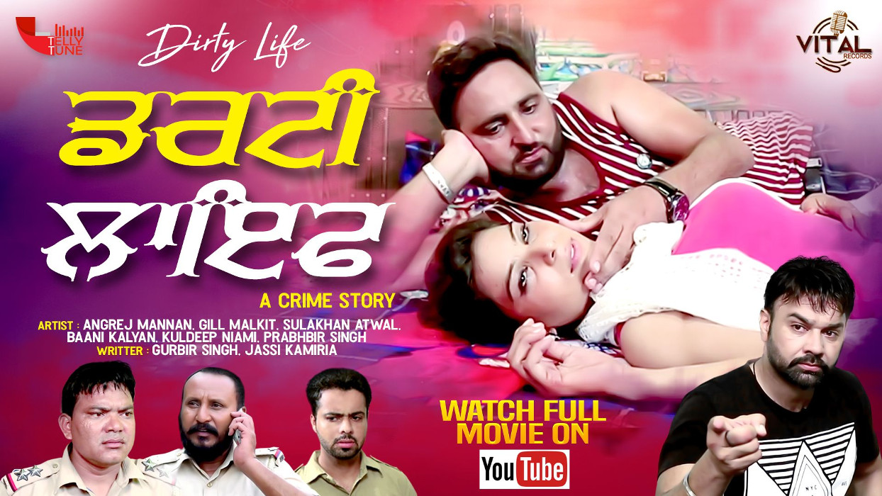

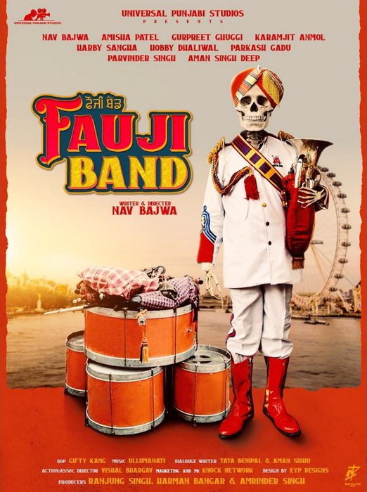
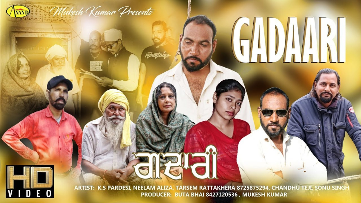
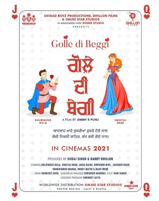
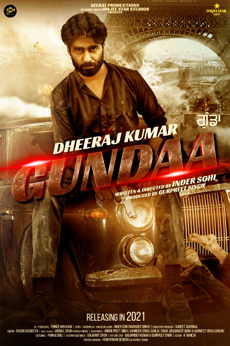

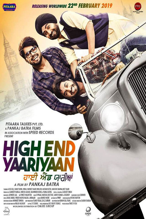
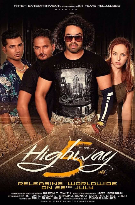
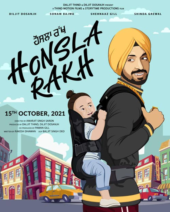
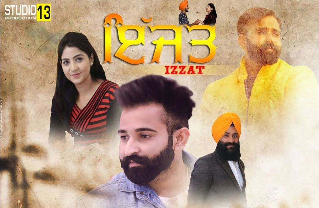
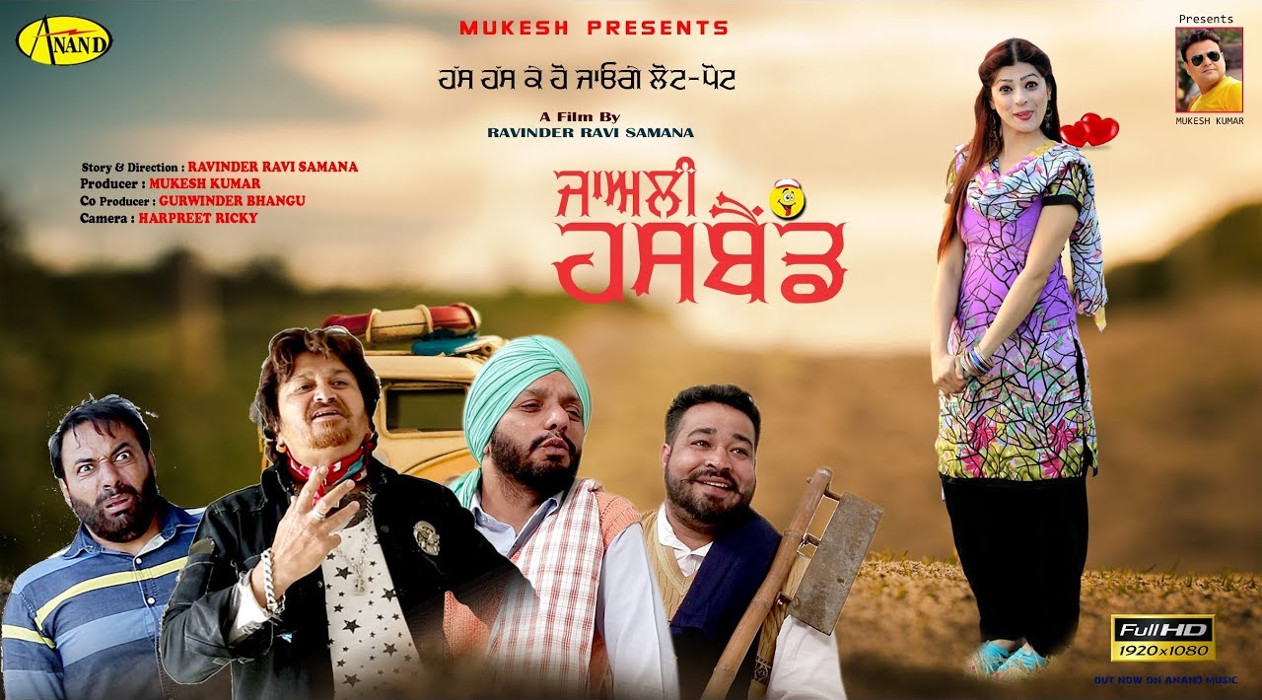
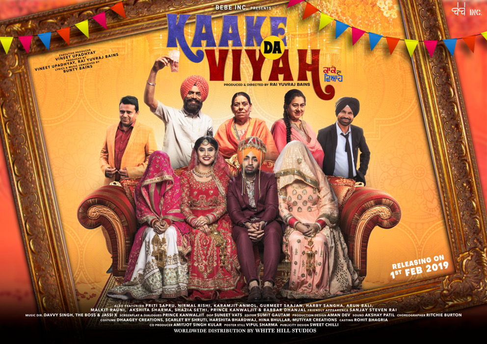

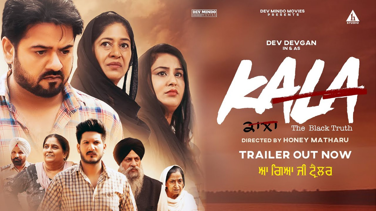

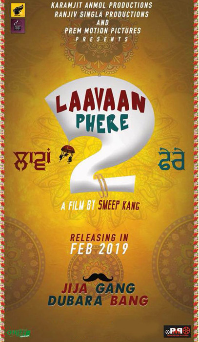
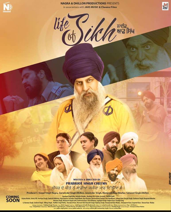
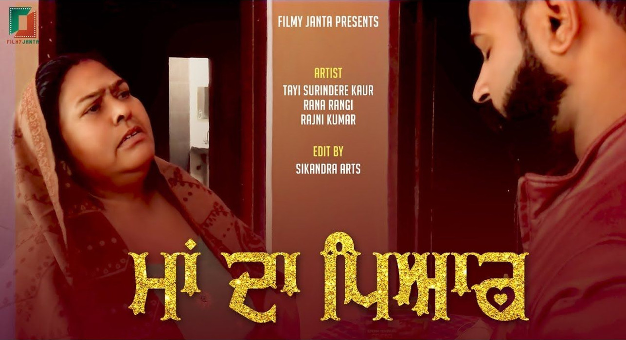
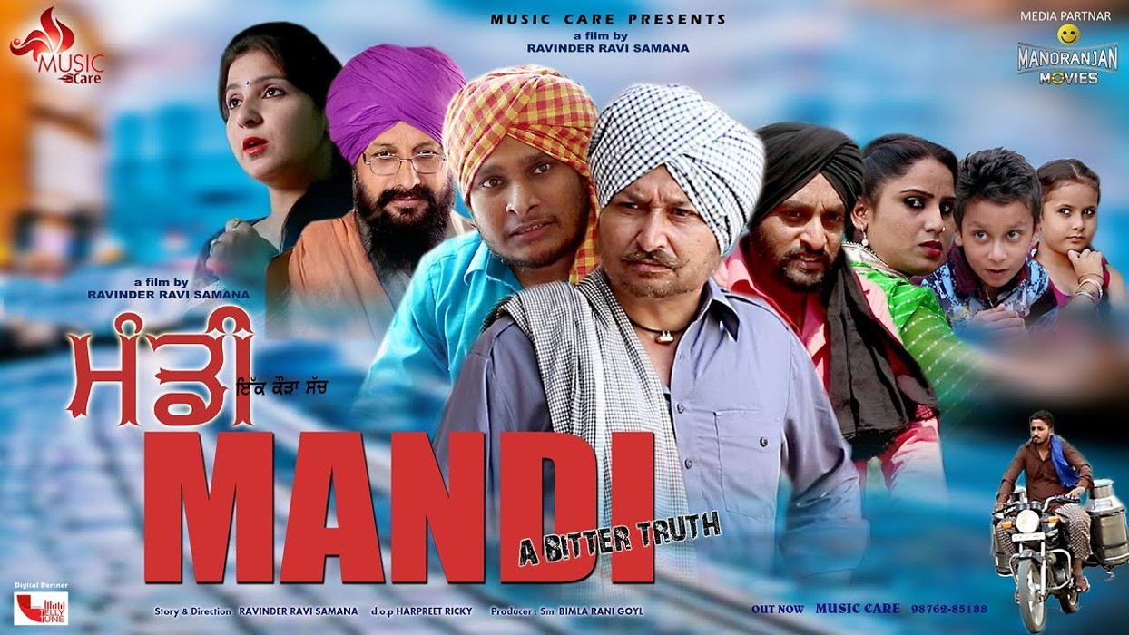
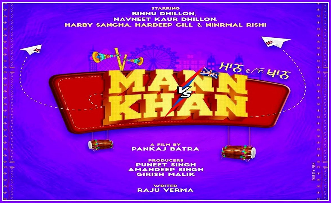
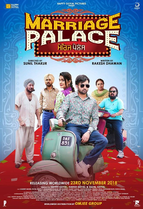
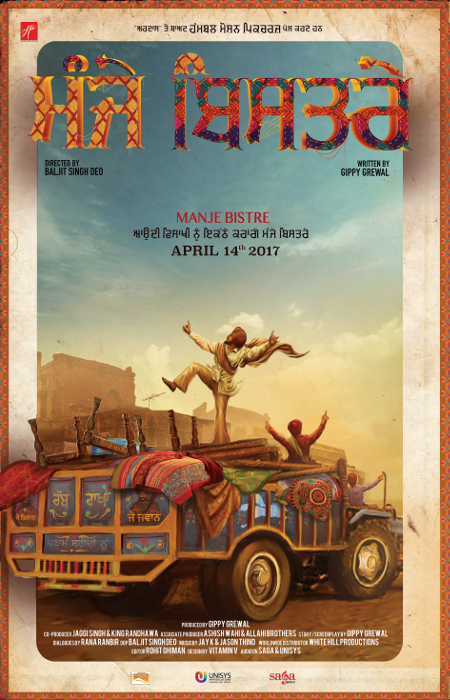

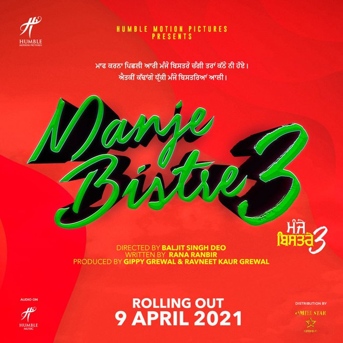
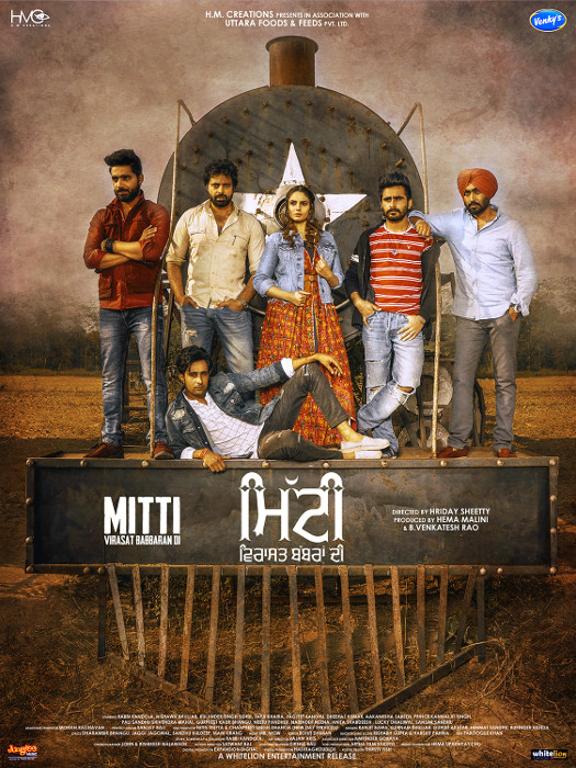
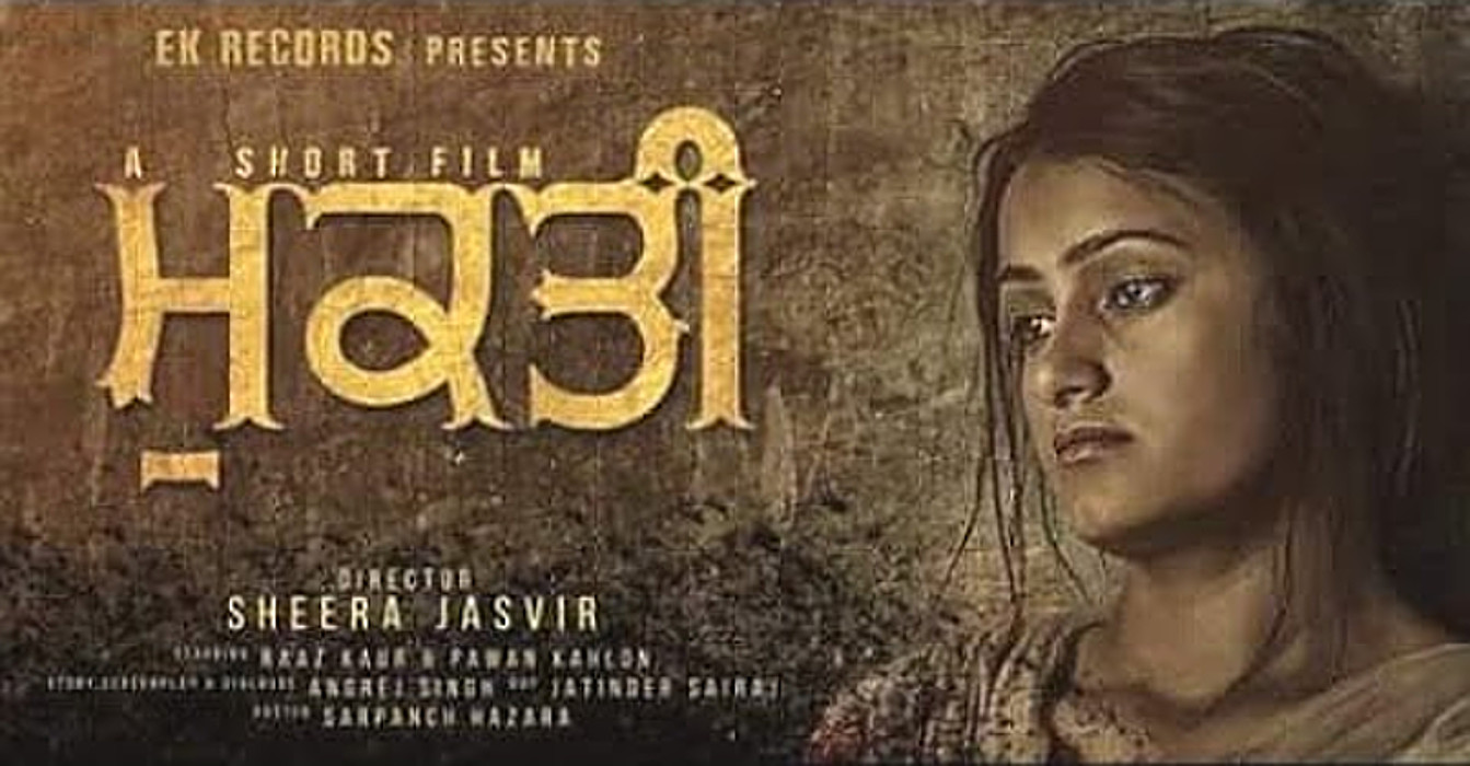
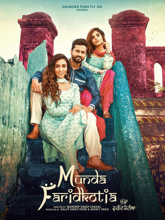
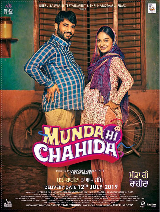
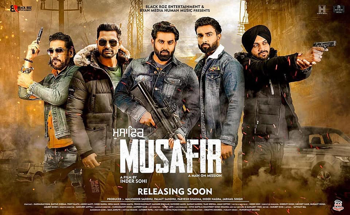
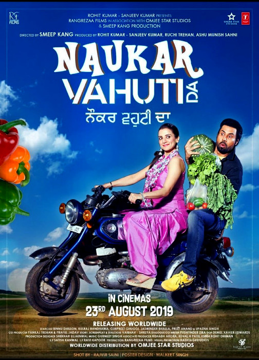
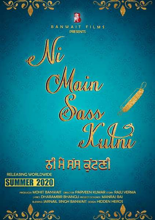
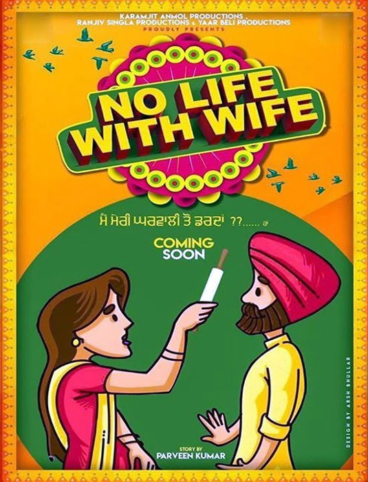
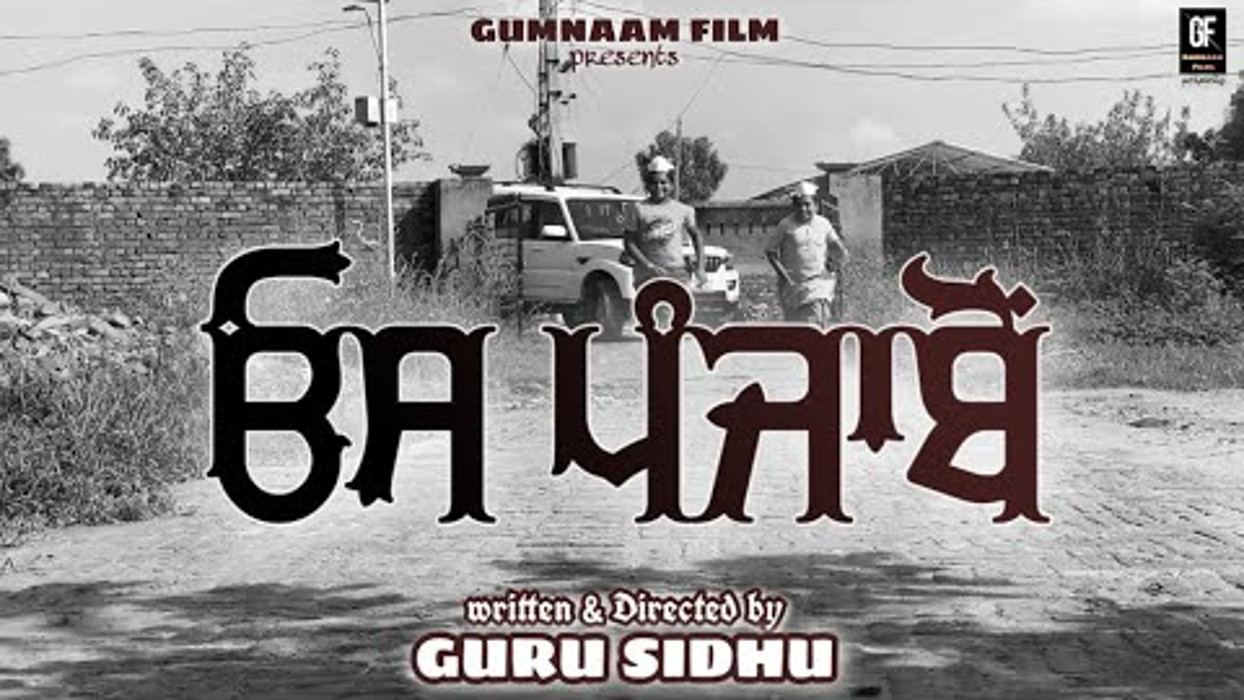
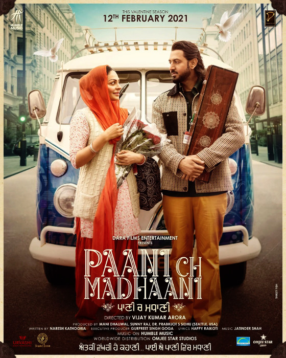
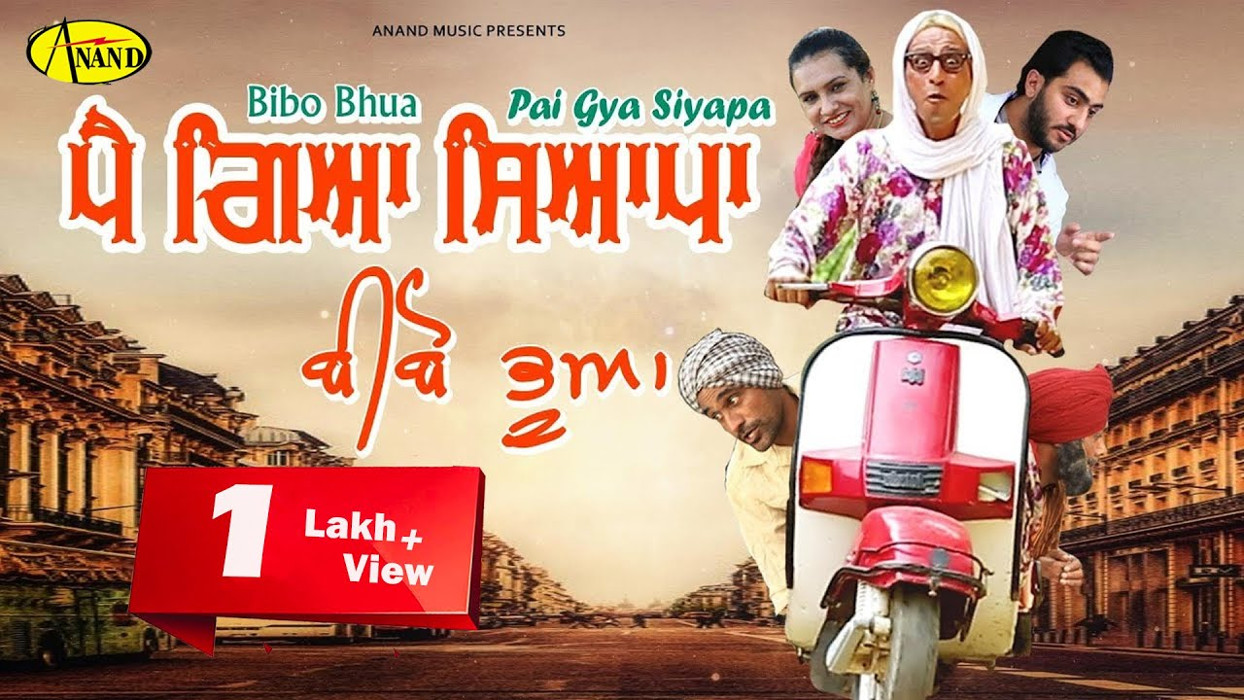
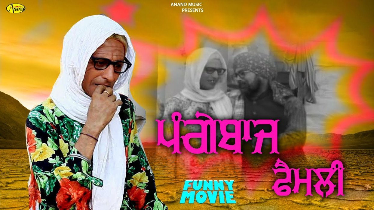
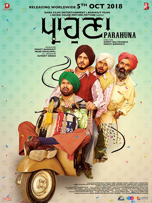
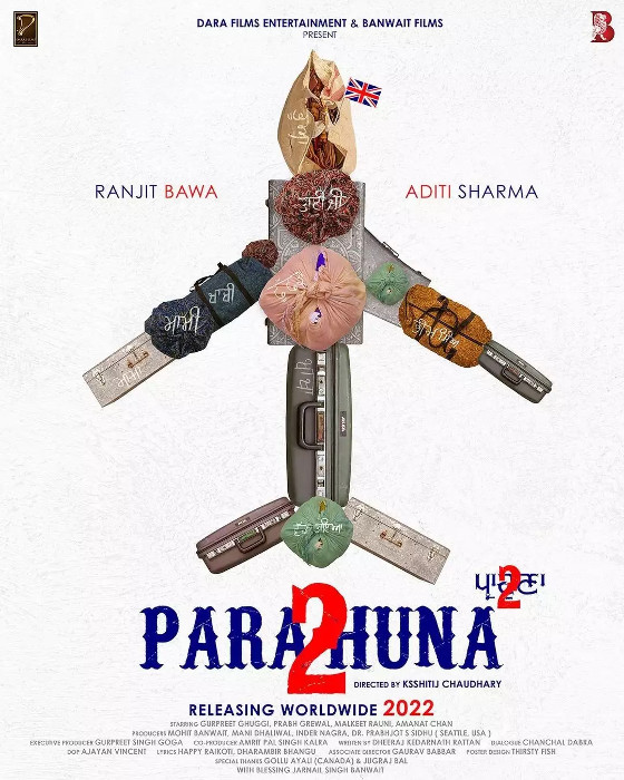
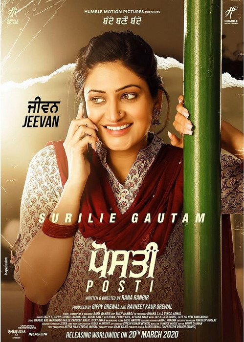
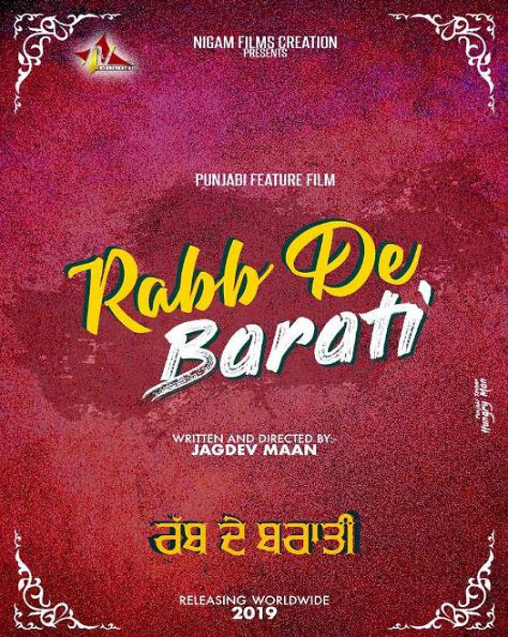
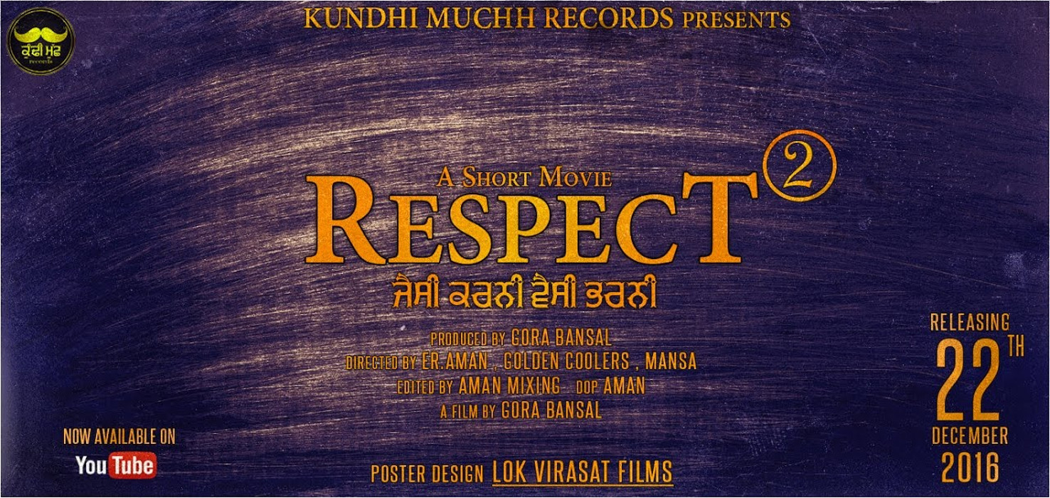
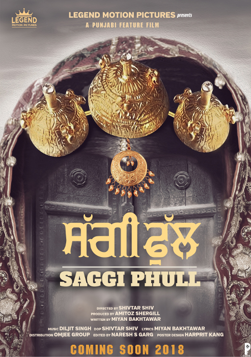
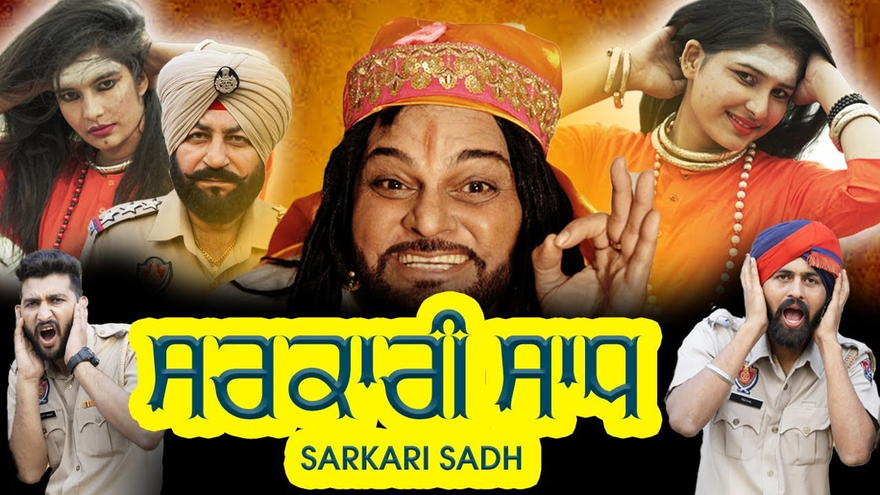
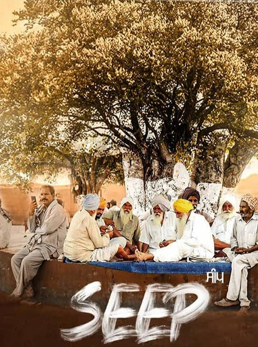
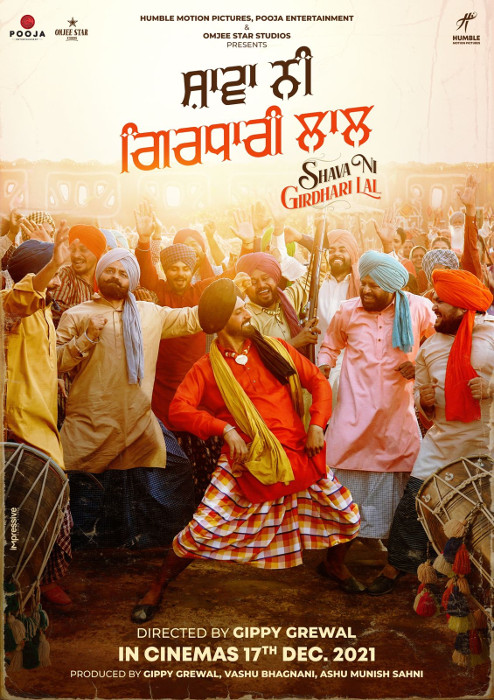
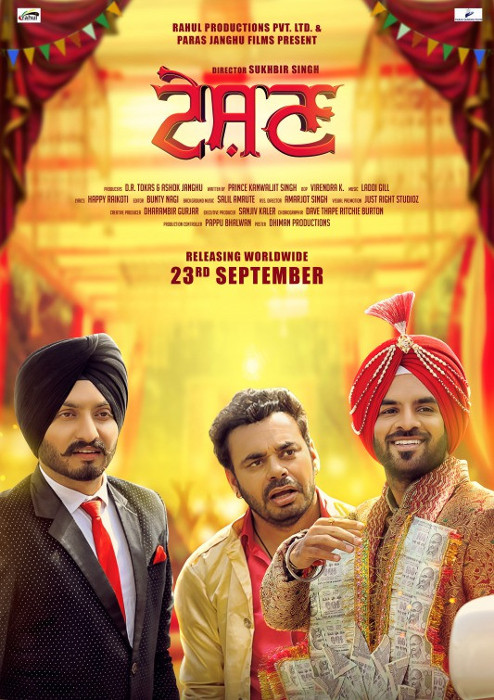
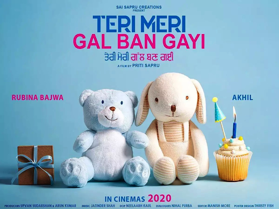
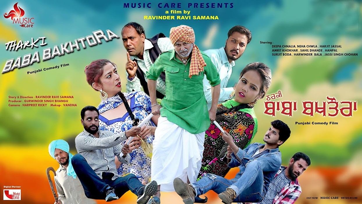
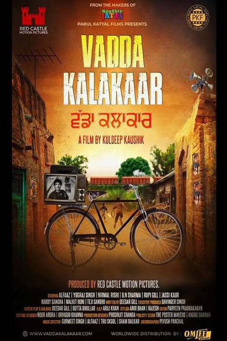
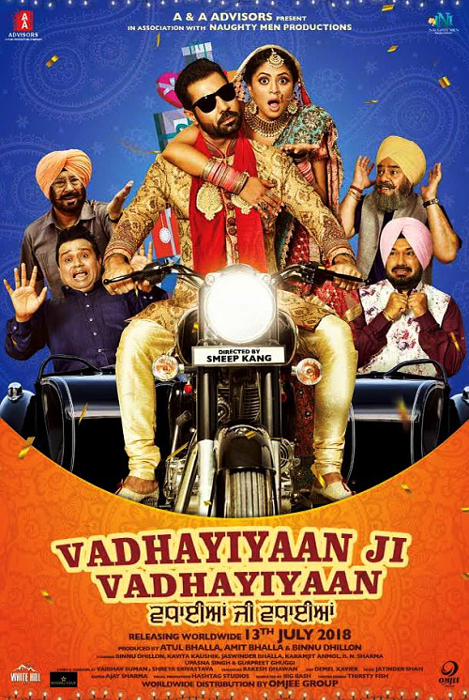
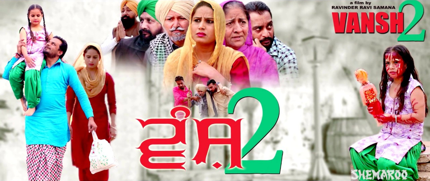
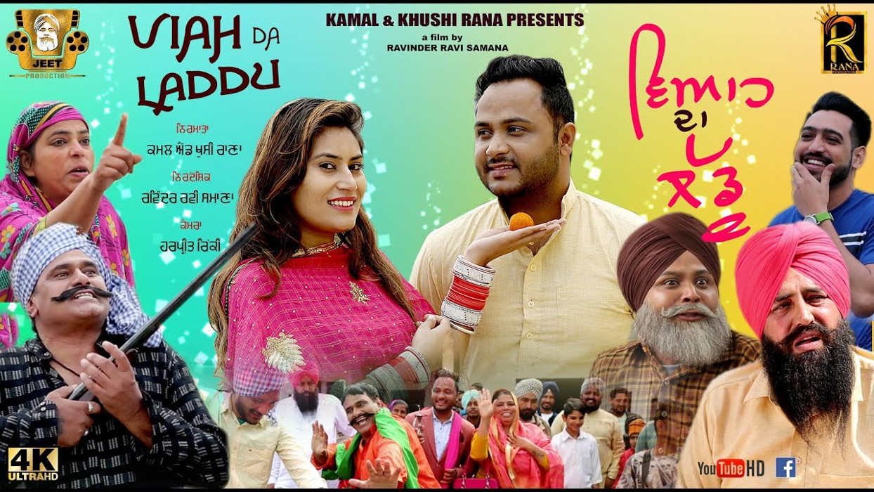
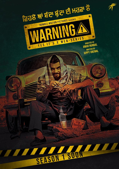
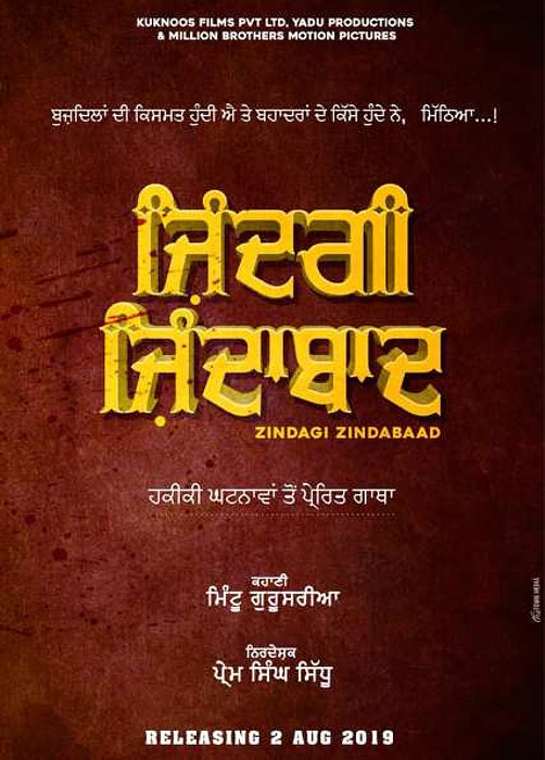
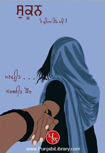
Hover the mouse over the images below to show examples of the font on book covers
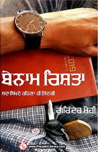
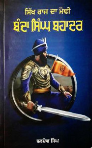
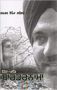
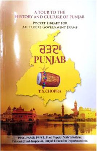
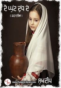
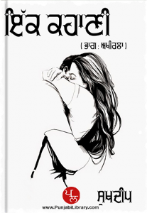
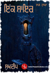
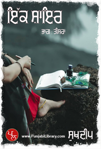
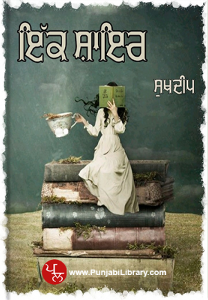
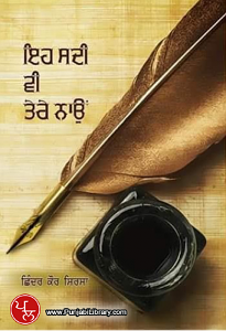
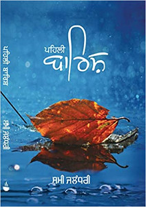
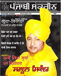
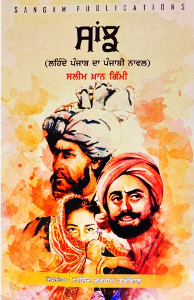
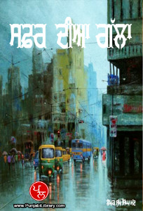
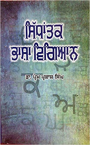
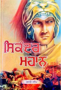
Hover the mouse over the images below to show examples of font characters and weights
Download GHP Full . . .
Download GHP Full 5 Medium TrueType font ful_5_b.ttf 63,132 bytes Download GHP Full 6 Demi-Bold TrueType font ful_6_b.ttf 76,632 bytes Download GHP Full 5 Outline TrueType font ful_5_o.ttf 85,208 bytes Download GHP Full 5 Outline 2 TrueType font ful_5_o2.ttf 90,032 bytes Download GHP Full 5 Shadow TrueType font ful_5_s.ttf 93,008 bytes Download GHP Full 5 Shadow 2 TrueType font ful_5_s2.ttf 102,860 bytes Have you got the latest version of one of these fonts? If you have just downloaded it from this site, you have. Otherwise, you can check any font file by comparing the hash function results of the file on your computer with the values in the list by clicking here for text file and here for a web page - opens in a new tab. Select the font file on your system and look at the properties. Compare the hash result against the values in the table. These pages are kept up-to-date so whenever I update a font or create a new one, it will be on there.
Download All Fonts
You can download all of the fonts from all of the font families on this site in one compressed archive by clicking here for a ZIP file
or here for a TAR.GZ file

If you want to make a contribution directly using PayPal, my email address is paul.alan.grosse@gmail.com and please include your name and if relevant, your company and the project so that they can be included on the contributors page with a link if appropriate.
To see a list of contributors, click here.
Thank you.
Copyright ©2007-2023 Paul Alan Grosse.


