


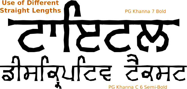
PG Khanna is based upon Gurvetica but its outline is made of short, straight sections and the end of lines widen out.
A number of times that fonts have been used in books and films is that the bar has been extended well beyond its normal limits so here, I have provided end cap glyphs so that the bar ends can look the same.
Like other fonts, the underscore also has a small part of the bar on it so that you add some wherever you need to. The underscore bar has parallel sides so that you can use the tracking on your image processor to change the length down to the order of pixel precision.
- On the right, you can see the text on its own;
- This one has the end caps on it. The end caps are the keys '{' and '}' which are sufficiently redundant for them to be sequestered for this purpose;
- Here, underscores have been added before and after the text, thus extending the bar a little;
- This just demonstrates that the underscore can be added anywhere although if you are using the Unicode glyphs, you can only add the underscores between syllables;
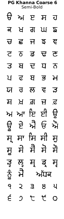
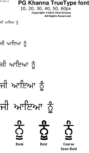
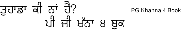
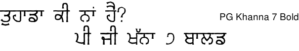
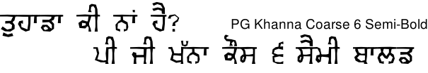
You can see from the image on the right that the font outlines are made up from short straight lines. The Book and Bold fonts have the number of points in a given length that is approximately twice that of the Semi-Bold font therefore, you can use the Semi-Bold font at half or even a third of the font size of the other two and it will match the level of detail.
In effect, the viewer's eyes look at fonts like this as a regular font that has had an effect applied to it. By using the font with half the number of points in a given length at a size that is around half the size of the other fonts, your mind subconsciously applies the same scale of filter to it and the two fonts look as though they are in the same environment - simply using the same font at a smaller scale looks wrong in comparison.
You can see an example of this in the image below...
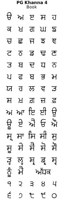
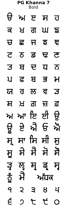
The 'PG Khanna' font family in 'normal cut length' is provided in Book and Bold weights and with double the length in 'Coarse' Semi-Bold weight.
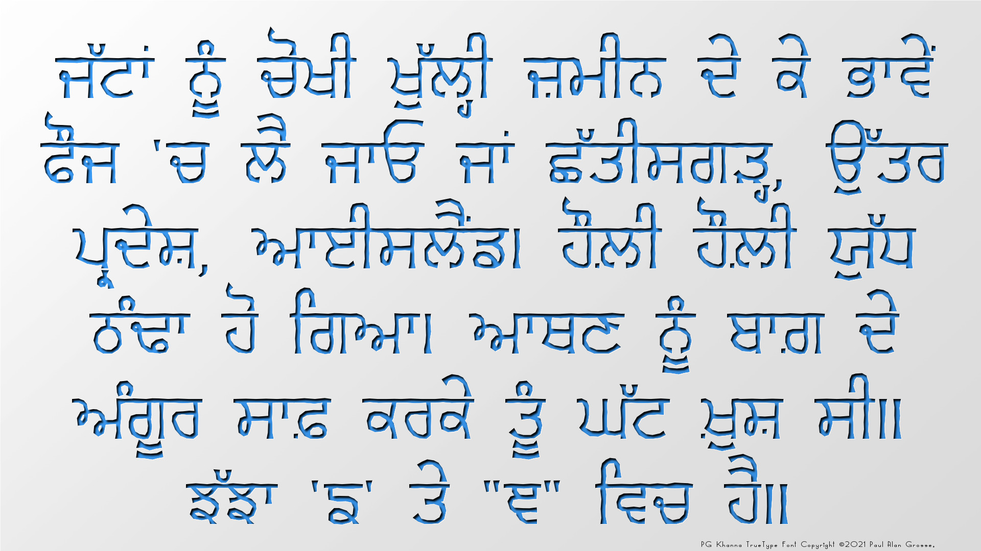
Examples of artwork with PG Khanna . . .
click on the images to open them up, full-sized, in another tab...
The second is 1920x1080p so you can set them as your desktop wallpaper and have a closer look if you want. The third image is the glyph set of the font.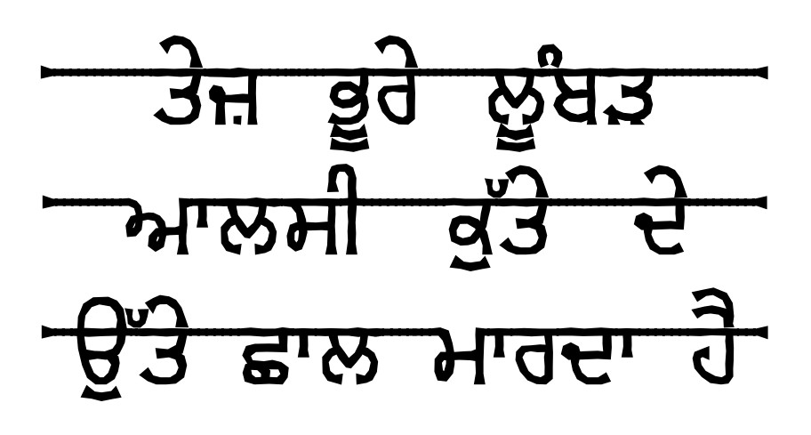
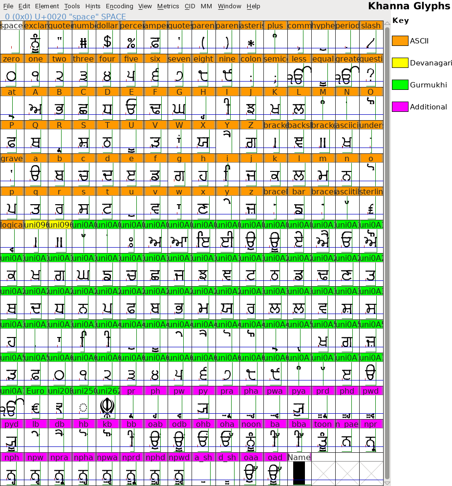
Hover the mouse over the images below to show examples of font characters and weights
Download PG Khanna . . .
Have you got the latest version of one of these fonts? If you have just downloaded it from this site, you have. Otherwise, you can check any font file by comparing the hash function results of the file on your computer with the values in the list by clicking here for text file and here for a web page - opens in a new tab. Select the font file on your system and look at the properties. Compare the hash result against the values in the table. These pages are kept up-to-date so whenever I update a font or create a new one, it will be on there.
Download All Fonts
You can download all of the fonts from all of the font families on this site in one compressed archive by clicking here for a ZIP file
or here for a TAR.GZ file

If you want to make a contribution directly using PayPal, my email address is paul.alan.grosse@gmail.com and please include your name and if relevant, your company and the project so that they can be included on the contributors page with a link if appropriate.
To see a list of contributors, click here.
Thank you.

Copyright ©2007-2023 Paul Alan Grosse.