


Machine Font Comparison - at the bottom of this page, compare two font families using a pangramatic paragraph devised by Hardeep Singh Mann, putting the characters in the context of actual words. The font examples have all been sized so that the centre of the font has the same height (a 'ਸ' or a 'ਖ਼' for example) with the ascenders and descenders going as far as they needs so that you can get a feel for each font.
Maximum Legibility
Bulara makes the most of the letter space with the ascenders and descenders minimised so that they take up the least room possible whilst still maintaining maximum legibility. Again, simple rules allow your eyes to read it very quickly as this is probably the font of mine that is closest to the writing that we learned to write in class. With most of the room taking up the letters in the middle, it is very readable at a distance.
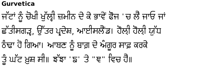
Gurvetica optimises every letter for the most optimised shape for each letter. Laanve and Dulaannve have tail ends that clearly point downwards and horda and kanorda have ends that clearly point upwards thus eliminating confusion between the two that so many of the conventional fonts allow. This font family has many widths and weights so that it can fit your text into any space that you need it to but the 44 and 55 fonts work well in any web browser and many other applications.
Serif takes a lighter weight of Gurvetica and puts a nice vertical or horizontal slab serif on each end. The font is highly legible and there is also a roman-style serif version of it.
From the list on the left: Move the mouse over to select a font family in a window; click on the name to go to that page. 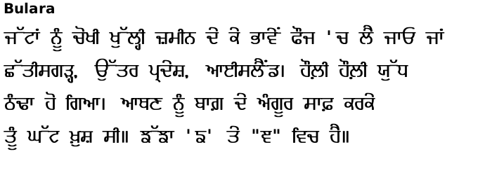
Copyright ©2007-2023 Paul Alan Grosse.