|
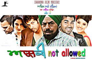 A number of my fonts have found their way into Newspapers, magazines, books, Pollywood films and so on. A number of my fonts have found their way into Newspapers, magazines, books, Pollywood films and so on.
Many times, with only a slight change such as, in the case of 'Ashqi Not Allowed,' little more than a colour change although you might note that the drop-shadow uses a mask of all of the letters so that the shadow doesn't overwrite the lettering.
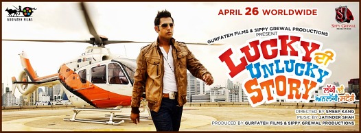 In the film 'Lucky Di Unlucky Story,' my Karmic Sanj font is used with plain colours for each word so that the Gurmukhi words have the same colours as the Latin versions. In the film 'Lucky Di Unlucky Story,' my Karmic Sanj font is used with plain colours for each word so that the Gurmukhi words have the same colours as the Latin versions.
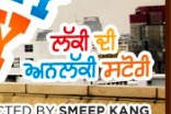 However, it doesn't have to be as simple as that... However, it doesn't have to be as simple as that...
 Hand-produced writing is an interesting medium to play with. Nobody can write perfectly consistently - there are many things that can influence how you might draw a particular character or other mark such as: the time of day; how you feel; how you are sitting; how relaxed you are; and, so on. In short, you will never draw a particular character the same way twice.
A number of the fonts offered on this site for free are handwritten fonts. They produce what looks like handwritten Gurmukhi simply because they are derived from real, handwritten Gurmukhi.
However, one thing that you might notice is that any character that you type will appear the same as the last time you typed it. Normally, this is not a problem because the work that you are producing is to be looked at casually and the feel that it is handwritten is the most important thing for the font to convey, second to the actual content itself.
However, there are situations where you need to have the consistency in design and feel that a font gives but you need it to look as though it is actually produced by hand. Examples of this situation includes title artwork for books, newspapers, music CDs and films.
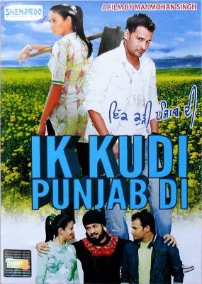
On the right, you can see the DVD cover for ਇੱਕ ਕੁੜੀ ਪੰਜਾਬ ਦੀ which uses my GHW Dukandar font from this site.
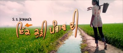 Here it is in more detail from a frame in the title sequence from the film itself.
As has been suggested already, variation has been introduced in order to make it approach the level of inconsistency that is found in real handwritten text whilst retaining enough consistency to be used in the titles of a Pollywood film.
So, how do we set about doing this?
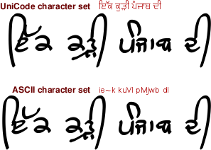 These are the characters that we can use to make the name of the film. You can see that there is a version in the UniCode range and another in the ASCII range - this is because the support for processing graphics - or even just text - outside the UNIX/Linux or open-source community is virtually non-existent.
Following a tip-off, I found that Microsoft's support was at best 'poor' and even Adobe's Photoshop was very bad at this - even with Microsoft's own Raavi font - I had always used the free to download and use Gimp for graphics and OpenOffice.org for wordprocessing and soon, including PDF production so it was a surprise to find that the paid-for programs failed to work properly with something as basic as this.
You can see that they have decided to use the ASCII characters (look at the 'ਇ' in 'ਇੱਕ').
 First of all, type in the text. in this case it is 'ie~k kuVI pMjwb dI' - I am used to the normal Indic keyboard layout which is a lot easier than learning to type like that but there you go. First of all, type in the text. in this case it is 'ie~k kuVI pMjwb dI' - I am used to the normal Indic keyboard layout which is a lot easier than learning to type like that but there you go.
There are a number of ways of doing this, using the distortion tools that are available on image processing but here is one of them - the order you do things and what you do is open to your discretion.
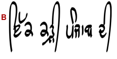 It is always good practice to work at least twice the size you are going to end up at so as to preserve the fine details so that is what I did here - it is shrunk down to let it fit on the page. Note that the height of the last bihari is roughly correct. It is always good practice to work at least twice the size you are going to end up at so as to preserve the fine details so that is what I did here - it is shrunk down to let it fit on the page. Note that the height of the last bihari is roughly correct.
B Next, shrink it down sideways so that the width is correct.
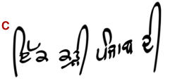 C Next, I used a distortion tool that allows me to move the image around so I shrunk down the two words on the left and created a gradual transition to that across the word 'Punjab.' C Next, I used a distortion tool that allows me to move the image around so I shrunk down the two words on the left and created a gradual transition to that across the word 'Punjab.'
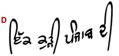 D Next, I shrunk down the adhak, moved the 'ਕ' of 'ਇੱਕ' to the left, shortened the aunkard and changed the 'b' slightly so that those who normally don't read handwritten Punjabi would find it easier to recognise. D Next, I shrunk down the adhak, moved the 'ਕ' of 'ਇੱਕ' to the left, shortened the aunkard and changed the 'b' slightly so that those who normally don't read handwritten Punjabi would find it easier to recognise.
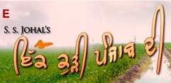 E When you compare that to the final version that the graphics people produced, you can see one way of how it can be done - there are many. E When you compare that to the final version that the graphics people produced, you can see one way of how it can be done - there are many.
Finally, colour is added, along with a darker outline and a drop shadow.
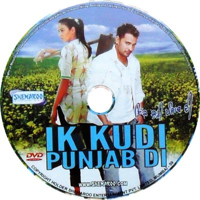 For the version of the text that appears on the darker background of the field in the DVD label, it is coloured in blue with a white border to create contrast. For the version of the text that appears on the darker background of the field in the DVD label, it is coloured in blue with a white border to create contrast.
Apart from performing major surgery on a font in order to get it looking as though someone has written it by hand, you are, with these fonts, at liberty to do any surgery you like - you only need to include a copy of the original font if you distribute the font that you have modified, you don't need to if you are just producing artwork.
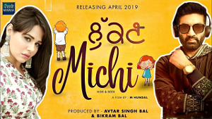 Here is another example, this time with the Dwarka font in the 2019 film 'Lukan Michi'. Here is another example, this time with the Dwarka font in the 2019 film 'Lukan Michi'.
 In the case of the book ਪੁਰਾਤਨ ਜਨਮ ਸਾਖੀ by ਡਾ. ਰਤਨ ਸਿੰਘ ਜੱਗੀ Gurmat Prakashan, Patiala, the designer has taken the Raajaa 7 Bold font. In the case of the book ਪੁਰਾਤਨ ਜਨਮ ਸਾਖੀ by ਡਾ. ਰਤਨ ਸਿੰਘ ਜੱਗੀ Gurmat Prakashan, Patiala, the designer has taken the Raajaa 7 Bold font.
 Next, the width has been shrunk to around 60 per cent whilst keeping the height the same. Next, the width has been shrunk to around 60 per cent whilst keeping the height the same.
 Next, the outline has been grown, in this case by using the 'Alpha to Selection' menu item on the layers dialogue box and then by right-clicking on the image and selecting 'Select'/'Grow' and then filling it with black on a new layer. Next, the outline has been grown, in this case by using the 'Alpha to Selection' menu item on the layers dialogue box and then by right-clicking on the image and selecting 'Select'/'Grow' and then filling it with black on a new layer.
 Finally, the black layer is blurred and the image flattened. Finally, the black layer is blurred and the image flattened.
 Here, you can see the top of the Punjab Telegraph's Glamour World Section with my Raaj font. Here, you can see the top of the Punjab Telegraph's Glamour World Section with my Raaj font.
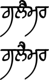 They have typed it out but taken the Dulaanv and rotated it by around 25 degrees so that it stands out more vertically, also, repositioning it so that it joins the ਲ where the letter joins the bar rather than at the right hand end of the letter. They have typed it out but taken the Dulaanv and rotated it by around 25 degrees so that it stands out more vertically, also, repositioning it so that it joins the ਲ where the letter joins the bar rather than at the right hand end of the letter.
Again, the lettering is given a white border and then a drop shadow.
|

or here for a TAR.GZ file


 A number of my fonts have found their way into Newspapers, magazines, books, Pollywood films and so on.
 In the film 'Lucky Di Unlucky Story,' my Karmic Sanj font is used with plain colours for each word so that the Gurmukhi words have the same colours as the Latin versions.
 However, it doesn't have to be as simple as that...
 Here it is in more detail from a frame in the title sequence from the film itself.
 These are the characters that we can use to make the name of the film. You can see that there is a version in the UniCode range and another in the ASCII range - this is because the support for processing graphics - or even just text - outside the UNIX/Linux or open-source community is virtually non-existent.
 First of all, type in the text. in this case it is 'ie~k kuVI pMjwb dI' - I am used to the normal Indic keyboard layout which is a lot easier than learning to type like that but there you go.
 It is always good practice to work at least twice the size you are going to end up at so as to preserve the fine details so that is what I did here - it is shrunk down to let it fit on the page. Note that the height of the last bihari is roughly correct.
 C Next, I used a distortion tool that allows me to move the image around so I shrunk down the two words on the left and created a gradual transition to that across the word 'Punjab.'
 D Next, I shrunk down the adhak, moved the 'ਕ' of 'ਇੱਕ' to the left, shortened the aunkard and changed the 'b' slightly so that those who normally don't read handwritten Punjabi would find it easier to recognise.
 E When you compare that to the final version that the graphics people produced, you can see one way of how it can be done - there are many.
 For the version of the text that appears on the darker background of the field in the DVD label, it is coloured in blue with a white border to create contrast.
 Here is another example, this time with the Dwarka font in the 2019 film 'Lukan Michi'.
 In the case of the book ਪੁਰਾਤਨ ਜਨਮ ਸਾਖੀ by ਡਾ. ਰਤਨ ਸਿੰਘ ਜੱਗੀ Gurmat Prakashan, Patiala, the designer has taken the Raajaa 7 Bold font.
 Next, the width has been shrunk to around 60 per cent whilst keeping the height the same.
 Next, the outline has been grown, in this case by using the 'Alpha to Selection' menu item on the layers dialogue box and then by right-clicking on the image and selecting 'Select'/'Grow' and then filling it with black on a new layer.
 Finally, the black layer is blurred and the image flattened.
 Here, you can see the top of the Punjab Telegraph's Glamour World Section with my Raaj font.
 They have typed it out but taken the Dulaanv and rotated it by around 25 degrees so that it stands out more vertically, also, repositioning it so that it joins the ਲ where the letter joins the bar rather than at the right hand end of the letter.