


The PG Dilli font is an ultra bold, extended display font with a strong bar that always has a gap between it and the rest of the character, giving it a unique appearance.
The bar is broken up between characters so that each syllable is separated from its neighbours, making it ideal for company logos sign making as the bar that is characteristic of Gurmukhi, Devanagari and Bangla does not form a physical barrier that prejudices physical the strength of a sign made by cutting areas of plastic to form letters.
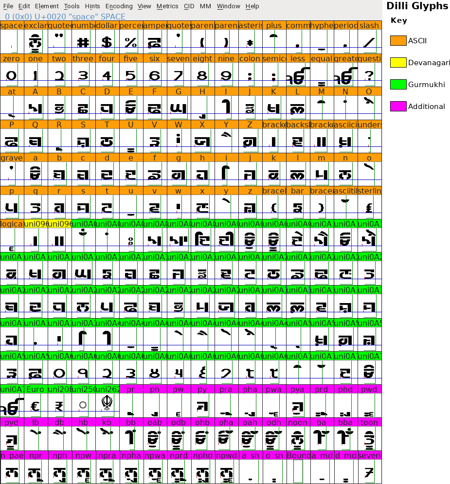
As this font is aimed at logo/sign production, it provides a Latin set of numbers in the ASCII number area with Gurmukhi numbers in the Gurmukhi Unicode area. To produce Gurmukhi numbers from the Latin keys, type the number you want and then press the hash mark '#' twice after it as in the diagram on the right. This will swap each Latin number with the Gurmukhi number.
Should you want the Latin number seven with the bar across the middle, just press the sequence '7-##' and you will get the version of the seven that you can see on the right.
Below, in the next section, the third image is the glyph map of the font.
- The Orange section is where the Latin characters are located. You can see that the exclamation mark produces noon - you can also get this by keying 'nUM' - and that the numbers in that area are the Latin number set. If you have never looked at this before, you will notice that there are some similarities with the InScript layout insofar as a particular letter as lowercase will produce the first or third letter on that line (depending upon which letter it is and shifting it will produce the next. For example, the 'c' will produce a 'ਚ' but shifting it, ie, pressing 'C' will give 'ਛ';
- The Yellow section is Devanagari and produces the Dande and Double Dand characters which are common to both Devanagari and Gurmukhi - the Dande and Double Dande keystrokes on the InScript keyboard layout produce the codes for the Devanagari characters and they are not reproduced in the Gurmukhi Unicode range;
- The Green section is occupied by the Gurmukhi characters and the order of characters follows the Devanagari layout. In this way, software that performs transliteration (or humans that are hand-coding it) merely have to change the first two hexadecimal code letters and not perform some weird transformation (which would make mistakes far more likely when humans are doing it).
- The Magenta section is where all of the special characters go that cannot be accessed directly through just one key press. Here, to get 'toon' (ਤੂੰ) for example, you press three keys and the application program that you are using passes this on to the part of it that processes the font and it looks for this character sequence. In this case, it finds it and displays this single character, instead of the three characters that were presented to it. You can see the paer characters and the special processing for different sized aunkard and dulaunkard characters that are used.
You can see in the glyph map that above-line collisions to the left are averted with glyphs that are called when, for example, a horda and bindi are required.
To avert a collision to the right, you need to adopt a different strategy - remember that this is a display font and not a body font so you are not going to need to do this all of the way through a series of paragraphs.
- The top example in the image on the right is the original - this is what you get whether you use the ASCII range keys or the Unicode keys. The font has been designed so that this sort of thing is kept to a minimum and if you look, the ahdak and the horda are not actually touching so really, you don't need to do anything about it. However, this is somebody's logo so they are paying you.
- The second version is the solution that involves changing the tracking for the adhak so that it is moved to the left. All you need to do is to take the cursor to the point between the '~' and the 'c' and change the tracking until it looks all right in your mind. Here, for this demonstration, I moved it by 8 pixels to the left (-8). Then, I took the cursor back to the point between the 'v' and the '~' and moved that the same amount to the right (+8) so that the 'c' would still have the same spacing from the 'v' as it originally had. Now, the spacings are all as they were except that the adhak has moved to the left by 8 pixels. This looks artistically better.
- The third version is where the space between the adhak and the next syllable has been extended by the addition of an extra bit of line. To do this, simply press the underscore key before the next syllable, ie, after the adhak. Some people prefer the way this looks to the above example because you scan the word in a way that is more consistent to the speed in which it is read - in some older fonts, the adhak always has some extra line under it.
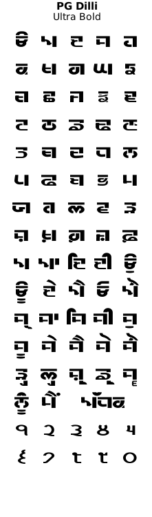
The 'PG Dilli' font family is provided in Ultra Bold.
Examples of artwork with PG Dilli . . .
click on the images to open them up, full-sized, in another tab...
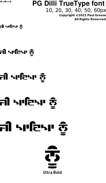
The first two are 1920x1080p so you can set them as your desktop wallpaper and have a closer look if you want. The third image is the glyph set of the font.

Hover the mouse over the images below to show examples of font characters and weights
Download PG Dilli . . .
Have you got the latest version of one of these fonts? If you have just downloaded it from this site, you have. Otherwise, you can check any font file by comparing the hash function results of the file on your computer with the values in the list by clicking here for text file and here for a web page - opens in a new tab. Select the font file on your system and look at the properties. Compare the hash result against the values in the table. These pages are kept up-to-date so whenever I update a font or create a new one, it will be on there.
Download All Fonts
You can download all of the fonts from all of the font families on this site in one compressed archive by clicking here for a ZIP file
or here for a TAR.GZ file

If you want to make a contribution directly using PayPal, my email address is paul.alan.grosse@gmail.com and please include your name and if relevant, your company and the project so that they can be included on the contributors page with a link if appropriate.
To see a list of contributors, click here.
Thank you.


Copyright ©2007-2023 Paul Alan Grosse.