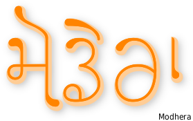
Modhera TrueType Font for free download. . .
About Modhera . . .
Modhera is a Gujarati-style Gurmukhi font that provides characters in the Unicode range as well as mapped versions to the ASCII range.
The ASCII-mapped characters provide the basic characters but the real gold with this font is the Unicode range characters.
As always, you get the best out of a fully-featured font by using programs - image/word processors - that can utilise the features. To date, I notice that Adobe Photoshop still fails to produce even basic proper Indic character order whereas the free programs - such as The GIMP - do and have done for many years. Until Adobe fix this bug, the saying; 'you only get what you pay for' still rings totally hollow.
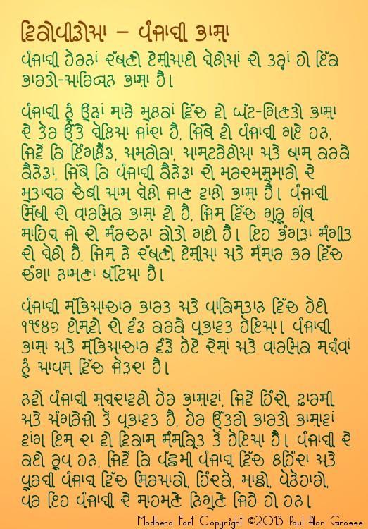
On the right, you can see Modhera's alphabet. The basic character set is the same as that of Dwarka, although there are some distinct differences:
- Like Dwarka, the full-height, straight verticals on the right of characters has a curl at the bottom, except that this is much bolder in Modhera;
- The aunkard and dulaunkard slope down to the right in Modhera and are not mono-linear;
- The starting point on all of the open-starting characters (ie, not ਥ, ਧ, ਬ and ਯ) is characterised by an emboldened point; and,
- There are a number of different types of sihari and bihari.
Like Dwarka, the tails are dropped when a paer character is used.
All of this goes into making a very stylish, fluid font that possesses: the general top-left to bottom-right visual flow; the line-free look; the small serifs; and the rounded look that Gujarati has.
The font also has such a consistent appearance that it is very easy to read and as such, can take on the role of a body font as well as a display font.
One thing to notice is that the Modhera ਥ looks a little like a Devanagari ब but without the top line. If you are familiar with Devanagari, you might find that to start with, you are reading it ias a 'b' but this passes quickly. Likewise with the Modhera ਧ and the Devanagari व.
This is not a problem with real Gujarati because the Devanagari and Gujarati versions of the Gurmukhi ਬ are ब and બ respectively, so, you can see that they could not be confused.
Modhera possesses a number of types of sihari and bihari, enhancing the fluidity of the font whilst maintaining its legibility.
The biharis come in four sizes, depending upon the characters that they follow.
The characters with the full-height, straight verticals on the right have a simple bihari that runs over the top and straight down again, making the resulting loop continuous as in type one on the right.
The other characters have different amounts of space in the top-right and this results in a choice from the other three biharis available, as you can see on the right - 2, 3 and 4.
There is a similar situation with the siharis where the bottom of the sihari extends to take advantage of the available space under the left hand side of the character. You can see this in sihari types 1, 2 and 3.
In types: 4; 5; and, 6, the top of the sihari extends to take advantage of the extra space over the top of the wider characters with type 5 also takeing advantage of the extra space under the ਚ.
In summary, you can see that the tops of the siharis all push up into the top left corner and the bottom slope down and to the right. The biharis slope down to the bottom right to varying degrees. Together, these two characters, which would normally make up an upright-standing block, add to the top-left to bottom-right feel of the font.
The ASCII part of the font has two variants of the adhak so you can choose whichever you like depending upon the space available.
However, the Unicode part of the font will do this automatically for you so there is no need to worry about that.
Not only that but as the available space changes with the bihari, the adhak moves into the available space, making for a more evenly spaced font.
You can see this clearly in the artificial examples on the right.
On the right, you can see what happens to the tail-flick on the bottom of the long-straight vertical that is a part of some of the letters in the Modhera font.
When a paer character is used, the paer character replaces the tail-flick - it does this whether there is a bihari there or not.
Another feature that I have programmed into this font is that it can extend the tippee part of the oorda of the Ek Onkar so that it is able to reach over some of the following text.
Instead of using the normal Ek Onkar character, use a Gurmukhi one - either in the ASCII range or the Unicode range - and then follow it by either the horda form of oorda, or the aunkard or dulaunkard forms of oorda as in the image on the right.
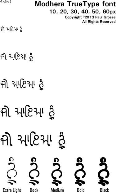
Click on the image on the right to see the full-sized breakdown of glyphs in the font.
This font - like almost all of the others - is a Unicode font with the Gurmukhi characters mapped onto the ASCII character positions as well.
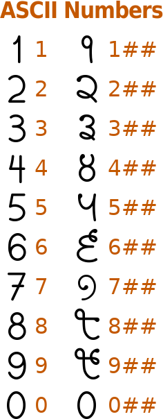
Note that you can see that there are normal ASCII numbers in the ASCII range as well as the Gurmukhi numbers repeated in the extended ASCII range in addition to their presence in their normal place within the Gurmukhi range. If you want to get Gurmukhi numbers using just the Latin characters, type the numbers that you want and then type two hash marks afterwards so for each number, say for a five, instead of just typeing '5', add the two hash marks so instead, you have '5##'.
As a result of this, you can use the ASCII keyboard setup you have if you want to use the ASCII characters and have access to both sets of numbers, or you can use the Unicode layout with Gurmukhi numbers on the keys above the alphabet on the regular keyboard or get the ASCII/Latin numbers using the number pad at the same time.
Also note that there are symbols for Rupee and Euro as well as the regular ones for Pound and Dollar/Cent.
If you are using ASCII, your keybaord layout should include the Gurmukhi numbers as certain key configurations. However, if you haven't got that or are unsure how to get them, the Gurmukhi numbers are at 0x00f1 through to 0x00fa. You can simply copy the string of characters below their corresponding numbers here (starting with ñ)
੧੨੩੪੫੬੭੮੯੦
ñòóôõö÷øùú
and paste them into your image/word processor (or copy the Gurmukhi numbers instead, if your system handles them appropriately).Character Sets . . .
So, can you get away with using just the ASCII characters?


On the right, you can see the main character sets for ASCII (Latin) and the Unicode Gurmukhi range in the font 'Modhera'.
You can see from the character layout (left) that the characters in the Gurmukhi part of the Unicode range are also lacking the flicks in their tails.
These are put on by the coding in the font so that you see them in the font that is presented to you in your word/image processor - this being done by replacing them, where appropriate, with glyphs that have the tails.
This is done so that if your image/word processor does not support the coding - this has been around for years now so there really is no valid excuse from the program manufacturer as to why it should not - the paer characters will still form properly, without overwriting the tail-flicks.
So, in order to take advantage of the more advanced features of the font, you really need to use the Unicode keyboard layout, along with a program that will do the job.
Previous solutions to the problem of typing Indic characters into a computer system involved the use of a font that had the indic characters in the ASCII range and these fonts support that still.
However, many of these layouts are incompatible with each other so if you change font, you get nonsense.
In addition, with these ASCII-based fonts, the sihari has to be typed before the character it is attached to instead of typing it the way you would write it down.
Now, though, modern computer systems support the Unicode fonts and you can type siharis the natural way because the coding in the font itself, sort out the arrangement on the screen - this being the case with other Indoc scripts such as Devanagari and Gujarati for example.
Text Input . . .
Typing in Unicode is just as easy as typing in normal ASCII. All you need to do is select the keyboard layout - usually a small button on the user interface at the bottom left, depending upon the layout of your screen - and then start typing. See the page on configuring the Gurmukhi keyboard (the page is about adding the Gurmukhi Unicode layout to your computer and the bit at the very bottom is all you have to do when you are using it).
There are keyboard layouts that have the same layout as the old, ASCII-based layout so that if you really do want to avoid learning a new layout in order to type Punjabi (or any Indic script) in Unicode, you can do it that way.
On the right is the layout for the Inscript keyboard for Gurmukhi - this one is for Microsoft Windows so the Bindi and the Tippee are the other way around.
It is laid out logically and once you have learned it, you can also type in Devanagari, Gujarati, Bangla and so on, without knowing those scripts.
Any text that you generate can be copied and pasted into various programs and with Unicode fonts - such as all of those available from this site - there are no compatibility issues other than the potential for taking advantage of additional typographical freatures that appear in some fonts but not others such as the extended Ek Onkar capabilities of Modhera, Dwarka, Full and so on.
Also, you can pull text from the Internet and it will reproduce with any Unicode font.
In short, the advanteages of Unicode are great: websites are adopting it as the new standard all of the time; existing fonts are being converted to Unicode versions; you can even email people using it without worrying whether or not they have the correct font on their system; and, it is just a matter of time before everybody has converted over to it.
Programs that work . . .
Windows, Linux, BSD, Solaris and even Apple's operating systems all support Unicode and certainly those that I have tried it out on (Linux, BSD, Solaris and to a large extent Windows) support it in their normal programs that come with the operating system such as browsers, email programs, word processors and so on although Windows has been a bit flakey with some of these.
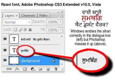
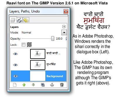
ਵਾਈ ਬਾਈ ਸੁਮਥਿੰਗ ਥੈਟ ਡੁਸੰਟ ਵੈਰਕ? However, the programs where you would use a font for its artistic qualities - image processing and word processing/DTP, in other words, producing bitmap images (.png, .jpg, .gif and so on) and vector images (.pdf, .svg and so on) - tend to suffer a problem.
Some quite expensive programs fail even the basic sihari test whereas their free, opensource equivalents work fine.
For image processing, if your image processor does not work properly with Unicode fonts (at the time of writing, the current Adobe Photoshop (CS6) fails the test and even puts the sihari after the letter instead of before it) then I would recommend using The GIMP which is a free download and will handle Unicode very well.
All of the images on this site (even the screenshots of Photoshop are captured with The GIMP) come from The GIMP and I have used it professionally as a regular (every issue for a number of years) writer for a PC magazine (PC Plus).
For word processing, if your word processor fails to work properly, I would recommend using OpenOffice.org which, again, is free and will also produce PDF (Portable Document Format) files for free. It handles the features of these fonts properly and will not cost you a penny.
If you really must use an image processor for your final work that does not support Indic fonts, there is nothing stopping you from creating any large image files on The GIMP, saving them and then loading them into your other image editing program for final assembly/composition.
An example of artwork with Modhera . . .
click on the image to open it up full-sized in another tab...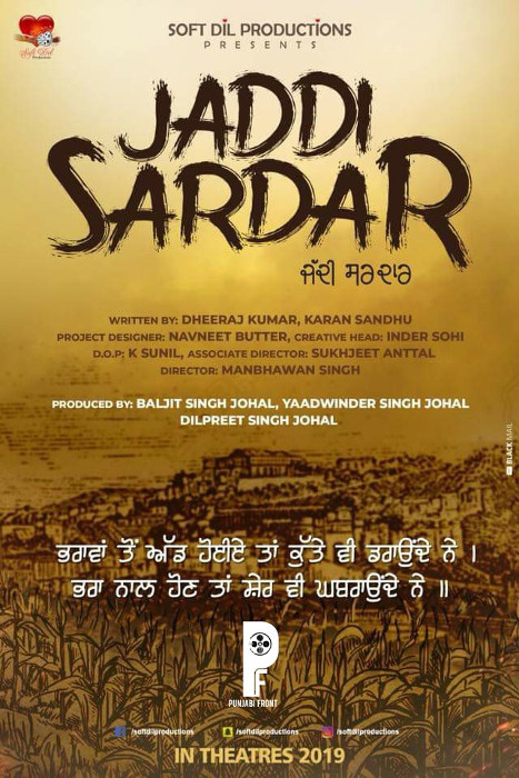
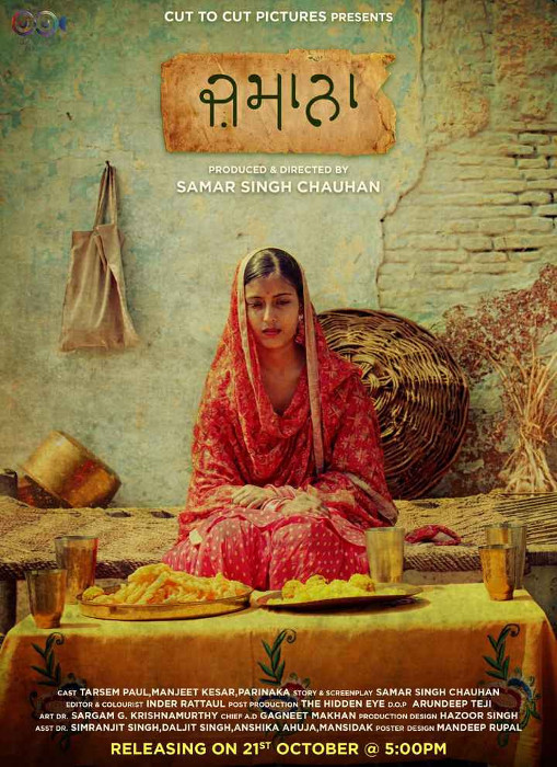
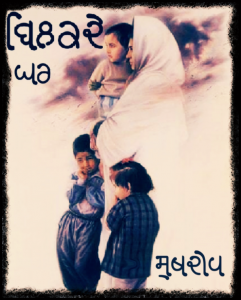
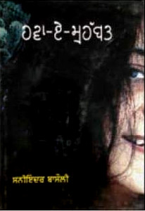
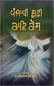
Hover the mouse over the images below to show examples of the font on book covers
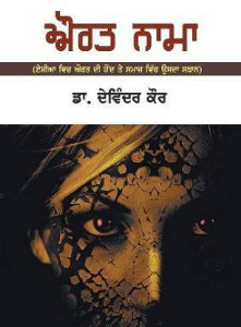
Hover the mouse over the images below to show examples of the font on book covers
Hover the mouse over the images below to show examples of font characters and weights
Download Modhera . . .
Download Modhera 2 Extra Light TrueType font modhera_2.ttf 60,812 bytes Download Modhera 4 Book TrueType font modhera_4.ttf 62,160 bytes Download Modhera 5 Medium TrueType font modhera_5.ttf 59,940 bytes Download Modhera 7 Bold TrueType font modhera_7.ttf 60,804 bytes Download Modhera 9 Black TrueType font modhera_9.ttf 62,612 bytes Have you got the latest version of one of these fonts? If you have just downloaded it from this site, you have. Otherwise, you can check any font file by comparing the hash function results of the file on your computer with the values in the list by clicking here for text file and here for a web page - opens in a new tab. Select the font file on your system and look at the properties. Compare the hash result against the values in the table. These pages are kept up-to-date so whenever I update a font or create a new one, it will be on there.
Download All Fonts
You can download all of the fonts from all of the font families on this site in one compressed archive by clicking here for a ZIP file
or here for a TAR.GZ file

If you want to make a contribution directly using PayPal, my email address is paul.alan.grosse@gmail.com and please include your name and if relevant, your company and the project so that they can be included on the contributors page with a link if appropriate.
To see a list of contributors, click here.
Thank you.
Copyright ©2007-2023 Paul Alan Grosse.


