


Fun Font Comparison - at the bottom of this page, compare two font families using a pangramatic paragraph devised by Hardeep Singh Mann, putting the characters in the context of actual words. The font examples have all been sized so that the centre of the font has the same height (a 'ਸ' or a 'ਖ਼' for example) with the ascenders and descenders going as far as they needs so that you can get a feel for each font.
Legibility
The DIN 1451's fonts have a version with Latin in the ASCII range and another with Gurmukhi in the ASCII range (in addition to the Gurmukhi in the Gurmukhi range, of course). The Latin text conforms to the original DIN 1451 specification which is seen everywhere in Germany and is very legible. This font gives you the original DIN 1451 specification as well as the Gurmukhi characters.
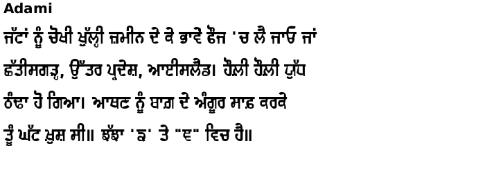
Adami is the Punjabi version of Adamski and is still very legible because if retains the curves of the outsides of the letters and the irregularity of the straight lines within the counters makes each letter distinct producing a longer term higher legibility that means that it can be used in body text although commercially, I have only seen it as display text at the moment.
Rocket is a Punjabi play on the NASA logo. It has the same proportions as the original NASA logo which, has fonts go, only had the letters NAS in it. Without actually trying to do so, it has ended up as a slightly bolder, slightly wider variant of the DIN 1451 font.
Pachami is like one of those western fonts from the late 19th century but using Gurmukhi instead. Its serifs follow the same rules as the western fonts making it easy to read.
Karmic Sanj is the Gurmukhi take on Comic Sans. This font shows what might be the careful writing of a younger person who is taking their time to produce a reasonably neat job. There is a slight 'left-heavy' feel to the font and whilst all of the character features are consistent, their expression is not, in the same way that a real person would produce them. Like Adami, the letter-to-letter inconsistencies make the font more legible to those with reading difficulties in the same way that Comic Sans has proven to be beneficial to people with dyslexia.
Rangdar is made from coloured pieces of plastic (or glass, or some transparent material) and is formed from rectangular blocks - there being variants of this that have three or four colours. In order to get these colours into your artwork, you create your text using the '1' font and then copy that layer to produce three or four identical layers - depending upon which one you select. You then select the variants - say 1, 2, 3 from the three coloured version - one for each layer - and then choose a different colour for each layer. Make sure that the layers are set to 'multiply' so that it looks as though the layers are filtering the light from the layers below. You can see what this looks like when you choose Rangdar in the comparisons below.
Imitation
Circuit Small makes your text look as though it is formed from single tracks on a printed circuit board. This is a multiple font in that whilst the tracks can be displayed completely with just the main font, there are a number of features that you can use with the supplementary fonts that help to make your text look more like printed circuit board copper tracks - more information on the font's home page.
Circuit makes your text look as though it is formed from double tracks on a printed circuit board. It is scaled so that the track width and other features end up the same size as the Circuit small font if you make this double the size so that you can use this version as the main title and the small font - at half the size - as the more loquacious subtitle.
Khanna - named after a small town in Indian and not a mis-spelling of kanna - is an irregularly edged font that looks as though it has been cut from some card with a sharp knife.
Pixel makes your text pixelated in two weights of square pixels and one weight of round dots. The square pixels are like the pixels on your monitor and the round dots are like the pins of a dot-matrix printer. Each variant comes in two widths.
Plotter is like the output of a plotter with a pen that flows just a little bit too much - one that did not would just be a monolinear font with nothing to differentiate between it and other monolinear fonts. Where the pen stops, ink still flows causing a little blob of ink.
Fluidity
Parda has an overall wedge shape where it has sagged under its own weight. The three variants increase their degree of sagging until the third one has accentuated exterior angles making it have the characteristics of bat wings in true 'horror picture' writing style.
Blob has a similar 'sagging' element to its design except that here, it is like a sack of fluid that is succumbing to the forces of gravity.
Dhobi Ghat has 'drooped' from the bar like dough sagging under its own weight or like clothes hanging from the bar.
Khicho, on the other hand, has been 'pulled' like blu-tak or chewing gum so that each end of any stroke is wider and the stretched bit in the middle has been 'draped' around to make the shape of the letter.
Gubara looks at the characters as buoyant and, as the name suggests, appears to be made from balloons that are held in place with string. The font is another composite font where you can choose the colour of your balloons and as a different font, you can choose the thickness of the strings. Instructions on the font's home page.
Energy
Jashan means party and this font has a lot of energy, imitating a style that could be formed from somebody quickly putting together a sign with some thick card and a large marker pen. An existing example is in the film Laatu - in the trailer, the font is used as the filament of a light bulb with great effect. See the font's home page for details.
Julaf means curls and again, like Jashan above, a quick improvised sign where a bit of fancy work has been used to make the lettering stand out.
From the list on the left: Move the mouse over to select a font family in a window; click on the name to go to that page. 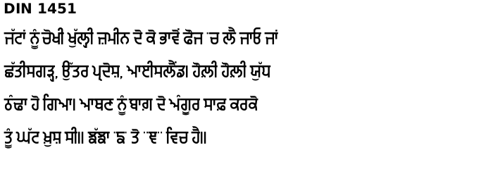
Copyright ©2007-2023 Paul Alan Grosse.