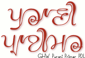
GHW Purani Primer PDL TrueType Font - based upon a 100 year-old primer, supplied by the Punjab Digital Library.
GHW Purani Primer PDL TrueType Font for free download. . .
This font is very easy to use and even though it has hundreds of glyphs, you can just get on with your work because the font does all of the hard work for you. All you need to do is cut and paste or type like you would normally do - the only time you might want to choose any alternatives are with the dandes/double dands where you might want a different one of the five of each that are provided (see below) - the coding in the font does all of the choosing for you, automatically.
Even if you are not using Unicode but using Latin instead, you can still access all of the glyphs and choose those you need. Simply type or cut and paste as normal but just pick the variants where needed - the middle-of-word glyphs are displayed as default so all you need to do is choose any special cases.
A short piece about this particular font was published in the Hindustan Times, Chandigarh Edition on 29th September 2013, in a section under 'Calligraphy'. It says that the lead to make the font came from Punjab Digital Library but in fact, it actually came from Hardeep Singh Mann (The same person who gave the the lead to make the GHP Full font) - I had seen it some time before but never thought about making a font of it and this sounded like a challenge.
The article goes on to state that I asked for high resolution images of the primer - Hardeep did - and that they gave them to me 'on the condition that the font should be available free of cost' - again false. In fact, they supplied me with the images (eventually) without imposing any such condition and on 29th June 2013, the PDL emailed me saying; 'This is just wonderful! I am sure the font will come out great. Please keep us posted on further developments and whenever you can share font with us for testing and appreciation. We would like PDL and you to jointly release the font. Are you planning to charge a fee for its usage or will it be free? Please keep us posted.'
In my reply, I said; '[T]here are plenty of people who genuinely cannot afford to buy things like fonts and I see no reason that somebody should be discriminated against on the grounds of being able to pay.'
I am a journalist and I work to a code of conduct - the NUJ code of conduct and that includes ensuring that disseminated information is accurate - in other words, get your facts right.
About GHW Purani Primer PDL . . .
GHW Purani Primer PDL is a Gurmukhi display font that covers both the UniCode Gurmukhi range and also places Gurmukhi characters in the ASCII range so it is compatible with systems or programs that are not quite as advanced as those that are able to use UniCode.
The font was inspired by the workings of somebody, identiy and gender unknown, from 1916, whose primer was scanned in by the Punjab Digital Library and passed on to me so that I could make a font from it. What you see here, can download and use yourself for free, is that font.
Being hand-written, as you can see from the image on the right, there are a number of variants of each character because of the context of each letter within any particular word. In fact, the font has 567 glyphs, along with another 28 glyphs that, if you don't use the Unicode but use the ASCII instead, help you as you type when you have to make decisions about which version of a glyph to use - if you do use the Unicode, it is all done for you automatically by the font.
A character can be at the beginning of a word, at the end or somewhere within it - it can even be on its own. Also, there are some characters that lead into the next letter at a different height and there are variants that take into acount those situations as well.
Unicode In the Unicode range, the programming in the TrueType font consideres the situation that any particular character finds itself in an it chooses the appropriate option for that situation - some options will never arise and some already existing variants are close enough to what other would be so a new one does not need to be created.
Latin As for the ASCII range, programming at that level does not exist. However, I have deliberately designed this font so that people without access to the more advanced, automatic Unicode environment, can still use the font to its fullest potential - at leasr as far as visual output is concerned although it is more of a hassle to input the code as each option has to be selected by hand.
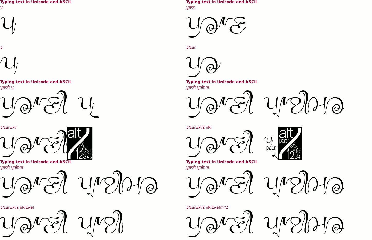
Such selections are performed by pressing the letters you want and then pressing the slash ('/') key and then a number. On the right, you can see the keys to press for any given option.
Most of the time, you will be typing letters that are in the middle of words but for the beginning or end characters, there are options. So, for the initial 'p' of 'Purani', you would type 'p/1'. See the animated example at the bottom of this page.
In addition to the basic penti and the vowels, there are also options on dulaunkard on the consonants that do not have a full-height descending bar at the right.
Unicode If you are using the Unicode part of the font, this is all done for you automatically.
Latin However, if you are using ASCII, you can get these by selecting the letter and then a 'U' and then the '/' and number for the context in a similar way to the characters above.
You can see the default versions under the 'Def' column but when you select the slash versions, a new, integrated dulaunkard version is formed.
So, to get the mid-word dulaunkard version of Bhabba, type 'BU/2'
Unicode Similarly the paer forms are selected automatically if you are using Unicode whereas with ASCII, you need to select them by hand if you are not using them in the mid-body location.
Latin Type the consonant letter and also type the paer character letter, then type slash and a number - as in the dulaunkard forms above, the ligature looks at the whole character and not just the last letter.
There are some additional forms that are available for short words that otherwise would look odd.
Unicode Again, it is all done automatically for you in Unicode, but you have to specify it if you want it in ASCII.
Latin For noon, type 'nUM/1' for the stand-alone version or use a '2' for the follow-on version, such as in 'tenoon'.
Similarly, with the others.
For the tippee, dulaanv and horda, there are terminal versions available by typing '/2' after the characters.
There are five different versions of dande and double dande so that they will look different and you can generate more of an appearance of writing that has been done by hand rather than something that something that has been produced by a computer.
Unicode For the Unicode users, the version that is selected is based upon the last character used before the dande or double dande.
Latin For ASCII users, it has to be selected by hand if anything other than the default version is needed.
However, even with Unicode, it is possible that this natural variation leads to the same version of dande or double dande being selected in an obvious way - say, if the last vowel is the same in two sentences that end close to each other on the page - so in both cases, an override is available.
In both cases, press the '/' key (yaeya will be selected in Unicode Gurmukhi) and then a number from the numbers at the top of the keybaord (not the keypad unless you are using ASCII). You can then get the alternatives shown on the right. For the Unicode user, you can get the default by pressing Gurmikhi zero.
Repetative numbers are another example where the uniformity of machine-generated glyphs make it look non-human.
With this in mind, I have made it so that if you press a number twice, you get a pair of numbers and if a third time, you end up with three different ones. You can see how these vary on the right - nobody draws letters or numbers exactly the same each time, no matter how hard they try.
Finally, you can get a wavy line to draw, centre-justified under your work by pressing the underline key.
Unicode In Unicode, start by pressing '/' or yaeya and then repeatedly pressing the underscore key.
Latin In ASCII, press the underscore key followed by an 'l' (left), 'm' (Middle) or 'r' (right) to get the beginning, middle or end of the line (you will see how they are different when you play around with this.
Finally, the space, when press twice produces a half-width space. This allows you to position words accurately. Have a play.
Click on the image on the right to see the full-sized breakdown of glyphs in the font.
This font - like almost all of the others - is a Unicode font with the Gurmukhi characters mapped onto the ASCII character positions as well.
Note that you can see that there are Gurmukhi numbers in the ASCII range as well as the Gurmukhi numbers repeated in the extended ASCII range in addition to their presence in their normal place within the Unicode Gurmukhi range.
Also note that there are symbols for Rupee and Euro as well as the regular ones for Pound and Dollar/Cent.
If you are using ASCII, your keybaord layout should include the Gurmukhi numbers as certain key configurations. However, if you haven't got that or are unsure how to get them, the Gurmukhi numbers are at 0x00f1 through to 0x00fa. You can simply copy the string of characters below their coresponding numbers here (starting with ñ)
੧੨੩੪੫੬੭੮੯੦
ñòóôõö÷øùú
and paste them into your image/word processor (or copy the Gurmukhi numbers instead, if your system handles them appropriately).
You can see from the above animation, the steps involved in typing out a couple of words. There are more keystrokes to the ASCII way of doing it but compared to the amount of work involved in other image processing that you will be doing when producing a book cover or tee-shirt design, this amount of extra work is tiny.
You can also see how the extra characters in blocks help to remind you of the options when you press the '/' key for options. If there are no options, you will usually get a message saying so. Again, just play around with it and see what it does.
Example of artwork with GHW Purani Primer PDL . . .
click on the image to open it up full-sized in another tab...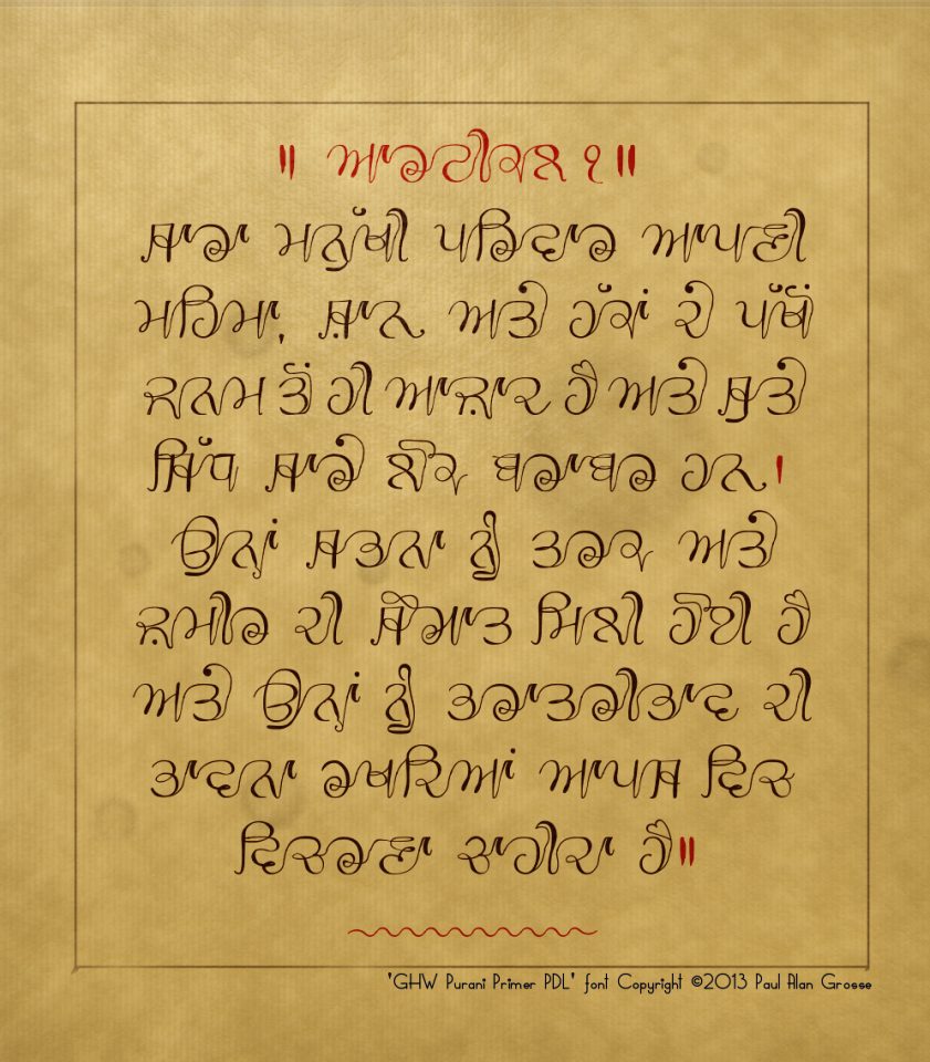
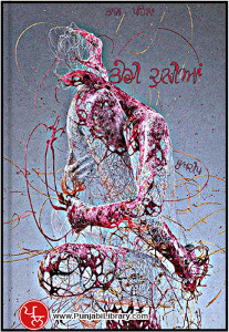
Hover the mouse over the images below to show an example of the font on a book cover
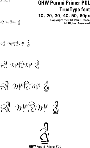
Hover the mouse over the images below to show examples of font characters and weights
Download GHP Purani Primer PDL . . .
Have you got the latest version of one of these fonts? If you have just downloaded it from this site, you have. Otherwise, you can check any font file by comparing the hash function results of the file on your computer with the values in the list by clicking here for text file and here for a web page - opens in a new tab. Select the font file on your system and look at the properties. Compare the hash result against the values in the table. These pages are kept up-to-date so whenever I update a font or create a new one, it will be on there.
Download All Fonts
You can download all of the fonts from all of the font families on this site in one compressed archive by clicking here for a ZIP file
or here for a TAR.GZ file

If you want to make a contribution directly using PayPal, my email address is paul.alan.grosse@gmail.com and please include your name and if relevant, your company and the project so that they can be included on the contributors page with a link if appropriate.
To see a list of contributors, click here.
Thank you.
Copyright ©2007-2023 Paul Alan Grosse.


